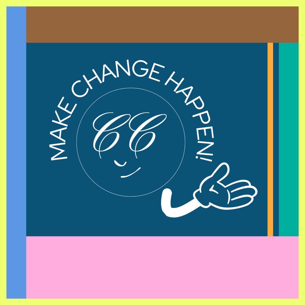
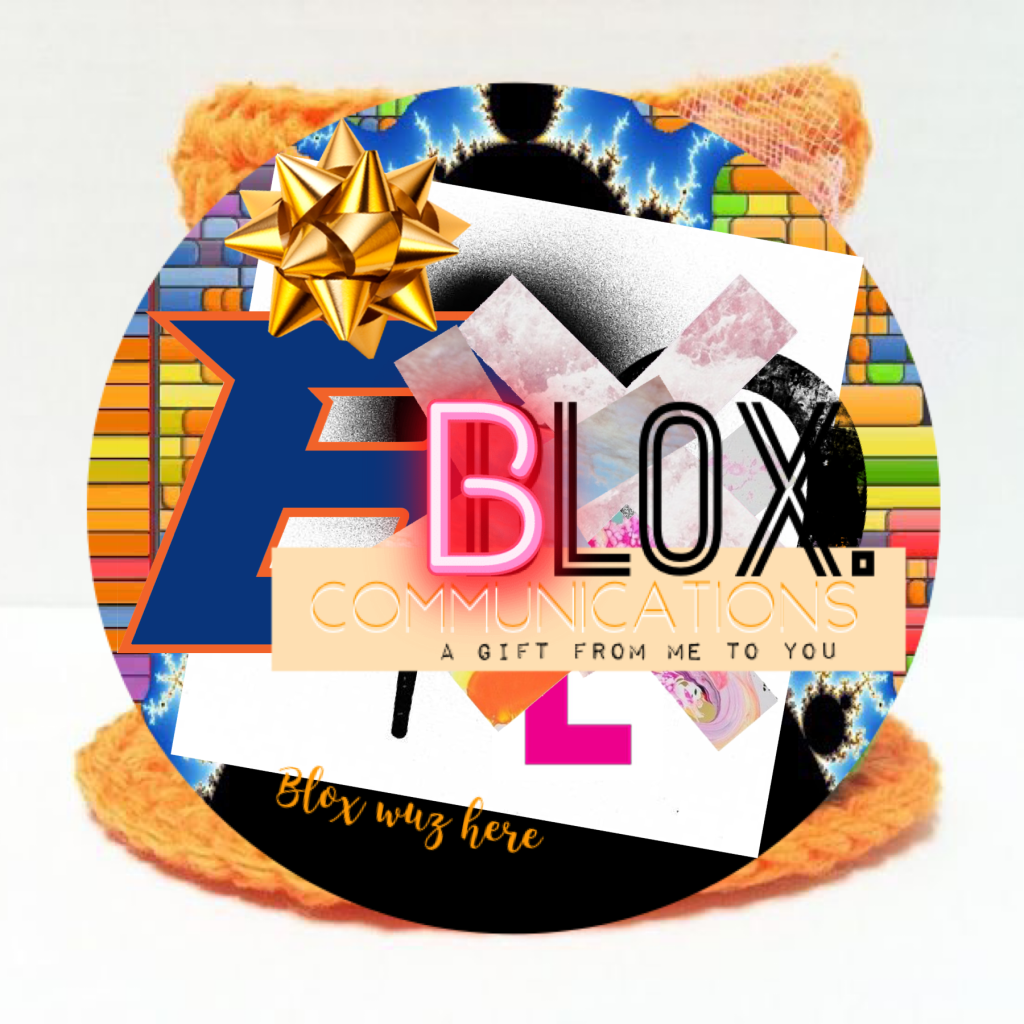
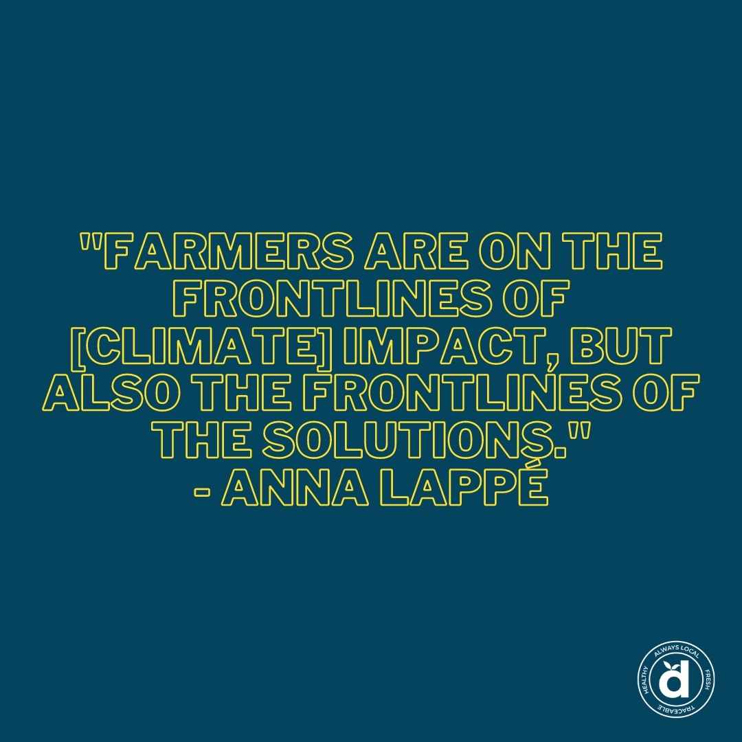
When the magic happens, You’re making change happen.
Identity stamped to perfection.
Understanding:
style, thinking, love, goals and aspirations.
There are always ways to re-imagine.
Be who you are. Strive to be better.
*This is a new day, a new era. My new personal brand stamp marks each letter as if to say, “Hi there!” We need to have a conversation about creativity and art and art and creativity and that relationship specifically.
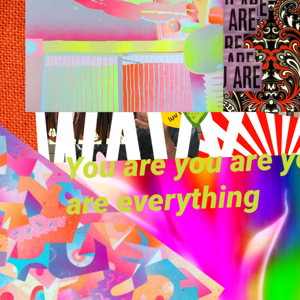
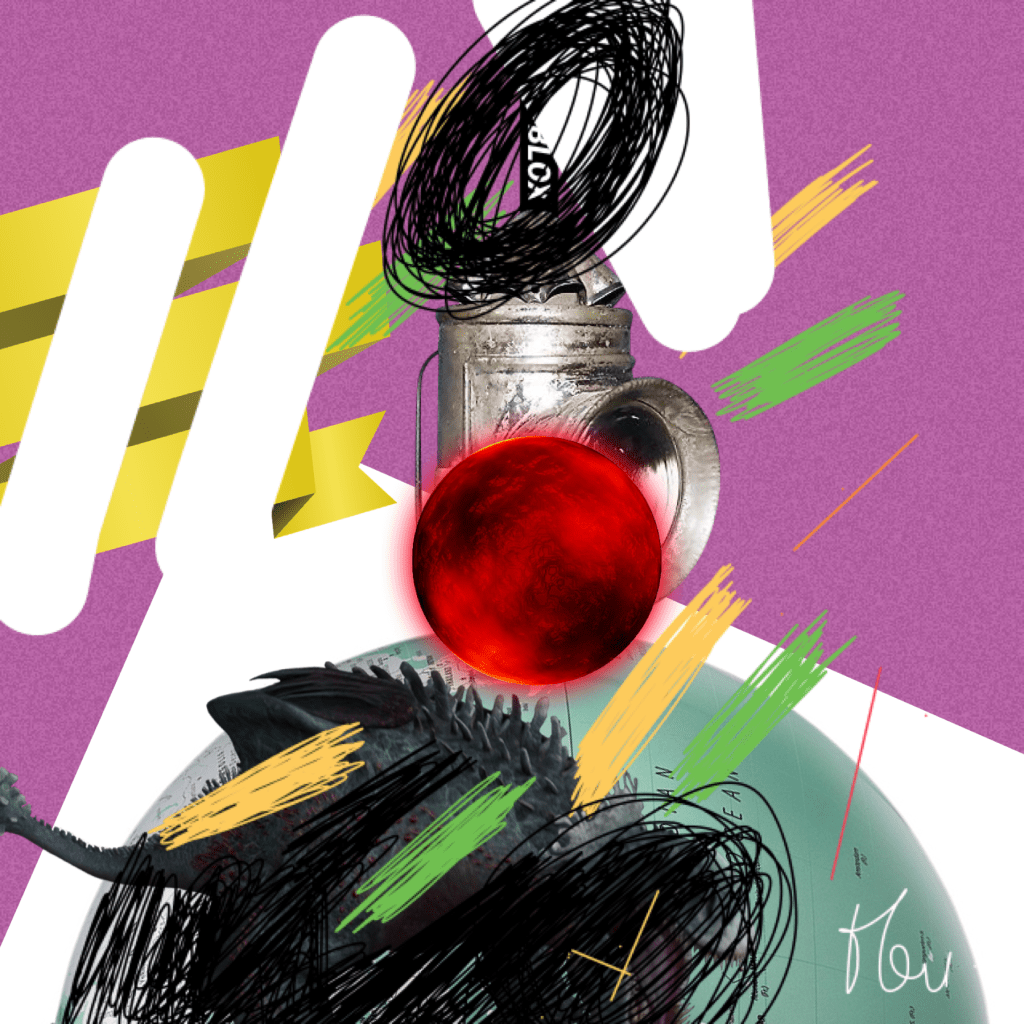
Capturing imagery + text in an intertwined relationship is fascinating work. There’s something about mingling elements, contrasting colours, and purely expressing a message that excites me.
Infographics are a great example of this type of communication. Well done work leaves me breathless (in a good way). So, to jump right into it, here are some things to consider when creating powerful infographics.
An infographic (information graphic) is a representation of information in a graphic format designed to make the data easily understandable at a glance.
Why do we use them?
Infographics are a great way to communicate ideas quickly and effectively. They help to simplify the process of presenting a message or data and help to establish connections, patterns, and relationships that allow us, as the viewer, to gather specific information.
Anything that’s too wordy, difficult to understand, or mind-numbingly full of roundabout detail. And it’s not about getting a quick fix. Some of us—me on occasion—enjoy digesting a mouthful of words. Still, no one can deny that pictures make everything easier to take in!
In 2019, 74% of marketing content contained a visual element. That’s not surprising, considering a whopping 90% of all information transmitted to the brain is visual.
Leaving us to believe that when you come across visually appealing content, you are much more likely to retain it. You might even share it with someone else after you’ve frolicked in its delight.
Taking inspiration from that which is shareable is also a thing.
I often create based on how much I liked LOVED something. I am graphically illuminated so much easier these days with all the impressive infographics to learn from!
They’re important, guys, for so many different reasons. But to summarize—infographics are important because they help us tell a story in a way that’s accessible to our audience.
Just the words below will let you know why.
Words that your infographics should be –
What’s the blox. way to create infographics?
Follow these steps:
1 – Find an appropriate ‘chunk’ of content you would like to translate pictorially, or that is so dang interesting, it’s already sparking imagery in your head.
2 – Follow your brand guidelines—typeface, colour, spacing, tone etc.
3 – Create to your heart’s content but make sure each element flows into the next. Continuity is critical, or you risk altering the message or even worse, spreading an inconsistent idea.
4 – Aim to make your infographics attention-grabbing and playful. People are much more likely to engage if they’re looking at something that incites positive emotion.
5 – Incorporate text carefully and precisely The text you add should uplift and reinforce your main message. Make sure it supports the imagery you are using!
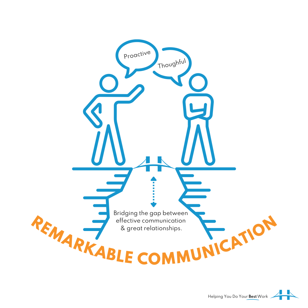
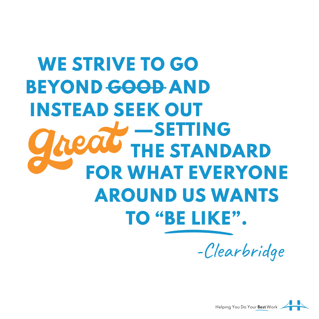
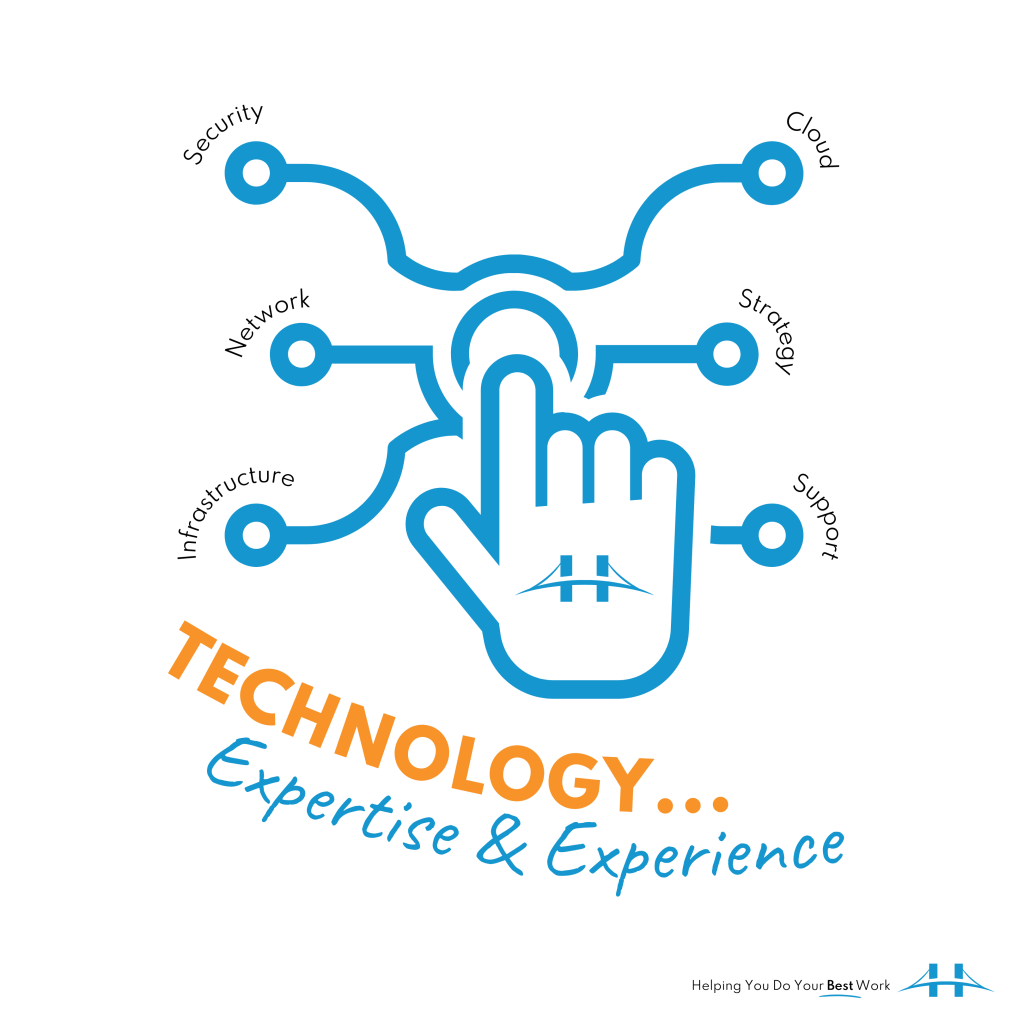
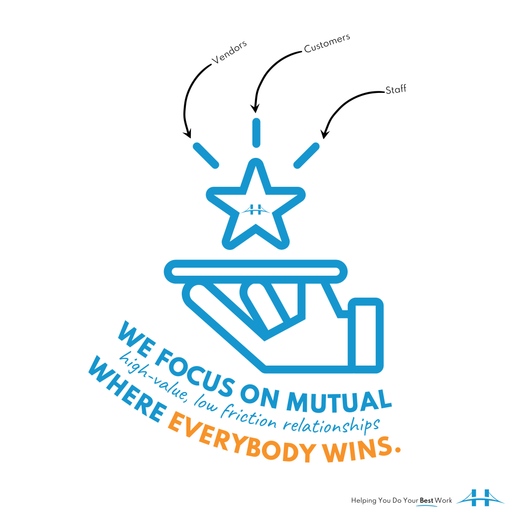
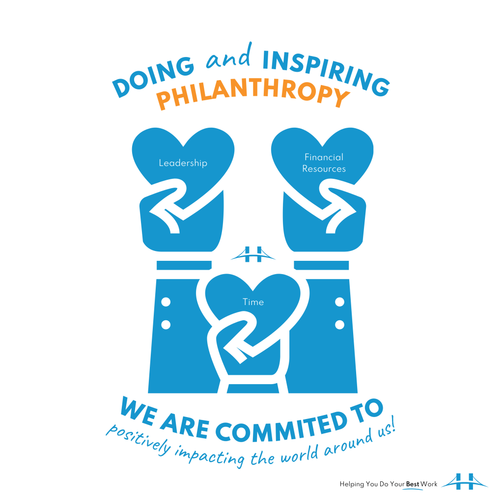
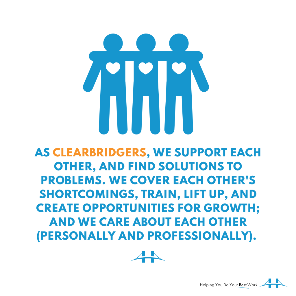
I am so excited to share these because designing them was such an enjoyable experience. I feel like I achieved what I was going after—visually describing our work and what we want to be known for (our #bestwork). I hope you like them! If you have any suggestions for modifications, let me know, I am always happy to make things #better!
Yearning for more design content? Check out these blog posts:
Brand strategy is my passion. What are you passionate about?
I compiled these images, which are re-designs (content has also been revised) of the original images in my post Brand Strategy and from the Recent Works – Direct Mail Proposal project I did in October. What do you think of the new design? It was inspired by mid-century modern graphic design. I did a whole series of work based on some images from a book titled, Mid-Century Modern Graphic Design by Theo Inglis. I will put together a #bloxbooks post about it soon. In the meantime, enjoy the work below. I am open to a discussion anytime, reach out!
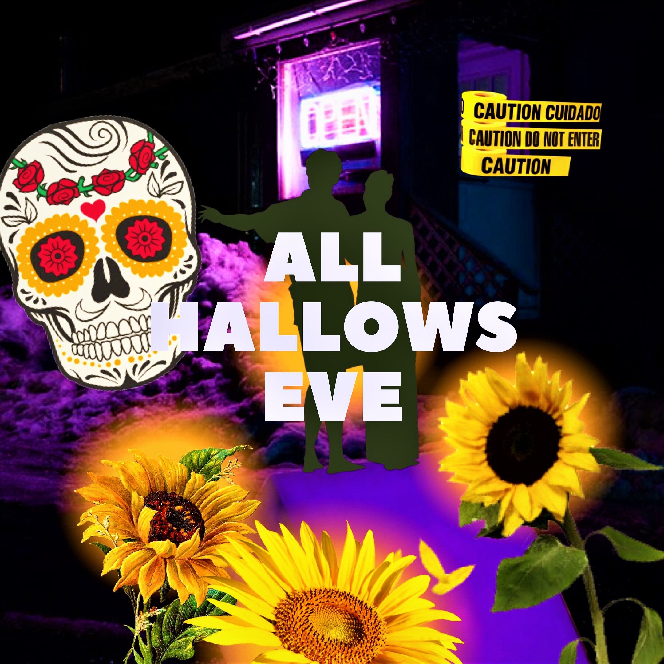
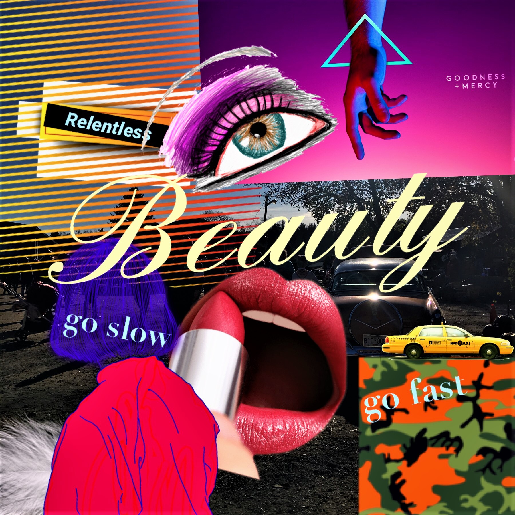
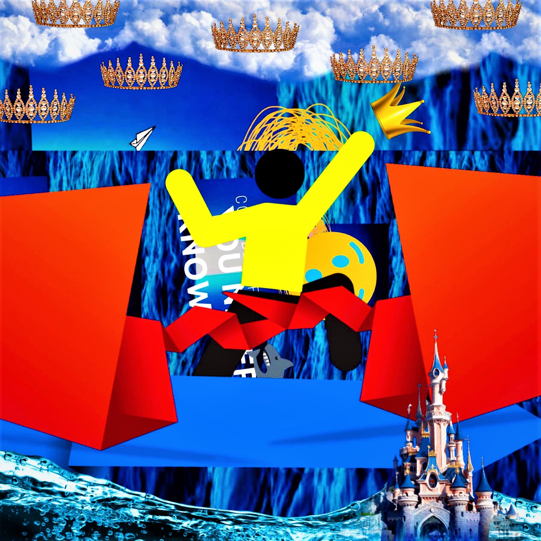
Here are a few graphic art/design pieces I put together over the past couple of months using my own photographs, Pic Collage + Canva.
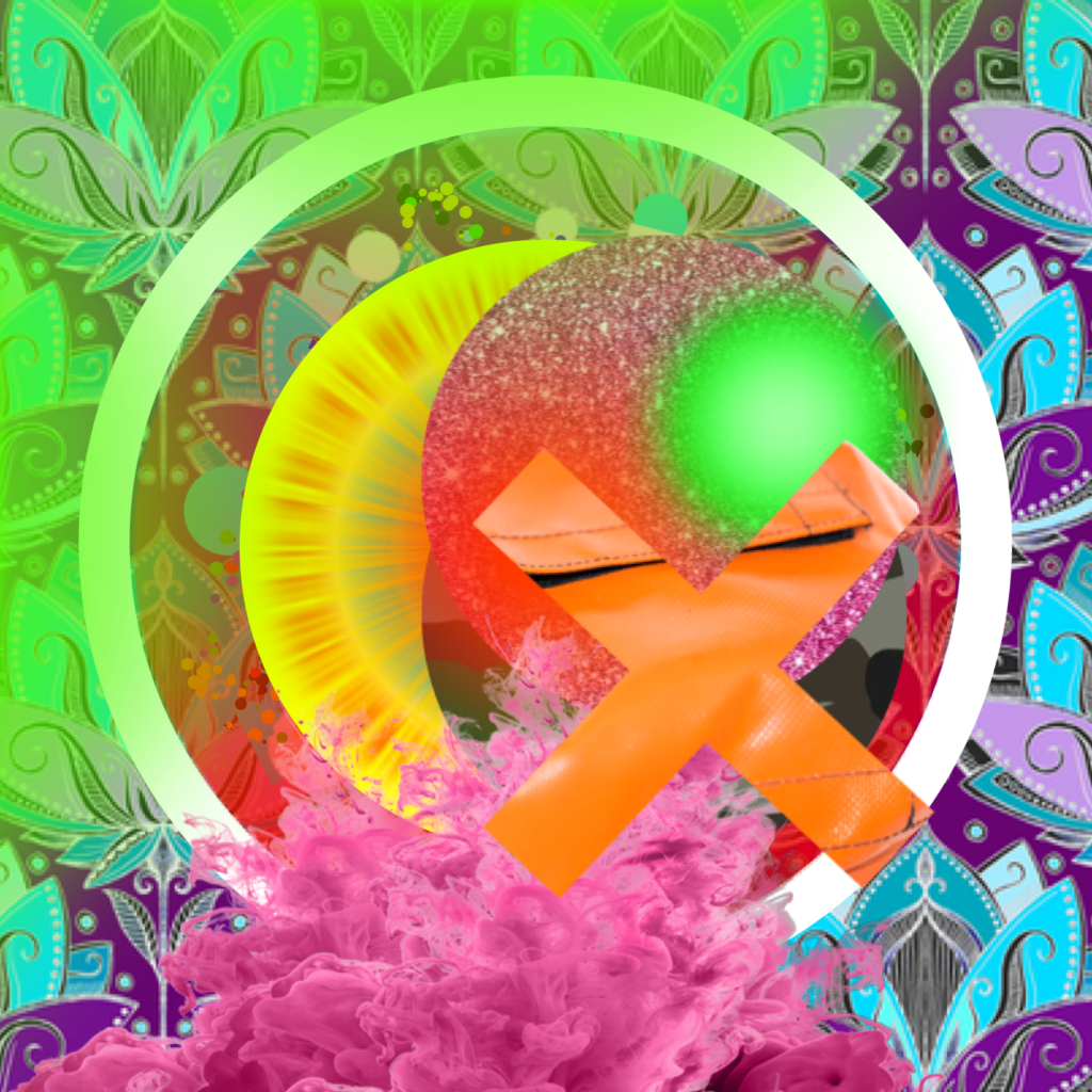
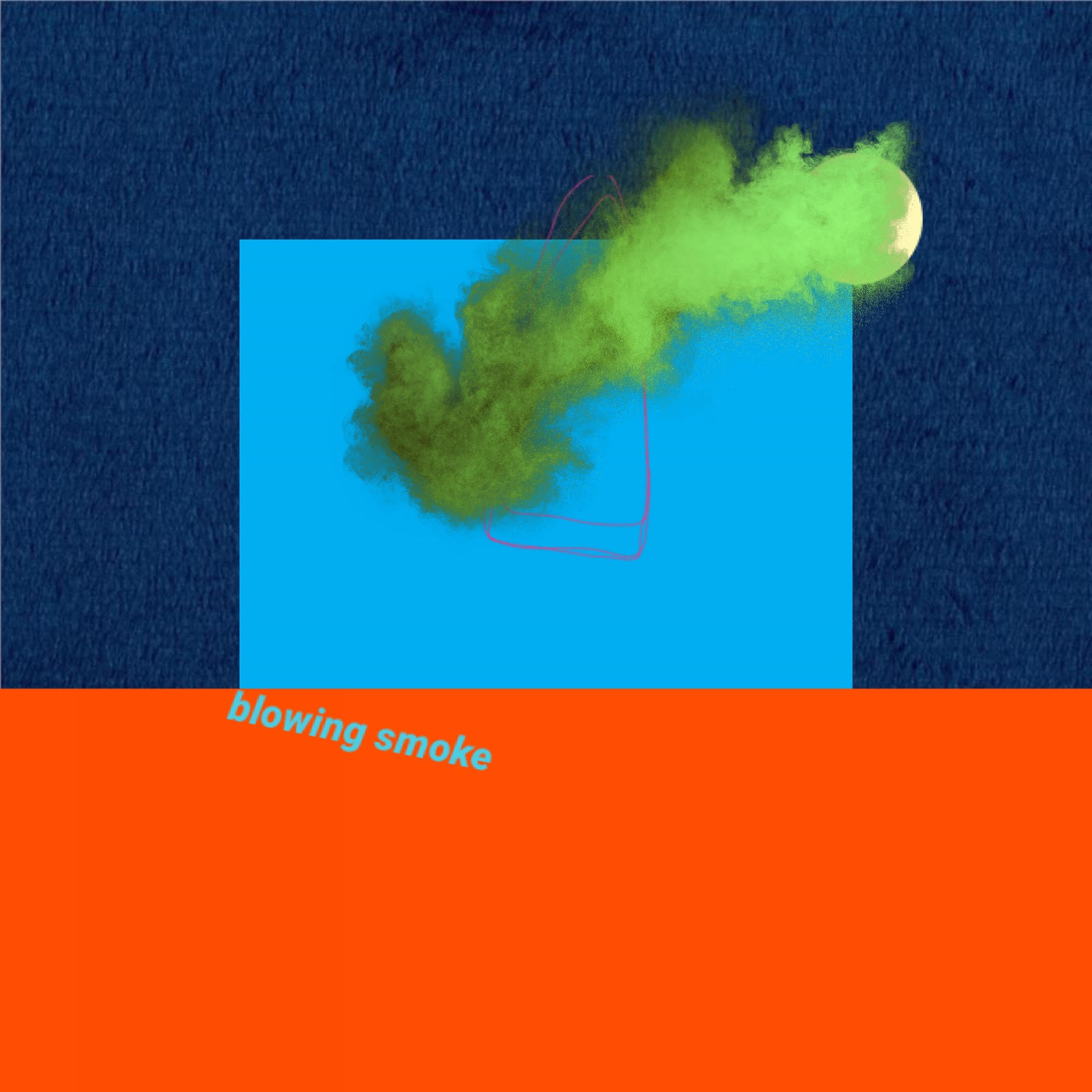
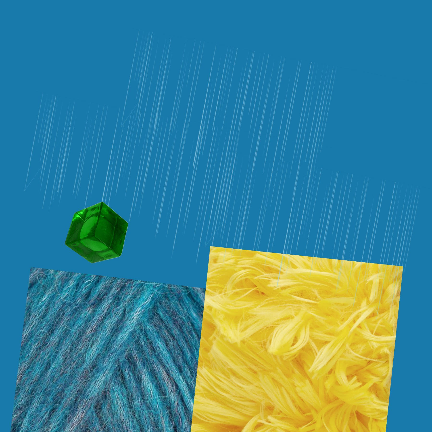
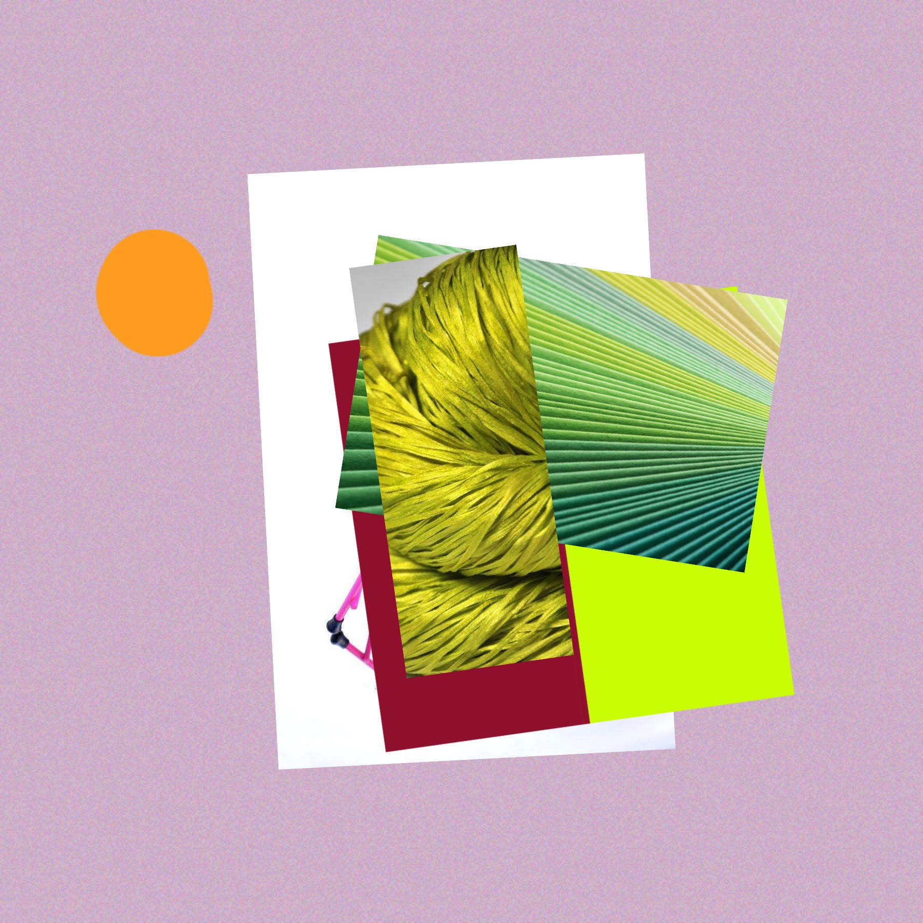
My images flow from one to the next. It’s not intentional, it happens. Lately, I’ve been focused on using two hues, often complimentary. This enables our emotions and makes us think – is the content more striking or the context? There are also 2-3 characters fighting for the space. Can you identify them? What kind of plot line would you tell about these pictures?
I was excited about creating these designs. The work was produced using Canva and took about 30 hours (including printing and assembling) to complete. I left out the personal part of my proposal, but I hope you can derive a positive sentiment from the style + tone I chose to go after!
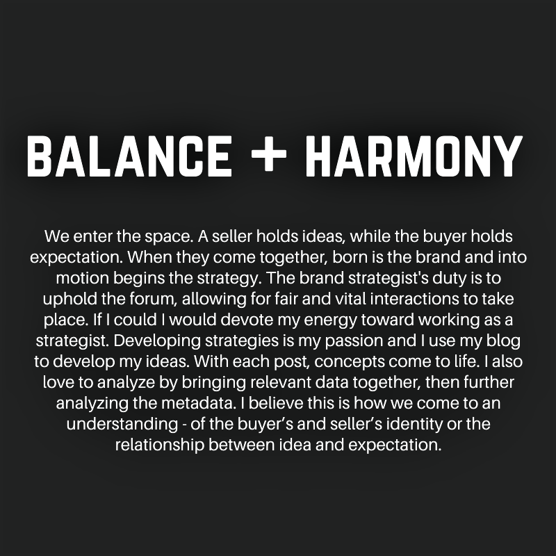
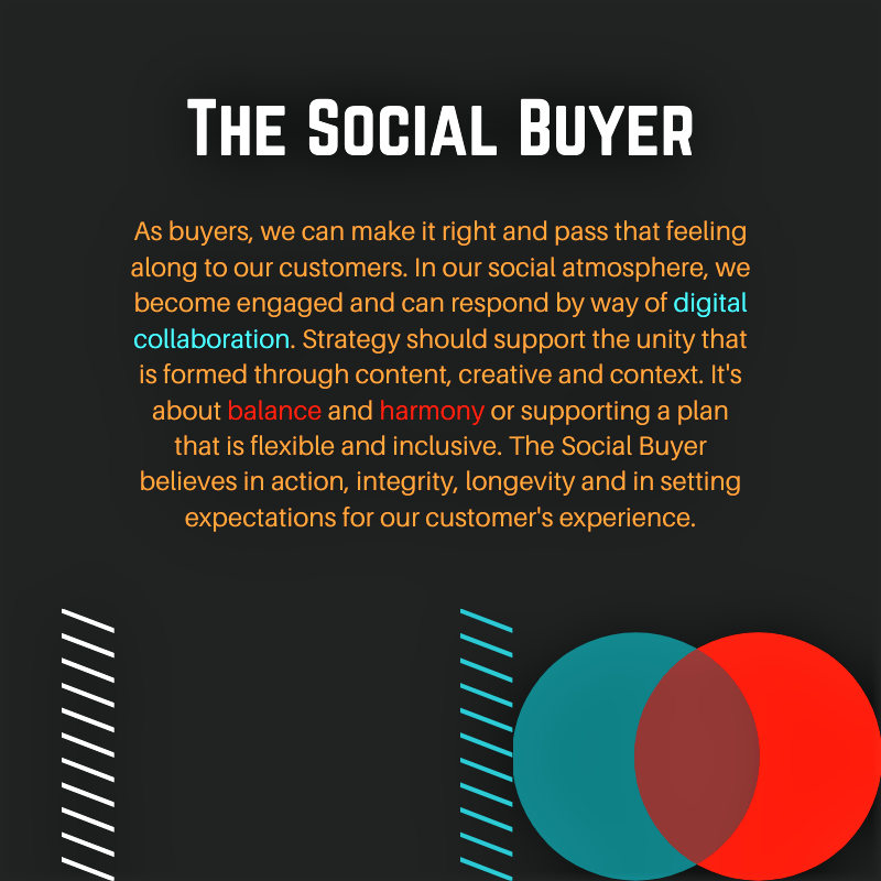
This portion of the proposal defines a brand strategy in three parts – the social media aspect (WHAT), art direction aspect (HOW) and digital specialty aspect (WHY). At best, these aspects are shared and applied to a project equanimously in order create a sweet spot, ‘the magic’ or WHERE and WHEN true potential can emerge.
This whole concept is derived from Simon Sinek’s Golden Circle Theory which purports that great organizations create their foundation by addressing WHY they exist, HOW they go about their mission, and then finally, WHAT they do.
In my model, social media is used as a product or service we sell, however this can be changed to web development, SEO, email marketing etc.
The HOW is the people who are involved in the project. It is what sets us apart from the competition. It is what makes us unique and indispensable.
Lastly, WHY is the ultimate outcome. Very few organizations know WHY they do what they do. Why is not about making money. That’s a result. Why is a purpose, cause or belief. It’s the very reason your organization exists.
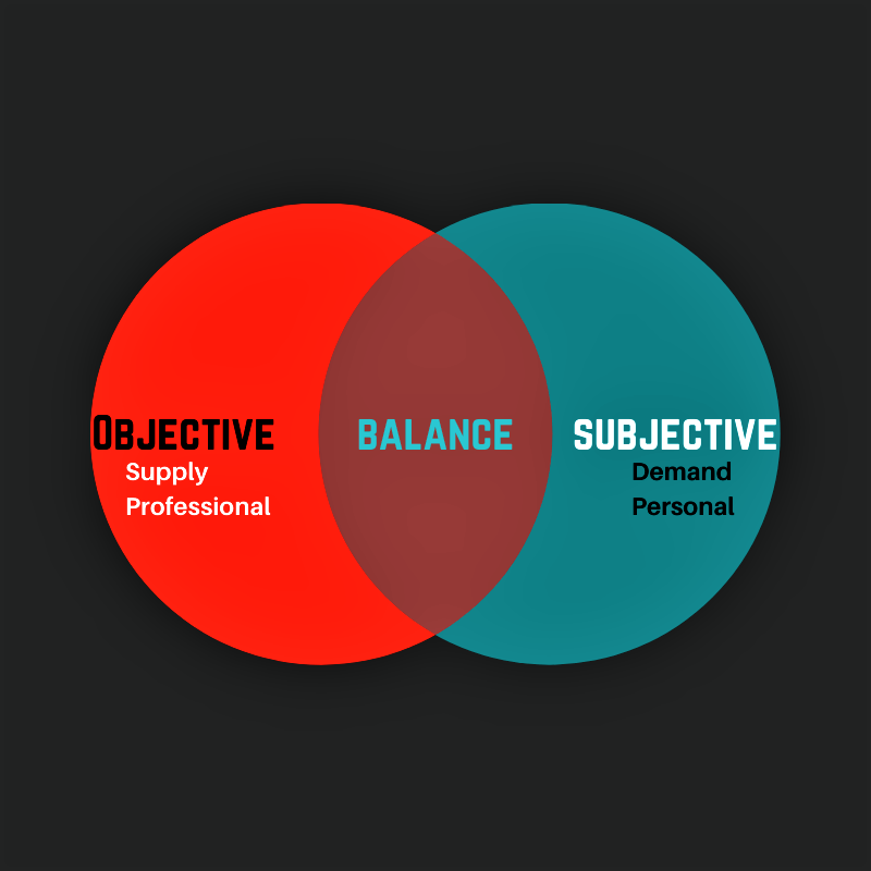
In synergy, any set of core values can be realized. In my model, I value belief, faith, trust and love. As a brand strategist, my ultimate outcome paints a beautiful picture for both the seller and buyer. The PICTURE is the agency differentiating itself from competitors. WHERE and WHEN this occurs impacts results – profitability, scalability and customer experience.
Have a look at this brief slideshow and let me know what you think –
This slideshow requires JavaScript.
Remember, there is always room for further or greater interpretation. This is the sweetness of advertising. Branding is the #1 method we can use to portray our message, whether that message be creative, technical or both, a brand is responsible for defining who we are and what we do!