Hey everyone!
Back into the swing of things.
This project may seem simple to you, but it challenges the idea of giving and receiving. In our digital space, we give constantly. And is the return of our efforts (ROE) measured through digital collaboration (DC) enough? Think: total impact of IQ + EQ + PQ or a new notion ascertaining digital quotient (DQ) / digital equilibrium (DE) / digital aspect ROI (DAROI). *I will explore these ideas in a future post.
When my mother received letters from her suitors (a common practice in her time), she did not write back. She kept each letter as if to say, I realize you are all interested, however I will hold in my heart, the one who is right. Is this action right? Is it just? We observe a similar practice in Japanese culture. The ritual is gift-giving (action), rather than the gift itself. Huffpost.com describes it in three steps – the reveal, the denial and the recognition. Or, revelation of intelligence + denying impact of emotionality + recognition of our role and place in digital space.
Using this interpretation, I could say that this project was aimed to reveal part of my identity/intelligence (I now question its visual and linguistic legitimacy in my current digital explorations), to reflect my denial of attaching emotion to the act of giving and receiving, and finally to sustain 2-way recognition/communication (between seller and buyer in this case) of the journey (action) itself – “For the Japanese, gratitude is a battle of endurance.”
We need to evaluate the tone and style of our expressions (gratitude being relevant today) as we delve further and further into a state of digital collaboration. We are impacted and at what point are we actually bringing more clarity to situations and circumstance? This is sort of the concept of ‘niceties’ and because I aim to maintain a certain level of accuracy in my work, details are important, but should my actions impose more or less scrutiny in regards to how my audience receives my message? This ties everything back to: total impact of IQ + EQ + PQ or a new notion ascertaining digital quotient (DQ) / digital equilibrium (DE) / digital aspect ROI (DAROI).
As you make your way through the below, try to remove feelings of assumption or judgement. Art is for everyone. Despite my specific approach, there’s a core selection from each demographic (Baby Boomer to Gen Z) that relates to my work in its simplest form, in other words – the visual and the language. For this project, I give it back to them!
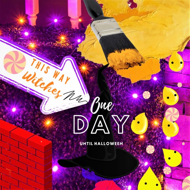
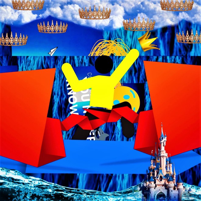
Abstract – slash / roboto / elephant
This project started out with a photoshoot. I was dressed as Wenda (Where’s Waldo’s girlfriend) and my friend Allegra and I captured a series of images in and around Horseshoe Bay, British Columbia, Canada. There was lunch at Troll’s (fish and chips of course) and a brief introduction/chat with family business owner Ab Troll. Then, tea at another local establishment Flour Bakery and the final shot – me peering over … The Giant Hedge.
I developed the concept around a youthful, graffiti-inspired (old BLOX style) rendering of sweetness or the sweet spot/’magic’ that we often search for in our interactions with brands and art projects in general. My old style was always striking, vibrant and street culture inspired. Think – Keith Haring meets baby Andy Warhol.
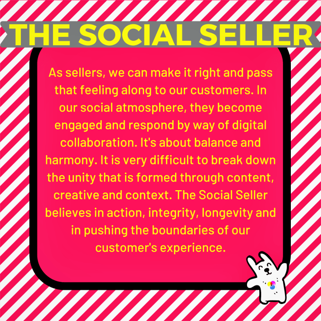
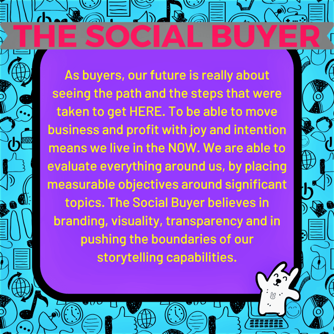
The first portion centres around strategy, the next on my Social Seller & Social Buyer personas and finally, the Wenda portion (introducing myself within a specific context) finalizes the presentation. I printed the images on glossy card stock and hand-cut each one with a paper cutter. The final presentation resembled 7-inch vinyl singles and are displayed most effectively in a stack, layed out as placards on a table or mounted onto a wall with colourful binder clips (yellow, purple or stainless steel would work).
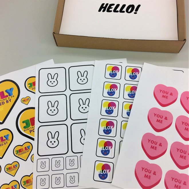
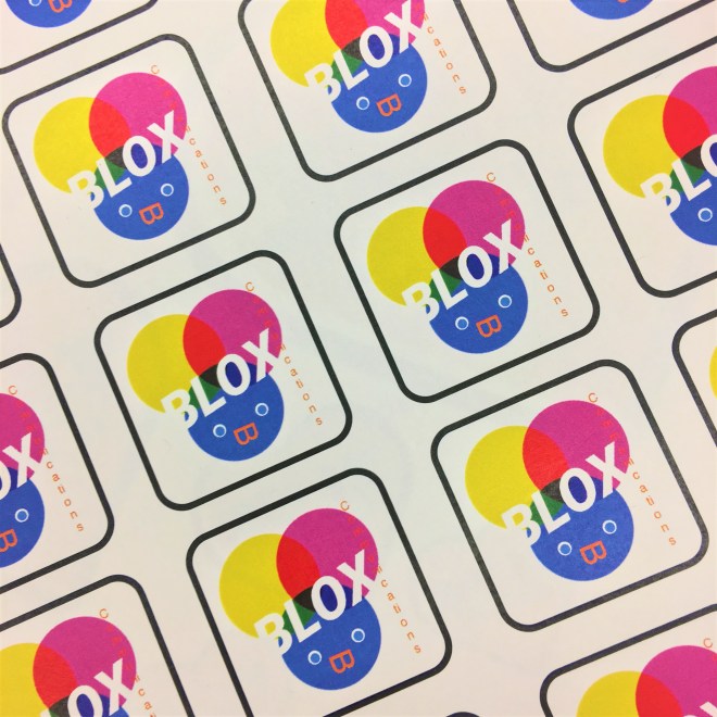
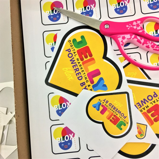
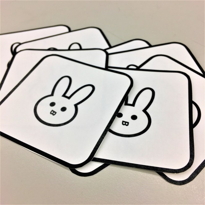
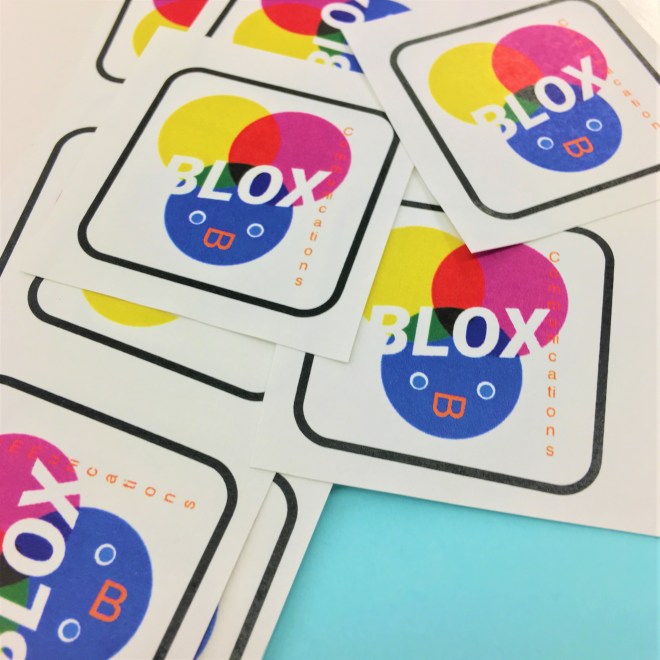
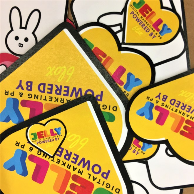
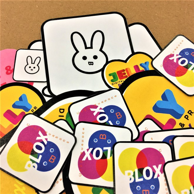
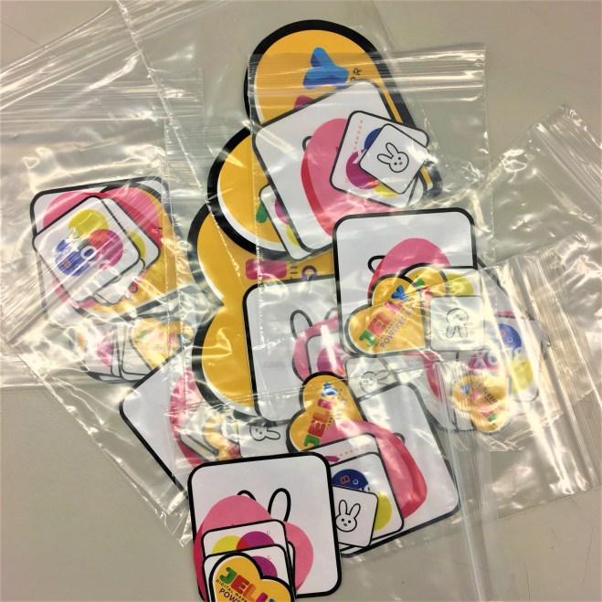
Along with my visual presentation, I designed a series of stickers that were printed on matte sticker paper and cut by hand. I then assembled the stickers, one by one, into individual, resealable plastic bags. Two of the images are BLOX identity concepts. The one with the primary color wheel represents right-brained or creative BLOX and the other with the black and white bunny mascot (and letter B branded roboto typeface mouth) represents left-brained or technical BLOX. The remainder stickers were simple and fun applications of imagery used in the presentation. To top the set off, I made a collaborative-style logo (powered by) for the agency I was presenting to.
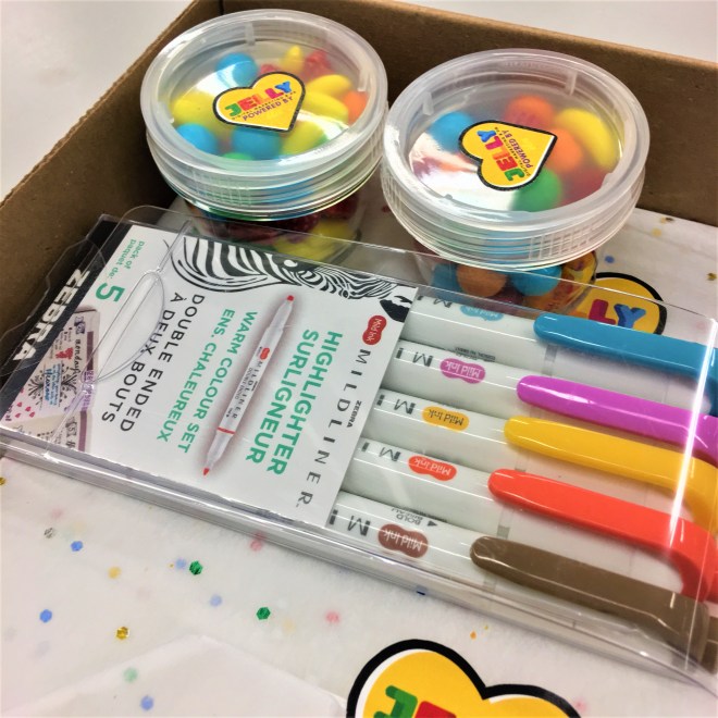
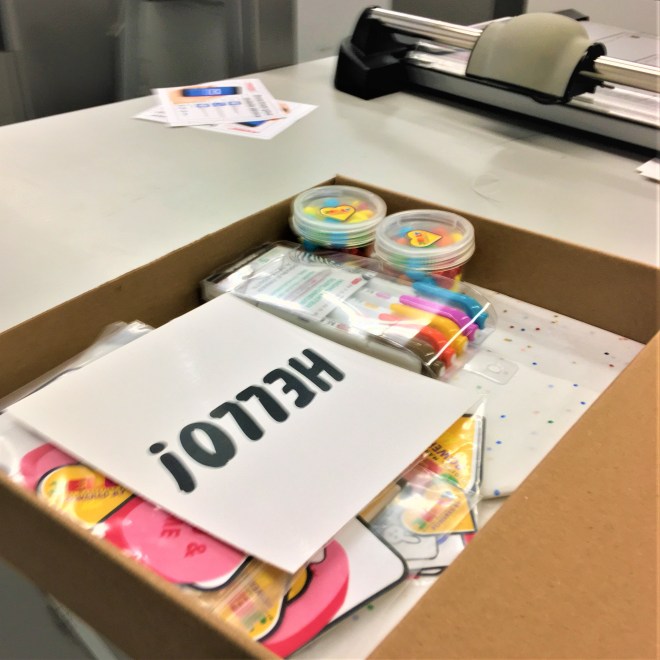
As a fun treat and tribute to the jam jar (featured in several of the images), I filled a couple of clear canisters with bright fruit candy (I once had a banana necklace) to match the colour theme and concept of sweetness. I also included a book containing 85 pages of work samples and creative/technical resources – collateral, white papers and articles. The book was bound using the specifications below:
8.5″ x 11″
Double Sided, Colour
Colour Laser, 98 Bright, 32-lb.
Binding – Wireless Binding – Black
Standard front cover
Pastel Yellow, 90-lb. Index
Standard back cover
Pastel Yellow, 90-lb. Index
*See more supporting documentation on my Instagram, Facebook or LinkedIn account.
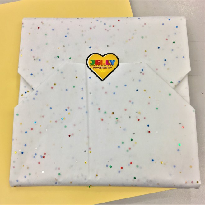
The final products were wrapped in colourful confetti paper and fastened with two Jelly Marketing stickers. Everything was arranged bento-style in an unobtrusive Staples box with a package of fun pastel highlighters and a final ‘hello’ letter placed on top.
I am eternally dedicated to my work and process. This project was a homage to my academic background as a printmaker and street identity as a writer. When I was practicing regularly, the art forms themselves took shape. There was no plan, just creation. I would compare it to writing and reading classical music. I can’t really compare it to anything else. But my efforts today are different. They are positioned around understanding and fully utilizing the creative + technical aspects of my brain. So, now there is a need to plan and there is a need to create, but by having a specific outcome in mind.


At the end of it all, this has generated the foundation of A Brand Strategy. You will hear more about this in the coming year.
A few quick work goals for 2020 –
- Find a job that I’m happy about
- Develop Digital Presence business model
- Develop A Brand Strategy
Next up: who’s down for white, black and corporate-friendly? Is it time to revisit my Digital Presence business model? Yes/No?
The question remains – To mail or not to mail? To give or not to give? To receive or not to receive? What matters most? Having or expecting? Waiting or forgetting? Are you a yes-man or a no-sayer? Check back guys!