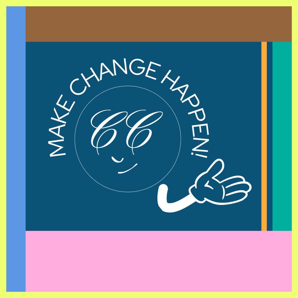
When the magic happens, You’re making change happen.
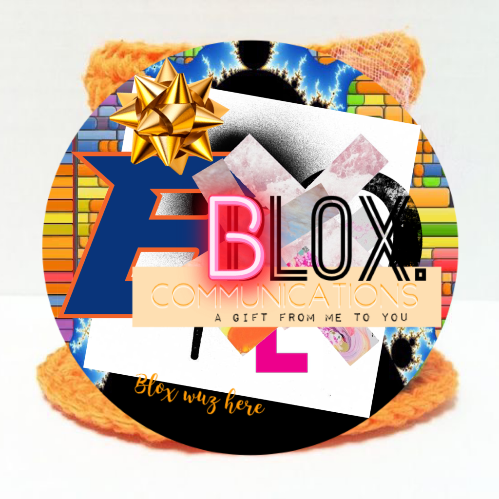
Identity stamped to perfection.
Understanding:
style, thinking, love, goals and aspirations.
There are always ways to re-imagine.
Be who you are. Strive to be better.
*This is a new day, a new era. My new personal brand stamp marks each letter as if to say, “Hi there!” We need to have a conversation about creativity and art and art and creativity and that relationship specifically.
Creativity is necessary. It may not have always been that way, but today, it matters immensely.
Whether you’re an artist painting on a canvas (Are your colours ‘original’? Do they spark emotions we are starting to understand?) or a marketer crafting campaigns (Is your work pivotal? Does it imbue change?)—creativity is the spark that turns ordinary moments into extraordinary breakthroughs.
It’s the difference between refining and redefining.
It is a flash of brilliance.
A slow-burning fire built on curiosity and persistence.
The truth is that creativity thrives at the intersection of structure and imagination.
It’s where the messy “what ifs” meet the grounded “how-tos.” And at this junction lies the power to unlock potential within teams, organizations, and leaders. Oh, and of course, within yourself.
So, creativity isn’t just about expression; it’s about connection—linking ideas, people, and strategies in ways that inspire growth and, more importantly, progress.
It’s about being part of a larger community where each participant has recognized their unique capabilities. We have taken an intellectual oath that includes emotion and experience to persist and sway. To churn ambition into reality, to light the fire beneath, spark bold ideas and fuel new mindsets.
Lean into these queries the next time you feel stuck or uninspired. Funnily enough, doubt can take you there.
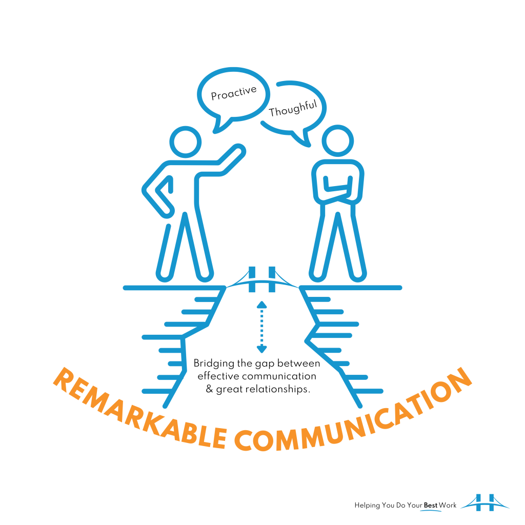
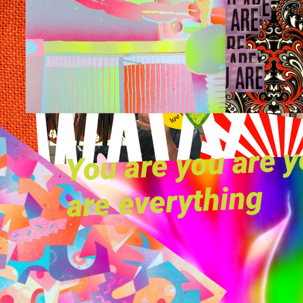
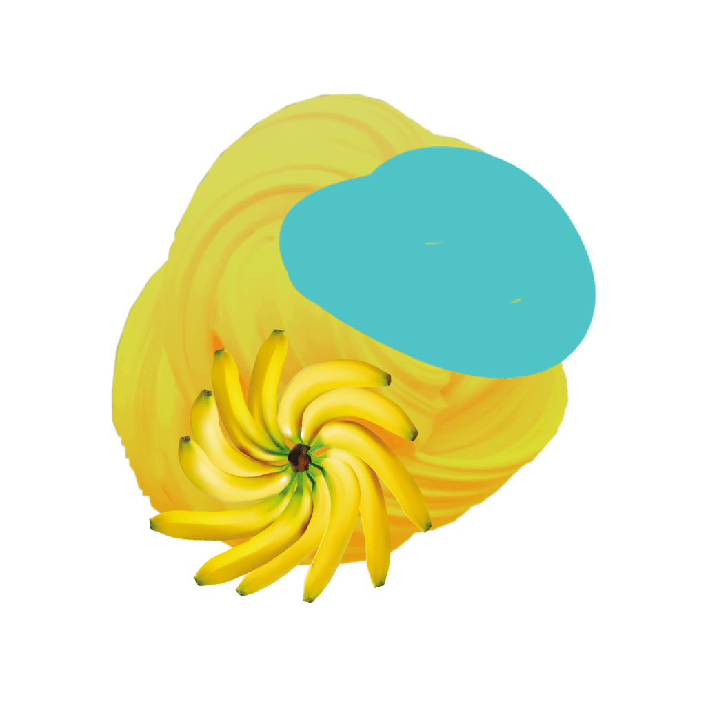
Capturing imagery + text in an intertwined relationship is fascinating work. There’s something about mingling elements, contrasting colours, and purely expressing a message that excites me.
Infographics are a great example of this type of communication. Well done work leaves me breathless (in a good way). So, to jump right into it, here are some things to consider when creating powerful infographics.
An infographic (information graphic) is a representation of information in a graphic format designed to make the data easily understandable at a glance.
Why do we use them?
Infographics are a great way to communicate ideas quickly and effectively. They help to simplify the process of presenting a message or data and help to establish connections, patterns, and relationships that allow us, as the viewer, to gather specific information.
Anything that’s too wordy, difficult to understand, or mind-numbingly full of roundabout detail. And it’s not about getting a quick fix. Some of us—me on occasion—enjoy digesting a mouthful of words. Still, no one can deny that pictures make everything easier to take in!
In 2019, 74% of marketing content contained a visual element. That’s not surprising, considering a whopping 90% of all information transmitted to the brain is visual.
Leaving us to believe that when you come across visually appealing content, you are much more likely to retain it. You might even share it with someone else after you’ve frolicked in its delight.
Taking inspiration from that which is shareable is also a thing.
I often create based on how much I liked LOVED something. I am graphically illuminated so much easier these days with all the impressive infographics to learn from!
They’re important, guys, for so many different reasons. But to summarize—infographics are important because they help us tell a story in a way that’s accessible to our audience.
Just the words below will let you know why.
Words that your infographics should be –
What’s the blox. way to create infographics?
Follow these steps:
1 – Find an appropriate ‘chunk’ of content you would like to translate pictorially, or that is so dang interesting, it’s already sparking imagery in your head.
2 – Follow your brand guidelines—typeface, colour, spacing, tone etc.
3 – Create to your heart’s content but make sure each element flows into the next. Continuity is critical, or you risk altering the message or even worse, spreading an inconsistent idea.
4 – Aim to make your infographics attention-grabbing and playful. People are much more likely to engage if they’re looking at something that incites positive emotion.
5 – Incorporate text carefully and precisely The text you add should uplift and reinforce your main message. Make sure it supports the imagery you are using!
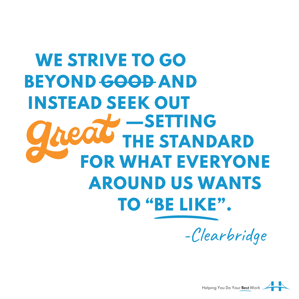
I am so excited to share these because designing them was such an enjoyable experience. I feel like I achieved what I was going after—visually describing our work and what we want to be known for (our #bestwork). I hope you like them! If you have any suggestions for modifications, let me know, I am always happy to make things #better!
Yearning for more design content? Check out these blog posts:
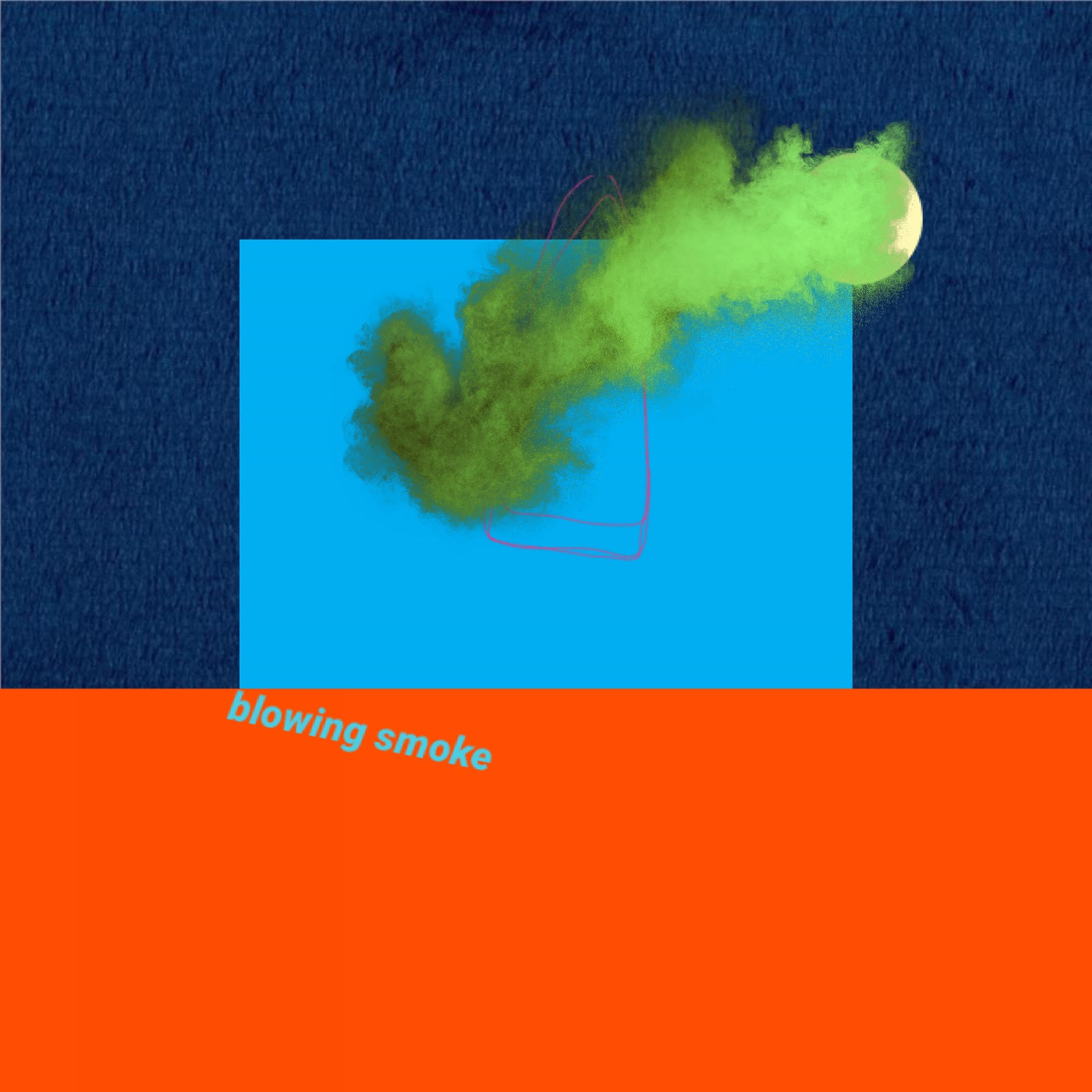
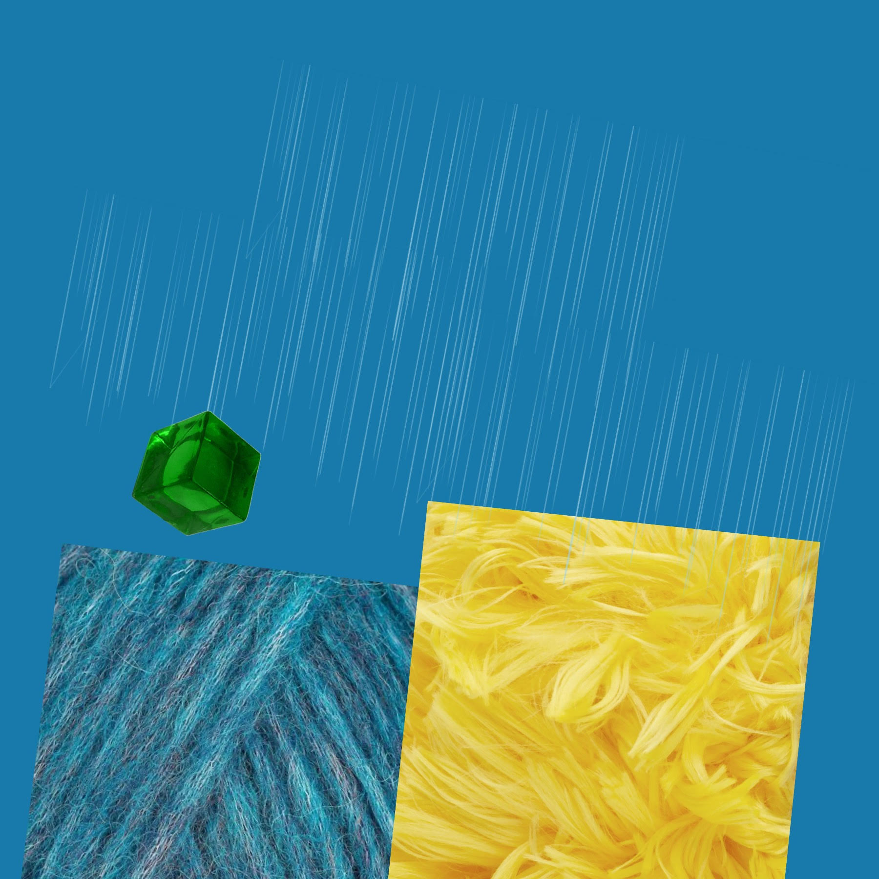
Between studying like a madwoman and trying to maintain a consistent posting schedule, I’ve designed some quick, quirky graphics for various topics up on The ChonaBLOX Blog.
Right now, they are being shared across multiple platforms (remember, have you had your FILPTS today?) and I will present them in one swift punch once my colour scheme (rainbow, of course) has had its say.
I suppose it would be my most current body of work, should any amazing agencies in the air desire a digital marketer with an artistic penchant to boot!
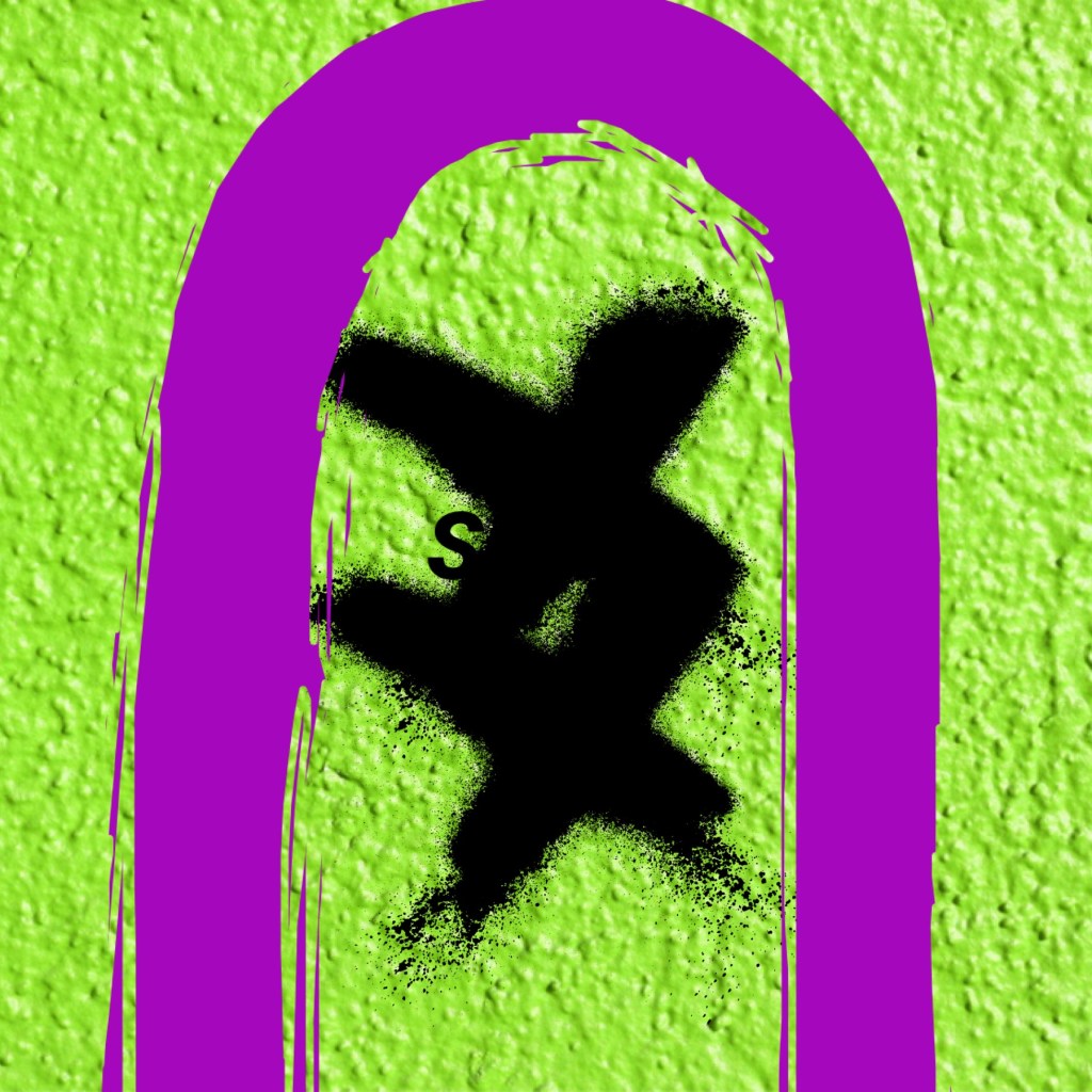
For now, here’s a sample. A graphic designed today for my latest #girlstories post – her name is SABRINA and she is a…GHOST!
Check out her story as it relates to two other Elevententeen characters, Judge Judy (I know, and yes, on purpose) and Alice from Wonderland.
And last thing, two very important marketing terms that I’ve come across lately and seem to apply to my work – top of mind and evergreen. Here are a couple of simple definitions.
First, per Wikipedia –
In marketing, top-of-mind awareness (TOMA) refers to a brand or specific product being first in customers’ minds when thinking of a particular industry or category. … At the market level, top-of-mind awareness is more often defined as the “most remembered” or “most recalled” brand names.
And second –
Evergreen content is content that is always relevant – much like the way evergreen trees retain their leaves all year around. Interesting and relevant content that does not become dated is necessary in order to be found online by search engines (The Balance Careers).
As we enter the beginning of Q4 or reach the end of the year, I want to consider these definitions as they relate to my brand and marketing strategy. How have these terms applied to your business? Do you think they are relevant and does applying these concepts to your work produce less disparity between yourself and your audience? Let’s have a brainstorm!
Cheers y’all!
PS – Halloween is just around the corner, what are your plans?
PPS – FILPTS is a BLOX acronym standing for Facebook, Instagram, LinkedIn, Pinterest, Twitter & Snapchat.
PPPS – I gotta up my Snapchat game! Any cool tips or tricks my friends?
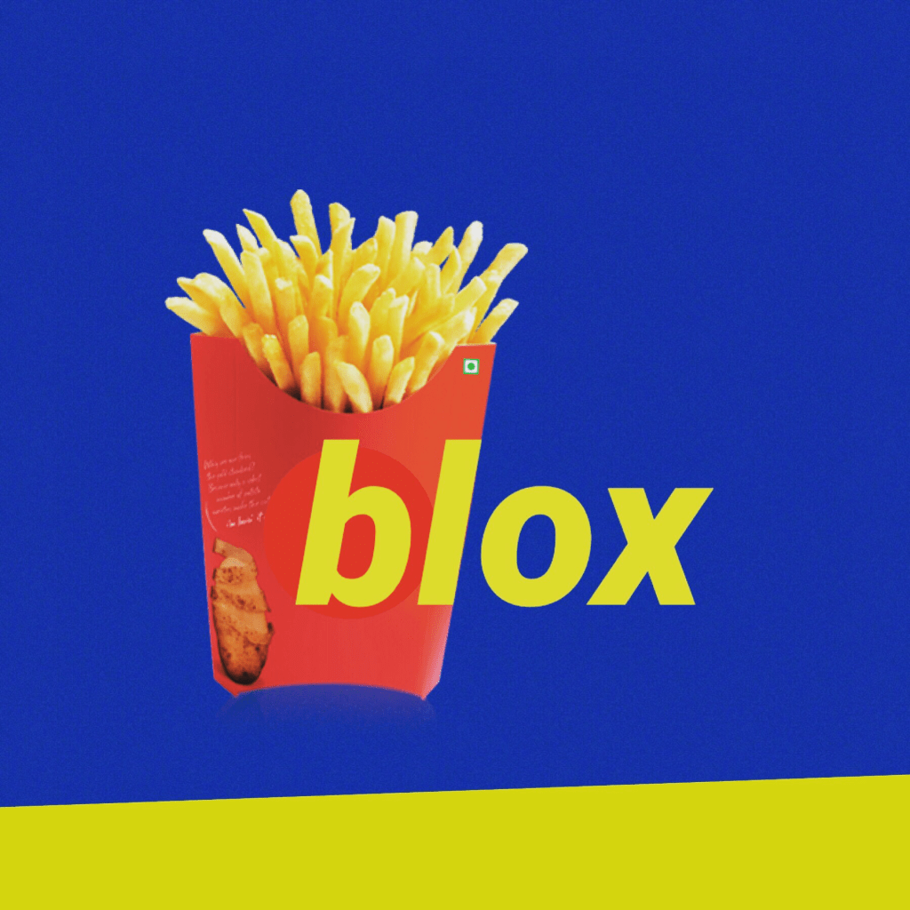
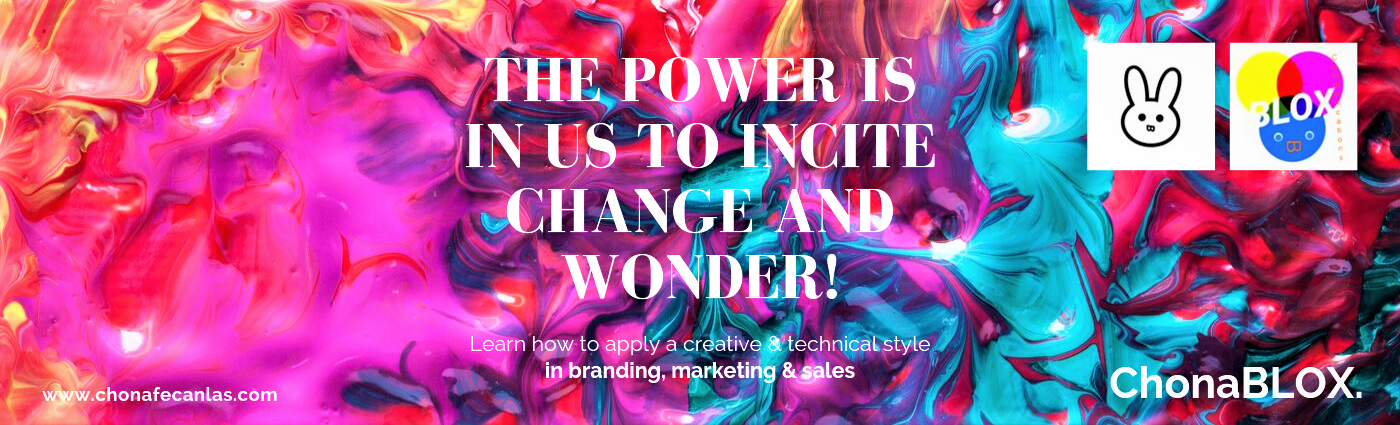
I designed a banner/billboard while studying the last bits of the Hootsuite Social Marketing Certification course. I usually take 5 minute breaks here and there, to do something creative. I find it helps with my focus and energy.
When designing work intended for large scale applications (think brand loyalty + awareness), consider an art theory I will call ‘Fever’ (see this post for more background). Note: You’ll have to dig around your mind to figure out the connections there!
But back to the theory…
Say you were looking through a 3000 page art history book. You see a tiny, little thumbnail image of a painting. Now, in your mind you’re imagining a massive piece of art, covering half of a wall in a prodigious art gallery. Fast forward to a trip you decide to take to England, where you’ve scheduled 4 museum visits per day. When you finally arrive at Tate St Ives (Art Fund Museum of the Year 2018 Winner) in Porthmeor Beach, St Ives, Cornwall, you come across Piet Mondrian’sComposition with Yellow, Blue and Red (1937-42). You can’t believe your mind!
It’s…so…SMALL!
How can that be, you think. Well, that is the theory.
I’m sure someone has written about this before, but my version entails –
Any work (work = image + subject matter) that produces reactionary propensity (influence) via media outside of the original source (appropriation). This may be based on an ability (equanimous object + subject or audience mental equilibrium) or on the evidence of power or size in the creator’s or audience’s interpretation. In other words, the work generates a sense of power or size, partly because of the artist’s or audience’s ability (talent) and partly from the image + subject matter itself (content). The work, creator and audience can choose how to participate, which results is an unintentional, yet intentional amplification of ‘grandeur’.
Believe me, I’ve tested out this theory with many works throughout my life. It is so cool!
Power of the work. Power of the people. Power of the experience.
So, coming back to the matter at hand. When creating work on a small scale, it is important to preview the work and to evaluate its ‘power’ as a billboard placed on a busy street or a light box advertisement hung over a retail store’s checkout space. We should advertise both the company and the ‘size’ or capacity of the image + subject matter itself. If everything checks out (sorry I’m punny), you should proceed to the checkout with the work’s development. Note: your work should imbue a positive force. Make the choice, because you have it!
Example of positive force –
I remember standing in line once at Sephora and just staring at the large and beautiful space directly above the cashiers’ heads. I daydreamed about covering that space with something amazing. At the time I envisioned graffiti, but today it would be a lot more reminiscent of this post’s featured image. I might just have to keep the slogan too!
The power is in us to incite change and wonder!
Hope everyone has a spectacular weekend! See y’all next week.
And remember, we stay on top!
fe
PS – The topic of Fever could imbue significant change in Western medicine.