Be sure to scroll all the way to the bottom!
Capturing imagery + text in an intertwined relationship is fascinating work. There’s something about mingling elements, contrasting colours, and purely expressing a message that excites me.
Infographics are a great example of this type of communication. Well done work leaves me breathless (in a good way). So, to jump right into it, here are some things to consider when creating powerful infographics.

First, a basic definition:
in·fo·graph·ic
/ˌinfōˈɡrafik/
noun
An infographic (information graphic) is a representation of information in a graphic format designed to make the data easily understandable at a glance.
Why do we use them?
Infographics are a great way to communicate ideas quickly and effectively. They help to simplify the process of presenting a message or data and help to establish connections, patterns, and relationships that allow us, as the viewer, to gather specific information.
Why are they important?
Poor content incites boredom. What’s poor content?
Anything that’s too wordy, difficult to understand, or mind-numbingly full of roundabout detail. And it’s not about getting a quick fix. Some of us—me on occasion—enjoy digesting a mouthful of words. Still, no one can deny that pictures make everything easier to take in!
In 2019, 74% of marketing content contained a visual element. That’s not surprising, considering a whopping 90% of all information transmitted to the brain is visual.
Leaving us to believe that when you come across visually appealing content, you are much more likely to retain it. You might even share it with someone else after you’ve frolicked in its delight.
Shareability is huge.
Taking inspiration from that which is shareable is also a thing.
I often create based on how much I liked LOVED something. I am graphically illuminated so much easier these days with all the impressive infographics to learn from!
They’re important, guys, for so many different reasons. But to summarize—infographics are important because they help us tell a story in a way that’s accessible to our audience.
Just the words below will let you know why.
Words that your infographics should be –

What’s the blox. way to create infographics?
Follow these steps:
1 – Find an appropriate ‘chunk’ of content you would like to translate pictorially, or that is so dang interesting, it’s already sparking imagery in your head.
2 – Follow your brand guidelines—typeface, colour, spacing, tone etc.
3 – Create to your heart’s content but make sure each element flows into the next. Continuity is critical, or you risk altering the message or even worse, spreading an inconsistent idea.
4 – Aim to make your infographics attention-grabbing and playful. People are much more likely to engage if they’re looking at something that incites positive emotion.
5 – Incorporate text carefully and precisely The text you add should uplift and reinforce your main message. Make sure it supports the imagery you are using!

Now, the fun part.
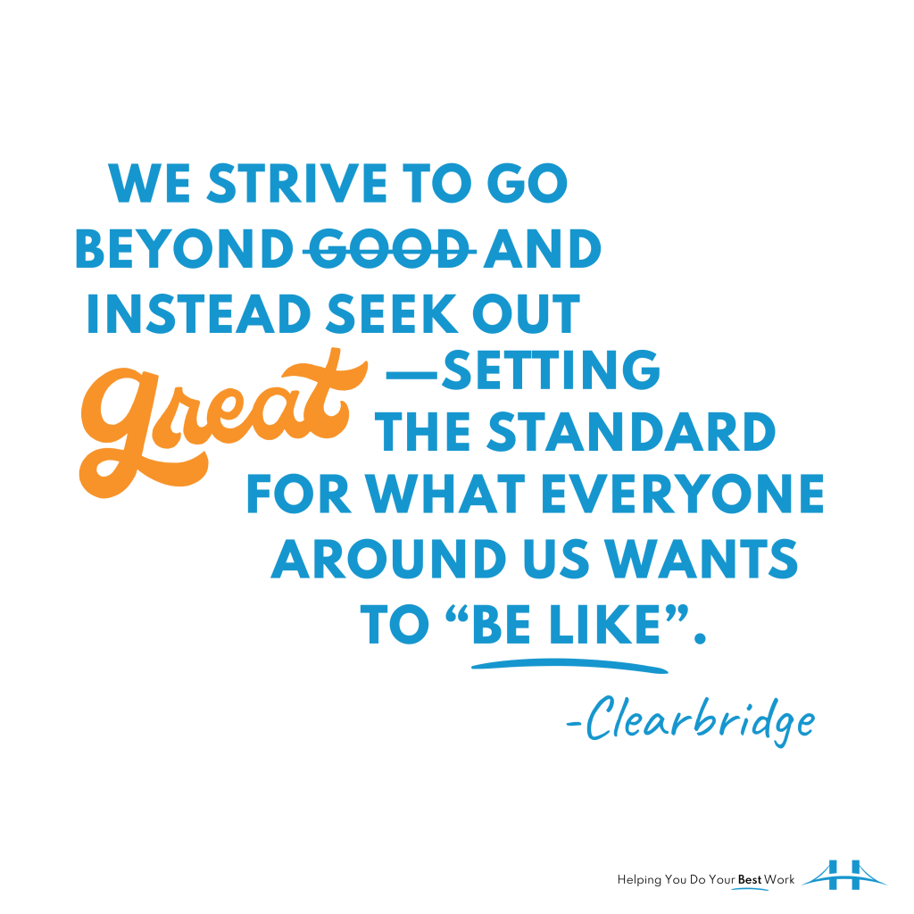
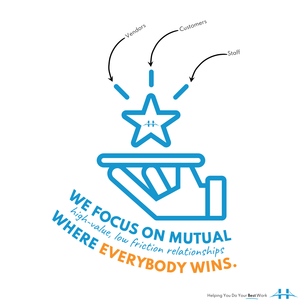
Here are some infographics I created for Clearbridge Business Solutions.
I am so excited to share these because designing them was such an enjoyable experience. I feel like I achieved what I was going after—visually describing our work and what we want to be known for (our #bestwork). I hope you like them! If you have any suggestions for modifications, let me know, I am always happy to make things #better!