
Hi everyone!
Using simple applications to turn out wicked images is fun. Sort of like the gamification of graphic design (what blogging is like to me). Gaming is portable these days, right? Here’s an interesting article on the history of gaming, maybe you can check for me!
The History Of Gaming: An Evolving Community by Riad Chikhani
Back to the matter at hand…
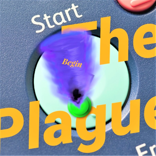
Here are 3 versions of an image I developed for a post (Start). I’ll try to share my process with you (unedited) about how it came together in a time frame of about 15 minutes.
Step 1 – Select a major topic from blog content. (the plague)
Step 2 – Decide if primary message will focus on an image or text. (text)
Step 3 – Decide on a colour palette. (complementary colours blue and orange)
Step 4 – For this image, I decided on text, so the next step was to figure out wording. Wording should be based on the blog’s content, and is usually more effective if it provides the viewer with a direct parallel or bold contrast to the primary message. (the plague)
Step 5 – Pair text with secondary element – image or text. For example, the post’s title is ‘Start’, so I looked for an image of a ‘start button’. (image)
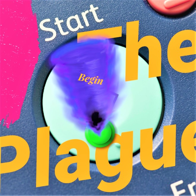
Step 6 – Publish the featured image. Go back to the website to see if it’s effective. In most cases, the image will be cropped, so you may have to edit to ensure the desired elements you want to showcase show up in the frame. (edit to fix)
Step 7 – For this image, I didn’t like the way it was cropped. So, I asked myself – to add or remove? In this case, I decided to add another element in the centre area where visual weight was lacking. (edit for composition)
Step 8 – Again, return to your website and check to see if the image is effective. Still in this case, there was a lack of balance in the top left side corner. I decided to add a pop of colour to provide an additional element of contrast. (edit for graphic design elements)
Step 9 – Check the image on your website. If it works, you will be aesthetically pleased with its presentation or you have found a balance between image – text – colour. (satisfaction)
Step 10 – Double-check to see if there were any cropping issues, spelling or grammar mistakes. Ensure each element of the design is balanced and harmonious. And, you’re finished! (completion)

What’s your graphic design process like? Do you create your own images for your blog? If you could write 10 steps to finalizing an image for a post, what would it entail?

