SEO

Hi everyone!

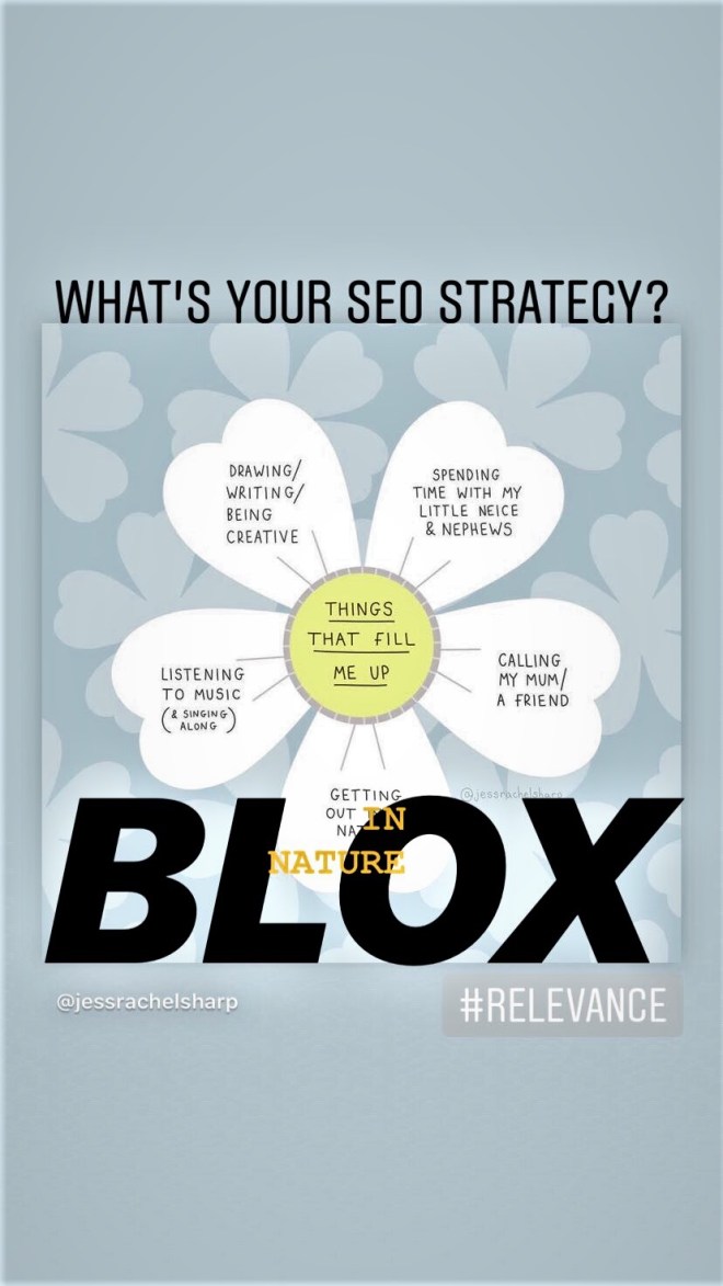
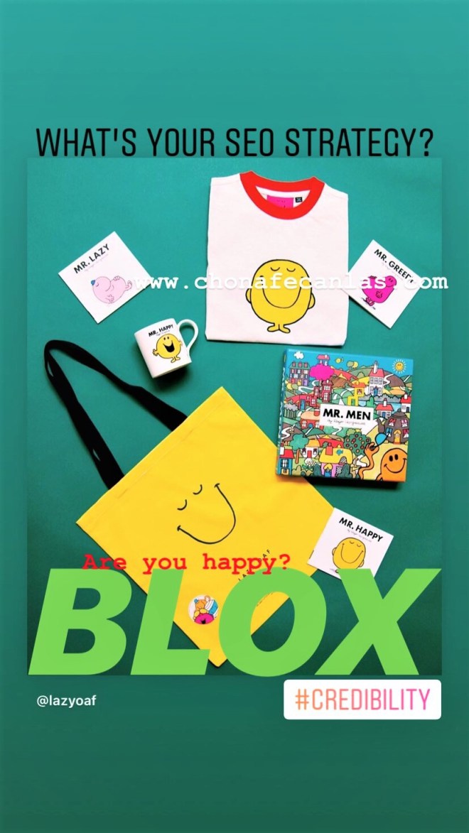
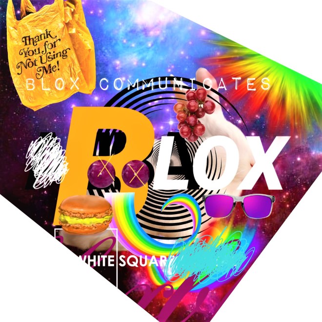
Just a short burst of info here. What are you drawn to? Do the colours play a significant role in your interpretation? What connections can you make with the chosen imagery attached to each hashtag?

A perfect brainstorming exercise for design newbies – make a list under each hashtag including transferable elements (actual aspects and items like a brand name or object) and attributes (descriptions and words) for each. Aim for 50 answers, then narrow down to your top 10 answers, then again to your top 3, then top 1. What conclusion can you draw from this experiment?

Always remember the acronym PRAC – Popularity, Relevance, Authority & Credibility. This will help you target your audience and ensure that your content is set up to improve your overall search engine rankings.

Yes, yes…SEO is a lot more complex than a simple acronym, but sometimes starting off with something more general helps to develop your digital marketing strategy or plan more succinctly down the road.

I will get into this topic (SEO) further in the  future!

8516971dc8824311b90739d6057393fc_Moment

3BC9F832-AADE-448A-A8C6-FBD0EEE0A5CE

FA7C92B5-50E1-40FE-A711-714E4251A799.jpg

B63AA3B1-EB38-4600-A85B-35C7CC4B6A72.jpg

Visual Transparency

Hi everyone!

Today’s topic is SMART Goals.

A brief definition of each objective and an example of how each objective can be applied to achieve an effective creative technical writing style.

Here, I am writing about visual transparency as it relates to an image I designed for Blocks, my first and ongoing social media management strategy. Blocks aims to explore left and right-brained thinking and our ability to control destiny (or in simpler terms, improve issues of self-image or esteem.) Note: Initially, I was going to include the image in this post, but the relevance of my imagery is too swift. I will always include my most recent works to keep you up-to-date with my current visual style and tone.

As an extra creative exercise, try to imagine a fruit to attach to each objective. How does it relate to the SMART goal and our definition of visual transparency? Could you affix these tasty symbols to a billboard? What would be the significance? How effective would say, a giant teal apple be at communicating a specific message?

I will post the fruits on my next post tomorrow!

BEGIN

HEADING: The heading is the text indicating the nature of the article below it. The large type front page headline did not come into use until the late 19th century when increased competition between newspapers led to the use of attention-getting headlines. (Wikipedia)

WILL IT ENTICE YOU IN A GLANCE?

SUBHEADING: For documents longer than 3 or 4 paragraphs, subheadings are an important usability and accessibility strategy to help readers both determine the overall outline of the document and to navigate to specific information on the page.

VISUAL TRANSPARENCY AS A COMMUNICATIONS STRATEGY

SPECIFIC: Goals that are specific have a significantly greater chance of being accomplished. It should be well-defined, clear, and unambiguous. Essentially a definition of your idea that allows your audience to understand your topic more accurately. (CFI)

Visual transparency, from an artist’s standpoint, is a form of contextual openness that allows viewers to become engaged on a more subconscious or subliminal level.

MEASURABLE: Goals that are measurable have criteria for measuring progress. Criteria can be in line with your vision, mission, values etc. The point is to measure your progress somehow, for example, how would you measure engagement or participation? Is the action itself significant enough? In writing, a statement of intent is a great way to achieve a sense of measurability. (CFI)

As a writer and digital specialist, the goal is to be transparent, accurate and responsible. As an artist, I simply want to be engaged with my work and for my viewers to participate. Note: professional transparency has more to do with how others perceive you and what your actions say about your brand.

ATTAINABLE: Goals that are attainable help you figure out ways you can realize an objective and work towards it. The achievability of the goal should be stretched to make you feel challenged, but defined well enough that you can actually achieve it. It would be a good time to insert your call to action here. (CFI)

With all of the outlets available, viewers can participate using whichever preferred medium they desire. And they don’t need to be 100% engaged for it to matter. For example, your interaction with a billboard might only last 5 seconds, so the argument could be that visual transparency is actually quite critical.

RELEVANT: Goals that are relevant must be realistic given the available resources and your timeline. What would be the innovative or mainstream approach? What are pertinent examples you can showcase? What will be the outcome? Ideal or realistic? Your exploration should be relevant to your life’s or work’s purpose. (CFI)

This is who we are today. We embrace a fast and furious approach to everything and criticize the results. From placing mobile food orders to providing subscribers with a mere minute to execute a successful Instagram (video) campaign – the faster we engage our viewers while applying visual transparency, the more likely we can succeed in delivering our message.

TIME-BOUND: Goals that are time-bound must have a sense of a start and finish date. What is it like today, what will it be like in the future? If the goal is not time constrained, there will be no sense of urgency or motivation to achieve the goal. What is causing the urgency for action? Are we in a position to answer or question? (CFI)

Perhaps one day it will be different, but for now artists and marketers must adapt to these swift modes of communication. Visual transparency will become the norm, then who knows what will be next…

END

Does using the SMART goal technique help you? I believe that it is a great stepping stone towards achieving a more clear and linear style of communication. Test it out!

Meanwhile, dear Alice is still falling…

down?

below?

towards?

76c60b704f37267d3082e8effe39302d

Consonance

IMG_2928

Hi everyone!

We do what we do! But without our mind getting in the way?

I sometimes find myself questioning my work. I ask myself – is it too ‘complicated’ for the ‘average’? Does it come off as ‘fluffy’ or ‘dense’? These words mean too many things, but we get used to one meaning, and that is not right.

And when our minds enter ‘the complex’, we should stop and perform self-talk. People avoid self-talk for fear that it gives others the impression that we’re ‘crazy’. I mean, my mouth moves when I’m thinking too hard! So what! Okay, it might just look ‘odd’. But nowadays, self-talk should be used as a positive, gentle form of therapy to get us back on track to believing in the idea of original intention. Google explores this concept readily, when it comes to understanding how people surf the internet. That being said, why is it today, that we feel an attachment to guilt, pity or shame when it comes to feeling a different way about something? Well, it could be ‘different’ things – an idea of interdependence, requirement or necessity.

When I came across the word consonance, I felt blessed and it quickly resonated with my current circumstance, because it challenges the notion of sleep (figure it out). Like take a break here and there, not everyone hates you, if anything shout it off the tallest rooftop – you are loved everywhere! Just go in with that attitude anyway, smile until it hurts. Find the humour in everything and go ‘nuts’, it’s not going to kill you to have fun! Here’s a bit on consonance as it relates to working and the whole job interview process thingamajigger.

Scott Olster, Ideas Editor at LinkedIn, wrote a brief article around “the idea of business trends, perspectives, and hot topics you need to know to work smarter”. He says –

Success can easily end up feeling hollow when it’s defined and measured by other people’s standards. For our work to have lasting personal value, author Laura Gassner Otting writes that we need to focus on developing what she refers to as consonance.

Laura is a writer for Harvard Business Review and she defines consonance as –

“Consonance is not just purpose writ large (and lofty). It’s your purpose, freely and clearly defined by you, and put into action through awareness of and alignment with your life’s plan. Consonance is when what you do matches who you are (or who you want to be).”

As I enter the interview zone, I will remember alignment with your life’s plans as another tip that will help me remember why this is taking so long. I’m dying here guys!

Hello. Thank you for the opportunity, now I have something to say…

Do you relate to this? What is the interview process like for you? Easy? Intense? How do you prepare?

Blogging Graphic Design Process

Hi everyone!

Using simple applications to turn out wicked images is fun. Sort of like the gamification of graphic design (what blogging is like to me). Gaming is portable these days, right? Here’s an interesting article on the history of gaming, maybe you can check for me!

The History Of Gaming: An Evolving Community by Riad Chikhani

Back to the matter at hand…

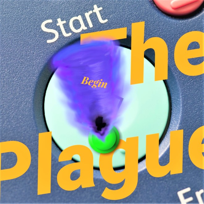
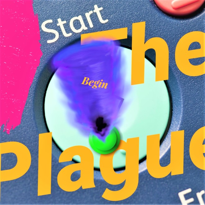
Here are 3 versions of an image I developed for a post (Start). I’ll try to share my process with you (unedited) about how it came together in a time frame of about 15 minutes.

Step 1 – Select a major topic from blog content. (the plague)

Step 2 – Decide if primary message will focus on an image or text. (text)

Step 3 – Decide on a colour palette. (complementary colours blue and orange)

Step 4 – For this image, I decided on text, so the next step was to figure out wording. Wording should be based on the blog’s content, and is usually more effective if it provides the viewer with a direct parallel or bold contrast to the primary message. (the plague)

Step 5 – Pair text with secondary element – image or text. For example, the post’s title is ‘Start’, so I looked for an image of a ‘start button’. (image)

Step 6 – Publish the featured image. Go back to the website to see if it’s effective. In most cases, the image will be cropped, so you may have to edit to ensure the desired elements you want to showcase show up in the frame. (edit to fix)

Step 7 – For this image, I didn’t like the way it was cropped. So, I asked myself – to add or remove? In this case, I decided to add another element in the centre area where visual weight was lacking. (edit for composition)

Step 8 – Again, return to your website and check to see if the image is effective. Still in this case, there was a lack of balance in the top left side corner. I decided to add a pop of colour to provide an additional element of contrast. (edit for graphic design elements)

Step 9 – Check the image on your website. If it works, you will be aesthetically pleased with its presentation or you have found a balance between image – text – colour. (satisfaction)

Step 10 – Double-check to see if there were any cropping issues, spelling or grammar mistakes. Ensure each element of the design is balanced and harmonious. And, you’re finished! (completion)

collage-60.jpg

collage (61)

collage (62)

What’s your graphic design process like? Do you create your own images for your blog? If you could write 10 steps to finalizing an image for a post, what would it entail?

Welcome

Hi everyone!

What type of woman would you hire to help brand your business? What marketing skills should she hold? What type of sales personality will she have? Is she strong, independent and willing to change in order to meet and exceed current industry objectives?

collage (48)

A Work in Progress

Hi everyone!

People wonder what I do, how I do it and why (golden circle). My blog provides answers to these questions.

To get you started, here is a profile and business model that I have been developing for BLOX/Blox. Communications.

As BLOX –

  1. I do writing, art and design.
  2. I do it for enjoyment, for education and for the development of my brain.
  3. My work targets a specific niche that caters to creative and technical authors, digital artists and designers who are innovative yet mainstream, and who work passionately and effectively in their particular domains.

As Blox. Communications –

  1. I do branding, marketing and sales.
  2. I do it for guidance, for learning and for the development of my ideal customer/source audience (1000 followers on Instagram by September 2020).
  3. My work targets a specific niche that caters to brand experts, marketers and digital specialists who are innovative yet mainstream, and who work passionately and efficiently in their particular domains.

I’m excited to share this information with you and welcome any comments.

Let’s start!

PROFILE

Blox is an artistic identity that was developed in the early 2000s. Since then, it has become a moniker for Chona’s creative + technical work embodying explorations of (a concept called) Digital Presence. She explores its relationship to topics surrounding the business and execution of art in digital marketing.

It is important to focus on our direct connection to customer needs, emotions and competitive environments. Selling is often an important feature and for success, we should present fluent work for customers to engage with.

As a creative director, Chona dreams of influencing the corporate landscape, impacting HOW and WHY companies use art in digital marketing applications. For the next year or so, she plans to either upgrade her educational background or find a permanent position with an agency open to art, growth and creation.

In order to breed success, I understand that I must learn the ins and outs of working in an ad environment, how to manage marketing clients and how to fit in with the demands of a competitive and ever-changing industry.

 BUSINESS MODEL

This business model creates objective goals for  my work as a digital specialist, social media/brand strategist and creative director focused on Digital Presence. I would like to create projects that incite wonder, plus change. I believe my experience and approach can create long-term impact for clients engaged with today’s latest digital platforms.

I will ask you this about your business:

  1. How did it all begin?
  2. What does your business need help with today?
  3. What is the spirit of your company?
  4. How can we improve your Digital Presence?

GOALS

a) To develop BRAND IDENTITY via transparent, accurate & responsible communication.
b) To promote GROWTH + ATTENTION using state of the art processes and techniques.
c) To cultivate COMPREHENSION of digital presence using a Simpler & Larger approach.

MISSION

Simpler & Larger – To produce work that is easily understood and done, so that businesses can consider a greater capacity.

VALUES

1. INTEGRITY is a choice of being honest; it encompasses consistent standards & ideas that impact a greater picture.
2. TRANSPARENCY is how actions are observable; it brings clarity & accuracy to communication where multiple parties are involved.
3. BELIEF is trust and confidence in our audience and work; it promotes the realities of the digital landscape through careful management of the creative process & its outcomes.

APPROACH

I approach my work with professionalism, courage and open-mindedness. I break it down this way –

I) Be professional; make a statement.
II) Have courage to make large moves; understand the difference between path and journey.
III) Be optimistic; express gratitude – open-mindedness can create a tidal wave effect.

FOCUSES

Communications
Strategy Development
Art Direction
Branding
Advertising
Promotions
Digital Marketing
Design
Research
Social Media
The Customer Journey
Creative Writing
Technical Writing
Campaign Creation
Content Creation
Sales
Adaptive Learning
Analytics
AI

This document is updated regularly, if you have any questions, please don’t hesitate to ask.

6 – The Train Naps

Daisy was out, then she arose. She could feel the left side of her neck, bent out of shape and sore from sleeping on it bent. And the train was still moving across moist carpeted land or moss coloured greenery, however you wanted to see it. The trees, they looked like LEGO pieces. She didn’t quite understand when she transitioned back, but she was glad to be here, smelling the faint stink of a ham and cheese biscuit.

You don’t actually want to see the workings of Elevententeen. What’s behind it is extremely frightening. The framework is made up of spider-like grids, when you see it, they move and pulse like a living thing. Daisy shuddered at the mere thought of it. She quickly patted her yellow eyelet dress to ensure it was still in existence. Another way to halt the screams (screams occur when your brain computes the framework) was to enter Elevententeen with a very specific wardrobe, preferably containing bold colours, pattern and texture.

Sighing, Daisy remembered what it was like in social media school learning about plain stuff. Graphic art and design attributes were existential now, they served no purpose. People only wanted multi-dimensional graphics, that breathed and pulsed and held meaning. I guess altering genetics in 2019 completely erased the human need for new things and surprisingly, technology. It no longer occurred. It was too fickle and rambunctious; nobody cared. It was now about Artha, Manipura and finding pure bling that could get you back through the framework unnoticed.

There were no humans on the train today, only empty seats and a refined beaver quietly sipping Earl Grey. “Well, he looks…dry…and  relaxed…so he must have come from the land.” The beaver heard and adjusted his frames while cocking his head North East. He wanted to see if he could grab the newspaper from thin air instead of having to hold it in his hands. Paper was so archaic, he thought. Daisy wasn’t sure if he noticed her. Her heart skipped a beat and she stopped for a moment memory, as he again adjusted himself out of what looked like discomfort. Inhaling a deep breath, they both fell deeply asleep. The reflection on the mirror was blank. Someone had switched time and space, again. What was going to happen?

Brand Names

Hi everyone! Branding is about consistency. Consistency in the words and language used to describe what you sell and do. Plus, if we can make personal connections to our messaging (visual communication), our audience will see better (think Visual Transparency).

Okay, let’s ride.

If your brand delivers quality products and/or services, creates exceptional digital exposure and aligns with your customers’ values, then we will begin to associate your brand with positivity (reciprocal awareness, ideology, experience, emotion etc.).

Wow, this website shows their products in a sensible order / the product descriptions are detailed and personalized / this makes me think of the wool bucket hats my Grandmother made / I want to contact the store right now to see if they have the hats in stock. And so on and so forth. The buyer’s process is attentive. What we need to ask is – is the seller’s process absolute?

Timing differs from various perspectives. In marketing sales, process and planning may not always be aligned. We need to find ways to guarantee customer conversion, but how can this be done?

Like the beautiful calico print top you wore when you were three or like the rain splattered window you peered out of on your way home from piano lessons, our audience develops brand identity in the same way we develop thought processes. Hup 2 3 4, hup 2 3. I would even argue that the buyer’s process is creative and the seller’s process is technical.

Can we then leverage creativity in a technical way to ensure customer conversion? Perhaps a topic for Kevin David!

For example, we (Sellers & Buyers) make the same, dedicated connections when observing a special life experience. Then, this can be observed through products and services. We recall brand names and in the long-term, we remember who you are for what you can bring to the table. Then, the name you have chosen to attach to your products and/or services will become synonymous and eventually engrained in time.

Time is of the essence and proves that business can have longevity! Seems really obvious, but it isn’t.

This is the importance of material and conceptual brand development (transparency) — when our audience can automatically associate a brand name with positive things, they become our friends for life! And that’s the brand speaking. This is the beginning of things of ‘internet of things’ (IOT) or one aspect of artificial intelligence (AI) – visual communication, visual transparency and straight-up old transparency.

Post brought to you by the McDonald’s and Tim Hortons billboards on McBride Ave (heading north). 

🙂

Sensory Marketing

Hi everyone! Do you think about what you’re doing when you dive into a pool? Most of us are probably counting down or counting in (up people). Let’s explore sensory marketing!

Per @AlisteMarketing, sensory marketing is a method of selling products. It is a form of marketing that influences our perception of brands using multi-sensory experiences to establish positive emotional connections. 

For example, in web development and social media management you can combine the IDEA of audial, visual and tactile cues (think of ‘3D forms’ that impart tangibility and distinctive qualities to your content and design) to produce a highly memorable experience. This will help build anticipation of the service and/or product you are representing.

I say idea because the future of branding will remove all literal association. It won’t be required in our digital age. With the concept and on the other end, a way to serve it up, born is a style of marketing that encroaches art. This won’t be fear-based and cannot be avoided by the mainstream. Marketers will simply use the most base and recognized forms of digitization to attract a target audience.

So to expand, our senses make it REAL. As in, AI. A sense is a cue to uncover a more elaborate idea. For example, I smell cinnamon.  I am now picturing Cinnabon. Drive by. What’s more powerful? Seeing a Cinnabon sign or smelling their cinnamon? Our senses tell us what we want and what we don’t need.

Again, this is attached to our personal experience. What we didn’t have growing up. What we had too much of as a child. The ultimate irony with sensory marketing is that it removes attachment to the branding experience, but we still invest in the product! This is ubiquity — there; not based on want, but desire.

Bottoms up!

Definitions

Hi everyone! Coming up with a unique definition can be tough. In order to understand Daisy’s story, we need to understand the conceptual terms that are presented. Can you help me define these ideas more accurately?

A Day –

Alive – a subsidized program enabling all citizens of mankind to partake in new technologies. The only side step is that it can be forced, unwelcomed and misunderstood to the point where confusion may set in counterparts. Return to Artha for renewed vitality

A Moment – You’re driving, the radio is on, a song plays and your entire Being is rushed with feeling. The feelings are so intense that you quiver and cry. You must get back to to Artha or suffer the consequences of emotionality

A Tree –

Always-always – A cutting edge technology in fabric that allows the human brain to decide between wool or cotton. A necessary sensory experience due to global warming

Animal characters – Filburt (beaver), Stan (antilope), Shady and Slime (frogs), the falcon,

Artha – Relatable to ego; meaning, sense, goal, purpose or essence; a place

Baby Bear – Baby Romel (in spirit)

Banana split second – That indulgent minute when you awake and everything feels perfect

Being – Relatable to id; associated with fire and the power of transformation; a lustrous gem

Bling –

Blueberry – A retro blue Ty bear stuffie, sewn together with black thread; his beady eyes are made of wind-blown agate, a mystical find these days in Chon

Daisy – Our existential hero

Dream – Ignorance; created by Alice for Daisy

Each Other -Chona (Each) and Romel (Other); the reason for everything; relational goal

Food – cherry scone, hot drink of lemonade, ham and cheese biscuit, ham and cheese sandwich, ham and cheese omelette, French macarons, sandwich, fruit salad, barbecued pork chop muffins, star anise, sweet lemons, grass seed, bread, Earl Grey, 3% milk, taro cream buns, Nanö, Dreamsicles, bright green granny smith apple, gum, solid steel jelly beans,

Free –

Gods – Alice from Wonderland, Judge Judy, Linz, Indigo (Paradise Colours)

Human characters – Daisy, Cherry

Life –

Locations – Chon, Elevententeen, Life Space, Nike outlet

Manipura – Relatable to superego; the totality of currency, the conscience plus the ideal self; an animal

Others –

Outsiders –

Seventeen – Dilettante, youngest version of Chona

Space – Where Daisy lives at times

Spaces – Diet, exercise, sex, sleep

Spiritual characters – A Day, A Tree, The Need, The Pause

States – Manipura, Artha, Being

Theories – Fever,

Toys –

Tree characters – Jared, Paul

Wide Awake –