Fruit Salad

Hi everyone!

These are the kinds of stories I love telling my daughter, Bishop. I want her to understand linearity and its purpose. So in the most basic of elements, the beginning and an end. Also, inserting subject matter that she is currently familiar with, like numbers, colours and fruits. Her stories lately start with, “One day!” as if she is saying ‘today’ with so much resolve, confidence and sobriety. She is not referring to daydreams in or of the future. It is a great mentality that I sometimes wonder (with my preposterous knack for discounting – this is why I value BELIEF), did she get that from me?

The answer is: Yes, she did. Of course!

If all else fails: trust your daughter!

Enjoy!

Abstract – the / an / referring / which village are you from

She bombed down the hill, biting her teeth into a teal blue apple. The shiny surface reflected confidence and her sobriety. She was going to win this game! But then suddenly, the mysterious sasquatch was coming. She could hear his roar and he zoomed through the trees landing victoriously onto a pile of soft snow. His green tuque made him look like a kiwi fruit. Bishop was suddenly starving, but there was no time to stop.

A team of yellow capricorns danced around the finish line, laughing and hiccuping at the sight before them. The orange judge was serious and studious. He seemed to bear more focus on his clipboard than on the race. Flipping her hair and toying with the pens behind her ears, another judge was vivacious and fixated. Her red dress was imprinted with marigold polka dots and it swayed in the warm breeze felt by all at Sunshine Village.

Village A is competitive. Always looking for the advantage. Has an alarming penchant for recognition, which bears a sense of positivity in their pursuits. Village A is not at first welcoming, but becomes comfortable if their surroundings seem to agree. 

Suddenly, Chona came flying down the narrow corridor wearing a vintage, pink one-piece snowsuit she found at Value Village precisely 10 years ago. There was no one behind her at this point, so she raised her arms proclaiming, “Funny. These bags seem heavier than they were yesterday. My stuff must have grown!” The clock was ticking down to the last few seconds, then a huge bell signalled the end of the race.

Village B is innovative. Always looking for the answer. Has an alarming penchant for reassurance, which bears a sense of positivity in their pursuits. Village B is not at first welcoming, but becomes comfortable if their surroundings seem to agree.

The champions switched outfits (because that’s what champs do when they win) and all stood boldly on the podium, waving arms, pleasing the crowds who came to watch them.

“Purple purple. The medals are purple! That is so cool!”

SEO

Hi everyone!

Just a short burst of info here. What are you drawn to? Do the colours play a significant role in your interpretation? What connections can you make with the chosen imagery attached to each hashtag?

A perfect brainstorming exercise for design newbies – make a list under each hashtag including transferable elements (actual aspects and items like a brand name or object) and attributes (descriptions and words) for each. Aim for 50 answers, then narrow down to your top 10 answers, then again to your top 3, then top 1. What conclusion can you draw from this experiment?

Always remember the acronym PRAC – Popularity, Relevance, Authority & Credibility. This will help you target your audience and ensure that your content is set up to improve your overall search engine rankings.

Yes, yes…SEO is a lot more complex than a simple acronym, but sometimes starting off with something more general helps to develop your digital marketing strategy or plan more succinctly down the road.

I will get into this topic (SEO) further in the  future!

8516971dc8824311b90739d6057393fc_Moment

3BC9F832-AADE-448A-A8C6-FBD0EEE0A5CE

FA7C92B5-50E1-40FE-A711-714E4251A799.jpg

B63AA3B1-EB38-4600-A85B-35C7CC4B6A72.jpg

Consonance

IMG_2928

Hi everyone!

We do what we do! But without our mind getting in the way?

I sometimes find myself questioning my work. I ask myself – is it too ‘complicated’ for the ‘average’? Does it come off as ‘fluffy’ or ‘dense’? These words mean too many things, but we get used to one meaning, and that is not right.

And when our minds enter ‘the complex’, we should stop and perform self-talk. People avoid self-talk for fear that it gives others the impression that we’re ‘crazy’. I mean, my mouth moves when I’m thinking too hard! So what! Okay, it might just look ‘odd’. But nowadays, self-talk should be used as a positive, gentle form of therapy to get us back on track to believing in the idea of original intention. Google explores this concept readily, when it comes to understanding how people surf the internet. That being said, why is it today, that we feel an attachment to guilt, pity or shame when it comes to feeling a different way about something? Well, it could be ‘different’ things – an idea of interdependence, requirement or necessity.

When I came across the word consonance, I felt blessed and it quickly resonated with my current circumstance, because it challenges the notion of sleep (figure it out). Like take a break here and there, not everyone hates you, if anything shout it off the tallest rooftop – you are loved everywhere! Just go in with that attitude anyway, smile until it hurts. Find the humour in everything and go ‘nuts’, it’s not going to kill you to have fun! Here’s a bit on consonance as it relates to working and the whole job interview process thingamajigger.

Scott Olster, Ideas Editor at LinkedIn, wrote a brief article around “the idea of business trends, perspectives, and hot topics you need to know to work smarter”. He says –

Success can easily end up feeling hollow when it’s defined and measured by other people’s standards. For our work to have lasting personal value, author Laura Gassner Otting writes that we need to focus on developing what she refers to as consonance.

Laura is a writer for Harvard Business Review and she defines consonance as –

“Consonance is not just purpose writ large (and lofty). It’s your purpose, freely and clearly defined by you, and put into action through awareness of and alignment with your life’s plan. Consonance is when what you do matches who you are (or who you want to be).”

As I enter the interview zone, I will remember alignment with your life’s plans as another tip that will help me remember why this is taking so long. I’m dying here guys!

Hello. Thank you for the opportunity, now I have something to say…

Do you relate to this? What is the interview process like for you? Easy? Intense? How do you prepare?

Blogging Graphic Design Process

Hi everyone!

Using simple applications to turn out wicked images is fun. Sort of like the gamification of graphic design (what blogging is like to me). Gaming is portable these days, right? Here’s an interesting article on the history of gaming, maybe you can check for me!

The History Of Gaming: An Evolving Community by Riad Chikhani

Back to the matter at hand…

Here are 3 versions of an image I developed for a post (Start). I’ll try to share my process with you (unedited) about how it came together in a time frame of about 15 minutes.

Step 1 – Select a major topic from blog content. (the plague)

Step 2 – Decide if primary message will focus on an image or text. (text)

Step 3 – Decide on a colour palette. (complementary colours blue and orange)

Step 4 – For this image, I decided on text, so the next step was to figure out wording. Wording should be based on the blog’s content, and is usually more effective if it provides the viewer with a direct parallel or bold contrast to the primary message. (the plague)

Step 5 – Pair text with secondary element – image or text. For example, the post’s title is ‘Start’, so I looked for an image of a ‘start button’. (image)

Step 6 – Publish the featured image. Go back to the website to see if it’s effective. In most cases, the image will be cropped, so you may have to edit to ensure the desired elements you want to showcase show up in the frame. (edit to fix)

Step 7 – For this image, I didn’t like the way it was cropped. So, I asked myself – to add or remove? In this case, I decided to add another element in the centre area where visual weight was lacking. (edit for composition)

Step 8 – Again, return to your website and check to see if the image is effective. Still in this case, there was a lack of balance in the top left side corner. I decided to add a pop of colour to provide an additional element of contrast. (edit for graphic design elements)

Step 9 – Check the image on your website. If it works, you will be aesthetically pleased with its presentation or you have found a balance between image – text – colour. (satisfaction)

Step 10 – Double-check to see if there were any cropping issues, spelling or grammar mistakes. Ensure each element of the design is balanced and harmonious. And, you’re finished! (completion)

collage-60.jpg

collage (61)

collage (62)

What’s your graphic design process like? Do you create your own images for your blog? If you could write 10 steps to finalizing an image for a post, what would it entail?

Meaningfulness

Editing could quite possibly be the treachery of writing! Overly edited content may tell readers, “This is not false.” On the other side, the raw construction of content is meaningful, but we should argue that the deliberate deconstruction of content to reveal a greater point of view (proper editing) more readily achieves the goals of an SEO/l or a communications strategy – to uphold popularity, relevance, authority and credibility and to distribute a message that is transparent, accurate and responsible.

C122F4BD-D35D-4EF5-AAFA-0AFAF1447EFD

This piece is inspired by a very popular surrealist painting, Ceci n’est pas une pipe by René Magritte. Ironically, my image overloads the viewer with elaborate messages (a commentary on keywords perhaps), whereas Magritte’s painting is a basic review of signified and signifier. Here’s some additional information taken from Wikipedia

The Treachery of Images (French: La Trahison des images) is a 1929 painting by surrealist painter René Magritte.

The painting shows a pipe. Below it, Magritte painted, “Ceci n’est pas une pipe“, French for “This is not a pipe”.

The famous pipe. How people reproached me for it! And yet, could you stuff my pipe? No, it’s just a representation, is it not? So if I had written on my picture “This is a pipe”, I’d have been lying! (Magritte)

Do you enjoy the process of editing? How do you know when to stop and is this action directly related to the meaningfulness of a  message, because content becomes inherently closer to ‘an answer’ or ‘a reality’? Which one for you?

Katie

She loved the red glitter on her eyes. It was so thick and opaque. Looking into the mirror, she had to tippy-toe onto her Dr. Martens to see the details. It gave her a buzz – the satisfaction of seeing colour on her face. Kate patted down her hair, trying to ignore the grays.

There was a lot now. They came in from nowhere. Probably due to stress. Her mom-in-law. Lack of inspiration or something like that. Katie inhaled a deep breath while admiring herself. One more time, she thought. And then, she turned to exit the restroom.

Her dress was red too. Strolling through the children’s department, Katie saw something green. It was fabulous! Hyper-fantastic and surreal. She had to run towards it. A supreme, three-piece, pastel green, polyester suit. It was a suit of dreams.

Flared pants, minuscule vest, oddly-sized plastic buttons, and a blazer. The blazer. The lapels and the boning. That feeling she got when fresh clothes actually existed was drugs. Not street drugs, but visceral happiness-coated candy love.

Lime green market baskets. Apple-scented Jolly Ranchers. That sort of thing. Why in the world would you even need drugs, if you could find clothes like these? She didn’t know. It blew her mind. As she took the leisure suit to the till to pay, she was anxious, but she still smiled.

She opened her Celine wallet, removing the VISA card – personal purchase – she thought. I’m gonna make this work! Smiling and not evaluating an inch of the sales associate’s grin, Katie took the handles of her JC Penney bag and walked out. Into the world.

***The stores that have given me a sense of fashionable purpose growing up were JC Penney, Fairweather, Smart Set, Dalmys, Le Château, Mariposa, Jacobs, Westbeach, Au Coton, Aritzia, Nike, Winners, Eaton’s and Hudson’s Bay. Most have come and gone. Based on this subset, the champions have focused on a specified niche market, continual dedication through brand evolution and reduced pricing.

CONCLUSION

Time changes everything. How do we keep up (trend)? Stay relevant (worth)? Do you remember your favorite stores and brands? Are they still around? Have they become more or less ubiquitous over time? Why are the champions still in ‘power’ and how do you think they got there?

Transparency


Abstract – that / this / things / work / jeans / hat

Hi everyone! Ready for some conceptual development? Let’s go!

Transparency is our ability to see through the madness. If you walk alongside an ad, a banner or a billboard, you are shuffling ahead, trying to get by the crowds surrounding your body and your spirit. This leaves you with little to no time to stop, to take a breath and to analyze what you see. But if you do have a moment, take it. Stop, breathe, then look. Let’s analyze this image as you would see it, if for example, you were walking through Burrard skytrain station (Vancouver, BC) trying to catch your ride home.

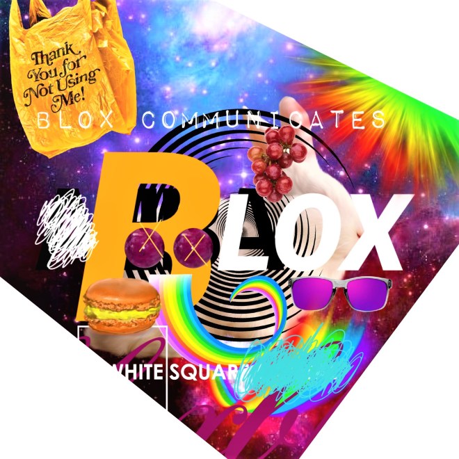
It’s so bold, you have to stop. Even if for 1 second. You’re wondering about the colours, the use of red + blue & light purple. Why would they do this? But look – a rabbit. It’s in the centre of the circle. I suppose we are trying to catch it, but it is getting away. That’s interesting! Softly positioned underneath, we see some text – A Technical Creative Company. Hmm. I guess this business is in the business of creating technical and creative things. And that is enough to think. A slight nod of his head, then he walks away.

From Wikipedia –

Hidden Markov Model (HMM) is a statistical Markov model in which the system being modeled is assumed to be a Markov process with unobservable (i.e. hidden) states.

In simpler Markov models (like a Markov chain), the state is directly visible to the observer, and therefore the state transition probabilities are the only parameters, while in the hidden Markov model, the state is not directly visible, but the output (in the form of data or “token” in the following), dependent on the state, is visible. Each state has a probability distribution over the possible output tokens. Therefore, the sequence of tokens generated by an HMM gives some information about the sequence of states; this is also known as pattern theory, a topic of grammar induction.

The adjective hidden refers to the state sequence through which the model passes, not to the parameters of the model; the model is still referred to as a hidden Markov model even if these parameters are known exactly.

Hidden Markov models are especially known for their application in reinforcement learning and temporal pattern recognition such as speechhandwritinggesture recognition,[7] part-of-speech tagging, musical score following,[8] partial discharges[9] and bioinformatics.[10]

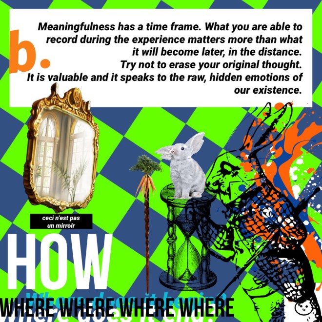
Transparency. It is hard to see the writing, but I suppose this is a play on words. Let’s take a step aside to identify another idea that could possibly contribute to our exploration of transparency.

Shakespeare wrote –

All the world’s a stage, and all the men and women merely players: they have their exits and their entrances; and one man in his time plays many parts, his acts being seven ages.

As an exercise for my readers, let’s remove ‘seven ages’ and replace it with ‘seven goals’, which we can create to incorporate more visuality into our practice. If you are a business owner, define these seven goals around the fields of branding, marketing and sales. And in case you were wondering about the word visuality, https://www.merriam-webster.com describes it as –

Definition of visuality

1the quality or state of being visual or visible VISIBILITY
2a mental image or picture VIEWGLIMPSE

So, seven goals to incorporate more visuality into my business (acting as a business owner for Blox. Communications) –

(Goals should relate to the quality or state of being visible, as in advertising/PR and should relate to a mental image or picture, as in HOW our customers perceive our business and our products/services.)

  1. Define 1 main logo and 1 main tag;
  2. Consistently promote ChonaBLOX. blog (with URL) across all social media platforms (Facebook, Instagram, LinkedIn, Pinterest, Twitter);
  3. Come up with a consistent slogan for each identity (BLOX, ChonaBLOX. and Blox. Communications);
  4. Ensure each project/document aligns with established goal attributes – transparency, accuracy and responsibility;
  5. Speak and write using vivid and bold description;
  6. Speak and write following a linear and logical pattern;
  7. Establish brand identity using colour + text as a visual tool across all platforms.

Can you come up with something like this for your own business? For myself, transparency is creating an abstract concept, breaking it down for my reader, so that they can begin to understand the ways we see and interpret visual and/or written data, using innovative + mainstream techniques. This is a skill and it must be honed. If you are trying to establish or refine your brand, your marketing strategy or your sales approach, comprehension of innovative + mainstream ideas is imperative, especially in a visual state. Do you agree with this?

Back to our analysis…

(Ask yourself, can we jump from paragraph to paragraph? Does it distort the message?)

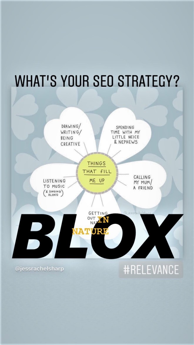
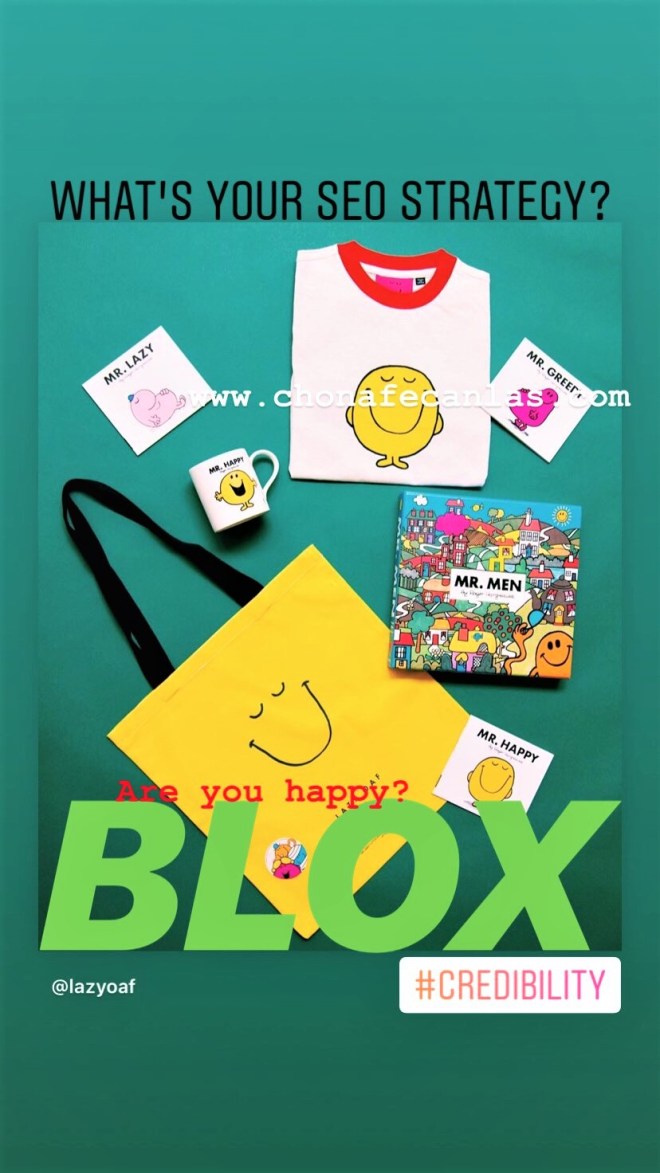
And it relates to the two images, because the first one is bold and the second one is more transparent. However, messaging does not exist along the same plane. Which image has more popularity? More relevance? More authority? More credibility? (These are SEO metrics to keep in mind.) The man, who I forgot to mention, wears a khaki-coloured trench coat and matching hat. He takes 5 steps back to re-read the word ‘transparency’. He quickly glances further back at the bolder image, then walks forward 8 steps to be faced directly with the more transparent image.

We have engaged our viewer. Transparency is a particular context that comments on HOW things work. Transparency, which lexico.com defines as – an image, text, or positive transparent photograph printed on transparent plastic or glass – is able to be viewed using a projector. Just as a frosted window engages its audience to peer in closer, these images encourage the same experience. Perhaps if the man looks closer, deeper, further into, he will begin to question HOW the messaging is working, while still taking in a normative meaning that most average ads, banners or billboards intend.

And visually speaking, the projector has imprinted the image in our minds, in our short and long term memory. In our digital collaborative state, the aim is to be able to study another’s work and run a real-time comparison to understand how someone else’s chosen elements could apply to and improve our chosen modes of communication. Again and again, we see that the stage is experiential and we must involve ourselves with interest and intention to reap any benefits for our business and our customers.

Members of the advertising discipline are playing many intentional ‘games’ that are designed to engage, enrapture and captivate a specific, targeted audience. Would you want your audience to be enthralled? Are there any downsides to this type of engagement? Is the experience itself enough?

Influence

Hi everyone!

We want to fit into the human experience, but in today’s digital condition, it can all seem very confusing. Let’s explore the idea of illusion and HOW it relates to social media marketing.

An illusion is a misrepresentation of a “real” sensory stimulus – that is, an interpretation that contradicts objective “reality” as defined by general agreement. For example: reach, likes, your interaction with a mirror or the selfie.

The psychological concept of illusion is defined as a process involving an interaction of logical and empirical considerations. Common usage suggests that an illusion is a discrepancy between one’s awareness and some stimulus.

Are you able to identify some LABELS OF ILLUSION used in social media today? Do the labels impart a lesser or greater influence in terms of how we see ourselves and others?

Case Study

Label:

She is in a bikini, showing the world her body. She is smiling, so she is happy with her appearance and comfortable in her own skin.

Hypothesis:

Influence, as opposed to reach, can extend beyond numbers/demographics and descriptors/psychographics.

Explanation:

Within our cultural/societal context, the labels identified in pink can impart a greater influence on ourselves and others. (Note: influence does not always have a positive effect/affect.) HOW? Cultural appropriation (in visual arts, to appropriate means to properly adopt, borrow, or recycle) effects/affects everyone using the same medium. Marshall Mcluhan, considered by many to be the first father and leading prophet of the electronic age (leaderu.com) argued that, “The medium is the message.” Therefore, the more people exploring similar labels influence more people and the message itself becomes more significant or important. WHY? Cultural integrity says that everybody is included and can be a part of the message. Support is shown by repeating labels within both our cultural/societal context and the content of our individual situations (message). (Note: again, support can have a positive or negative effect/affect.) The more we relate to one another, the greater influence can be.

Exploration:

What we want to know is – HOW then, can we substantiate, quantify (excellence) or qualify (perfection) the labels that we see across channels and platforms? You’ve probably come across messages proclaiming, “She just looks that way online, but in real life, she is miserable.” Or captions that comment, “That is just a flattering angle, I’m posing.” And, “She used filters to slim her waistline and to make it seem like she is wearing makeup.”

Within our cultural/societal context, the labels identified in red impart an even greater influence on ourselves and others. HOW? Cultural integrity causes a competitive sentiment which promotes unique content and more importantly, individuality. This brings us back to asking WHY? And, we can answer in the same way as above — cultural appropriation says that everybody can be included and is a part of the message. Support is shown by repeating labels (or opposing labels) within both our cultural/societal context and the content of our individual situations (message). The more we relate or contend with one another, the greater influence will be.

So, how can we discern true ownership in a digital condition riddled with illusion? 

Cultural appropriation: to explore further

Cultural integrity: to explore further

Effect: to explore further

Affect: to explore further

Strong values and ideas in branding are important. This is cultural appropriation + cultural integrity. Everyone can play a role because as a whole, we are impressing cultural/societal change and development for ourselves and for others. No matter WHAT the message is, it is being shared and released within a free, digital democracy and thus, the content we create and HOW it is transmuted becomes a message in and of itself.

Influence is an original, unbiased and rare phenomenon. It can create a streamlined effect in messaging (communication), which affects WHY we think.

The questions become:

WHY do we choose to direct the flow of creation, messaging and communication (our omnichannel experience)? To change the human experience? To change negative thought processes? As an outlet to comprehend the difference between analog and digital meaning? To explore our digital condition? To belong to a revolution? To simply participate?

To expand:

Use Digital Presence – A Business Model (exploring left and right-brained equalization through messaging/communication management)

Conclusion (for now):

Blox. Communications is always looking for ways to impact the greater picture. We are a POWER OF INFLUENCE and we want to ask: HOW can we influence positive change in the human experience psyche using a digital mind frame? Can our channels become more transparent if a few simple rules (i.e. questioning ASMR) or set practices (use of the selfie to elevate self-esteem, rather than self-image) were put into place? Can our platforms be used for something other than self-promotion? This competitive nature that we rarely talk about, it is happening and what is it serving us? Do we need to adopt digital minimalism? Studies show anxiety among youths has skyrocketed and Generation Z is suffering the consequence with increased cases of depression, attention deficit hyperactivity disorder (ADHD), impulsive disorder, problems with mental functioning, paranoia, and loneliness (adaa.org). Needless to say, our society is up to speed. We know this is going on, but WHAT are we going to do to change it?

Worry is a false attribute. That is the argument – that our involvement in the digital condition is impacting the human experience, our psyche, modes of thinking and ways of communicating messages. We can choose to negate the entire experience, or we can believe that change is already happening. And, for the better.

We don’t need physical collaboration. It occurs spontaneously through the power and magic of digital media. We are all potentially working together, depending on how you choose to see it.  Your perception is bold enough to see outside of regular composition. You can see more than the truth that the regular world presents to us. You see an ideal, an ideal that is off the grid and too good to conceive. So, it is a matter of comprehension. HOW will we bring the world together in our new digital condition? Can we teach youth HOW to go beyond apparent teachings? Can humankind collectively push the boundaries of medicine and science (through art and language), so that our human experience can be brought into a new time frame that will change the very aspects of our health and wellness?

Continue to imbue your force upon other forces. In this great way, wild things will occur. Changes guys, changes!

This journal (thesis development) is TBC. If you have any inquiries, please reach out – info@chonsfecanlas.com.

7 – Breathe Life

The train made its usual stop at Chon. Chon was the last remaining urban centre, where transforming humans dabbled in post-consumerist delights like colourful French macarons and antique Balenciaga dad pants. It was a place for fun and rest.

Daisy sat up. She was awake for the last little while, finishing her sandwich and still wondering about Mr. Beaver in the hat. He was gone, probably somewhere between Life Space and Elevententeen. She was happy to be at Chon. She wondered if her best friend from Calgary was there. It was Linz, she worked for WestJet, a now defunct flight carrier that was sold off to Indigo, a distributor of Paradise Colours. Really, the world was so different now. The practice of social media marketing was a language in and of itself. Depending on one’s digital cognition, it could provide sustenance to an audience or increase the relativity of binary disease. After all this time, survival of the fittest was still the game. Humans didn’t want to be sick. They didn’t want to be dead or alive. They wanted to be living, breathing real air and doing regular chores.

As she stepped off the bus (she’s been off the train for A Day now), Daisy headed to the Nike outlet, so she could change her clothes into something more beguiling. Her mind thought of lime green, neon orange polka dots and always-always white eyelet lace. Daisy picked something out. While waiting, she made her third eye blind to prevent identity thieves from crushing her steez, then headed to the wall of bags to pick something out to put it all in.

Afterwards, she stopped at Yoga Passage. It was that time of day again to reset and recharge. Yoga was literally a moment to decompress. Everything left your body as your soul lay suspended in a hue of neon pink. Rearranging locations and transformations, so you could see properly. Daisy practiced yoga once, when she was young and did not finish her teacher training practice. Alice from Wonderland stopped a sour pursuit of a man named Justin Patterson, as he would have led her to full-fledged inebriation. The relationship was stopped by a major car alternative.

Lying in Savasana, Daisy fondled her mat, remembering that life filled with creativity and ideas can shut places to smithereens. She closed her lids and drifted off into space. She could see letter z’s italicized, drifting into time followed by baby emoji apples and puffy digital rainbows. It was the stuff of her man-made dreams. Visions, they come in Elevententeen.

Do you see orange or blue?

Logo Design

Hi everyone! Here are a couple of funky collages containing recent logo work designed for Blox (Blox. Communications requires a corporate image, so more on that later).

The Blox logo is a study on minuscule composition, where the subject matter is paradoxically enlarged in comparison to the traditional meanings we normatively attach to logos. Each logo is a project in itself, undertaken with massive charisma as the final piece must speak to the idea of liberty in design and the humour found in the seriousness of brand identification.

A logo thus indicates fun. Why does it have to be the same every time? Can our audience begin to understand the concept of change? And can this change be something ethereal and definitive, because gosh darn, it compels you to say, “I don’t understand?”

So then, we must connect our audience to basic things that work underneath context to bear a logo with simplistic meaning. Visual design elements are a foundation to understanding the essence of a statement. The viewer will say, “Oh, that green and that red are complimentary. This works for me.” Or, “That paint pouring down resembles the shape of that banana. Why is there a banana in this?” WHY is there a banana in this logo? Peel. Peel away the layers, to find a tasty meaning. “The peony, is it for me?” Well, doesn’t that make you feel nice? 

We must find ways to evolve harmlessly. It doesn’t hurt anyone to have fun. But it hurts to see thoughtless design. But, who am I to judge? The show must go on (onto the next logo) and the work will still appear on a van. Have a look and edit it in your mind. Make it better. Make it run and most importantly, try to consider a logo as a gift from the world of design. 

Which is your favorite? What type of imagery would you like to see? Colours?


collage (13)

collage (9)