
Category: Communication


Past Experience


Fruit Salad
Hi everyone!
These are the kinds of stories I love telling my daughter, Bishop. I want her to understand linearity and its purpose. So in the most basic of elements, the beginning and an end. Also, inserting subject matter that she is currently familiar with, like numbers, colours and fruits. Her stories lately start with, “One day!” as if she is saying ‘today’ with so much resolve, confidence and sobriety. She is not referring to daydreams in or of the future. It is a great mentality that I sometimes wonder (with my preposterous knack for discounting – this is why I value BELIEF), did she get that from me?
The answer is: Yes, she did. Of course!
If all else fails: trust your daughter!
Enjoy!
Abstract – the / an / referring / which village are you from
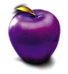
She bombed down the hill, biting her teeth into a teal blue apple. The shiny surface reflected confidence and her sobriety. She was going to win this game! But then suddenly, the mysterious sasquatch was coming. She could hear his roar and he zoomed through the trees landing victoriously onto a pile of soft snow. His green tuque made him look like a kiwi fruit. Bishop was suddenly starving, but there was no time to stop.
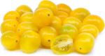
A team of yellow capricorns danced around the finish line, laughing and hiccuping at the sight before them. The orange judge was serious and studious. He seemed to bear more focus on his clipboard than on the race. Flipping her hair and toying with the pens behind her ears, another judge was vivacious and fixated. Her red dress was imprinted with marigold polka dots and it swayed in the warm breeze felt by all at Sunshine Village.
Village A is competitive. Always looking for the advantage. Has an alarming penchant for recognition, which bears a sense of positivity in their pursuits. Village A is not at first welcoming, but becomes comfortable if their surroundings seem to agree.
Suddenly, Chona came flying down the narrow corridor wearing a vintage, pink one-piece snowsuit she found at Value Village precisely 10 years ago. There was no one behind her at this point, so she raised her arms proclaiming, “Funny. These bags seem heavier than they were yesterday. My stuff must have grown!” The clock was ticking down to the last few seconds, then a huge bell signalled the end of the race.
Village B is innovative. Always looking for the answer. Has an alarming penchant for reassurance, which bears a sense of positivity in their pursuits. Village B is not at first welcoming, but becomes comfortable if their surroundings seem to agree.
The champions switched outfits (because that’s what champs do when they win) and all stood boldly on the podium, waving arms, pleasing the crowds who came to watch them.
“Purple purple. The medals are purple! That is so cool!”


Share this:

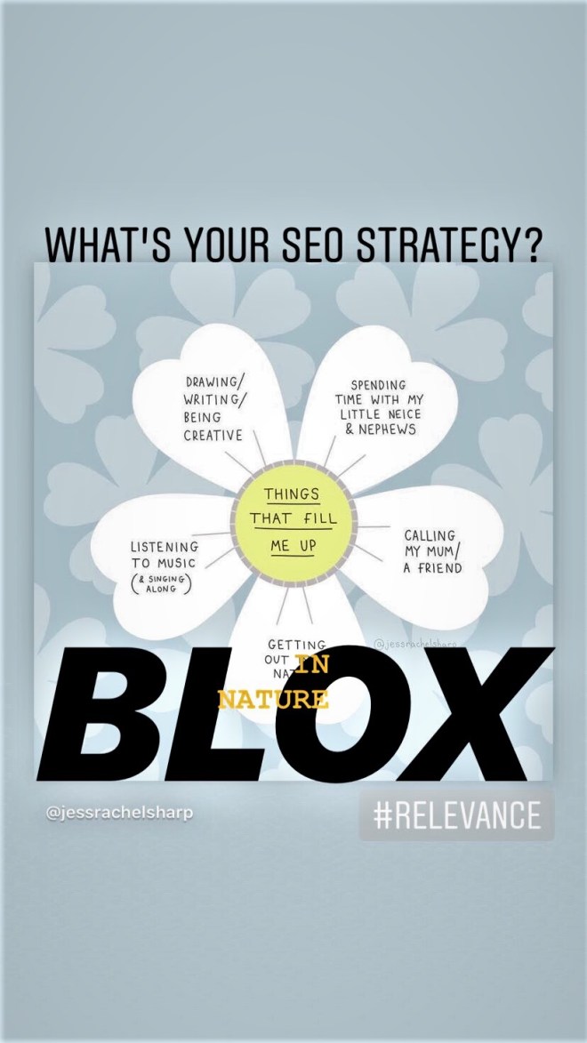
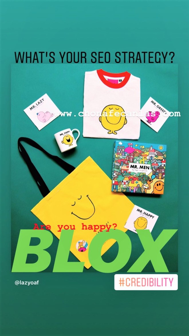
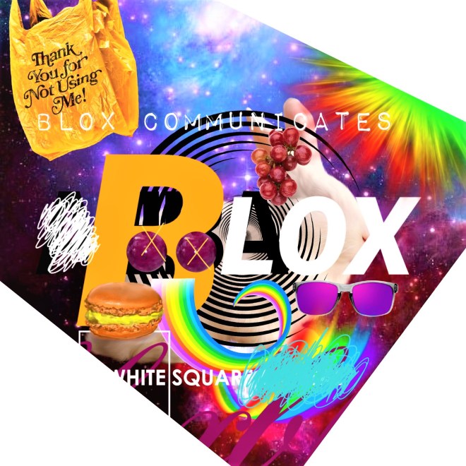
SEO
Hi everyone!
Just a short burst of info here. What are you drawn to? Do the colours play a significant role in your interpretation? What connections can you make with the chosen imagery attached to each hashtag?
A perfect brainstorming exercise for design newbies – make a list under each hashtag including transferable elements (actual aspects and items like a brand name or object) and attributes (descriptions and words) for each. Aim for 50 answers, then narrow down to your top 10 answers, then again to your top 3, then top 1. What conclusion can you draw from this experiment?
Always remember the acronym PRAC – Popularity, Relevance, Authority & Credibility. This will help you target your audience and ensure that your content is set up to improve your overall search engine rankings.
Yes, yes…SEO is a lot more complex than a simple acronym, but sometimes starting off with something more general helps to develop your digital marketing strategy or plan more succinctly down the road.
I will get into this topic (SEO) further in the future!


Share this:


Visual Transparency
Hi everyone!
Today’s topic is SMART Goals.
A brief definition of each objective and an example of how each objective can be applied to achieve an effective creative technical writing style.
Here, I am writing about visual transparency as it relates to an image I designed for Blocks, my first and ongoing social media management strategy. Blocks aims to explore left and right-brained thinking and our ability to control destiny (or in simpler terms, improve issues of self-image or esteem.) Note: Initially, I was going to include the image in this post, but the relevance of my imagery is too swift. I will always include my most recent works to keep you up-to-date with my current visual style and tone.
As an extra creative exercise, try to imagine a fruit to attach to each objective. How does it relate to the SMART goal and our definition of visual transparency? Could you affix these tasty symbols to a billboard? What would be the significance? How effective would say, a giant teal apple be at communicating a specific message?
I will post the fruits on my next post tomorrow!
BEGIN
HEADING: The heading is the text indicating the nature of the article below it. The large type front page headline did not come into use until the late 19th century when increased competition between newspapers led to the use of attention-getting headlines. (Wikipedia)
WILL IT ENTICE YOU IN A GLANCE?
SUBHEADING: For documents longer than 3 or 4 paragraphs, subheadings are an important usability and accessibility strategy to help readers both determine the overall outline of the document and to navigate to specific information on the page.
VISUAL TRANSPARENCY AS A COMMUNICATIONS STRATEGY
SPECIFIC: Goals that are specific have a significantly greater chance of being accomplished. It should be well-defined, clear, and unambiguous. Essentially a definition of your idea that allows your audience to understand your topic more accurately. (CFI)
Visual transparency, from an artist’s standpoint, is a form of contextual openness that allows viewers to become engaged on a more subconscious or subliminal level.
MEASURABLE: Goals that are measurable have criteria for measuring progress. Criteria can be in line with your vision, mission, values etc. The point is to measure your progress somehow, for example, how would you measure engagement or participation? Is the action itself significant enough? In writing, a statement of intent is a great way to achieve a sense of measurability. (CFI)
As a writer and digital specialist, the goal is to be transparent, accurate and responsible. As an artist, I simply want to be engaged with my work and for my viewers to participate. Note: professional transparency has more to do with how others perceive you and what your actions say about your brand.
ATTAINABLE: Goals that are attainable help you figure out ways you can realize an objective and work towards it. The achievability of the goal should be stretched to make you feel challenged, but defined well enough that you can actually achieve it. It would be a good time to insert your call to action here. (CFI)
With all of the outlets available, viewers can participate using whichever preferred medium they desire. And they don’t need to be 100% engaged for it to matter. For example, your interaction with a billboard might only last 5 seconds, so the argument could be that visual transparency is actually quite critical.
RELEVANT: Goals that are relevant must be realistic given the available resources and your timeline. What would be the innovative or mainstream approach? What are pertinent examples you can showcase? What will be the outcome? Ideal or realistic? Your exploration should be relevant to your life’s or work’s purpose. (CFI)
This is who we are today. We embrace a fast and furious approach to everything and criticize the results. From placing mobile food orders to providing subscribers with a mere minute to execute a successful Instagram (video) campaign – the faster we engage our viewers while applying visual transparency, the more likely we can succeed in delivering our message.
TIME-BOUND: Goals that are time-bound must have a sense of a start and finish date. What is it like today, what will it be like in the future? If the goal is not time constrained, there will be no sense of urgency or motivation to achieve the goal. What is causing the urgency for action? Are we in a position to answer or question? (CFI)
Perhaps one day it will be different, but for now artists and marketers must adapt to these swift modes of communication. Visual transparency will become the norm, then who knows what will be next…
END
Does using the SMART goal technique help you? I believe that it is a great stepping stone towards achieving a more clear and linear style of communication. Test it out!
Meanwhile, dear Alice is still falling…
down?
below?
towards?

Share this:


9 – Coming Down
I’m so tired, Daisy thought. You’re always tired, retorted Cherry. She was just sitting there, twiddling her thumbs, looking at her green shoes. She turned her head right, was there something there? She suddenly felt uncomfortable. Someone was watching them. They didn’t know who.
It’s time to pack, dear. The routine was the same every June. Alice from Wonderland would arrive to take Daisy home. Daisy couldn’t do it without help. It was a sad time for her. She was remembering the death of her mom, those last few cigarettes she had outside with her dad, in the snow. She was really angry Being because of Ben. He ruined her life, led her astray. She was an addict when she was with him.
Forget thinking about it, darling. Alice stroked Cherry’s hair, handing her a cheese and ham biscuit. This is ridiculous. I’m practically choking on this bread, it’s getting lodged in my throat! I can’t take it anymore! By then, their tears were flowing, ruining everything including a pink dress and a gigantic muumuu.
All of the pupils present today were busy writing down their answers. Not me. I’m just going to sit it. Read his brain. Oh shit, he’s looking. The girls looked away, frantically grabbing their miniature Navajo backpacks, matching, gifts from the Philippines and their Auntie Stella.
Daisy? Can you contribute something to this discussion we’re having? Her teacher was frustrated, but tried his best to be kind and patient. Daisy twitched her mouth. No, I don’t think I can. They could feel every single eye in the room blink. Then, 999,999 heads turned to look at her. What were they expecting? She wasn’t going to put on a show. And especially not in this muumuu. Do you have anything to say, young miss? Neither had enough bitcoins to argue. Clearing her throat, Miss Daisy stood up. Cherry budged in front, knocking her sister to the floor. I bought these with my own cash! Dreams, actually. It was Toys clearly. Can any one of you in the room debate that? We highly think naught. And with haste, they flipped their skirts and left the room.
Flying through the wind, Cherry grabbed her big sister’s hand. They were going to be just fine.
Share this:

5 Influential Marketing Personalities
Hi everyone! Without further ado…
We crowdsource (ideas). It’s our membership and contribution to the digital landscape. Wikipedia says –
Crowdsourcing is a sourcing model in which individuals or organizations obtain goods and services, including ideas and finances, from a large, relatively open and often rapidly-evolving group of internet users; it divides work between participants to achieve a cumulative result. The word crowdsourcing itself is a portmanteau of crowd and outsourcing, and was coined in 2005.[1][2][3][4] As a mode of sourcing, crowdsourcing existed prior to the digital age (i.e. “offline“).[5]
Crowdsourcing is a great way to develop content and topics for your target audience. I put together a listicle based on a few influential marketing personalities I admire. In my opinion, they provide some answers (to my design life) and a unique perspective. I hope they can help you in any way, shape or form.
Also, here they are in a creative digital collage. Does it make you crave mangoes or money?

1
Chris Do, Matthew Encina & the team at Blind
It started with advice from my brother. He goes, check out the vlog by The Futur. This happened right when I started at VanWhistle Media. I was looking for a way to feel inspired. These guys helped me identify high-end pricing techniques and I designed my website portfolio around a couple of videos they put out with creative director of Vrontikis Design Office, Petrula Vrontikis. I’m drawn to these guys for simple reasons – energy and passion.
2
It started with an interview. Chris Do and Seth Godin, together, hashing out topics like, What is school for? Watch it on YouTube – Seth Godin—Make Something Everyday (Best Hour You’ll Spend Today). This was the first time I felt inspired to write continuously and I tried out (half of) his challenge by posting 50 blog posts, once a day. I didn’t quite make it to 50, but the point of the matter is, I identified with Godin’s creative process. He also coined the phrase Make Change Happen, a slogan I adopted for my artistic identity BLOX.
3
Just a straight-up, no fluff business guy, I follow Barney Cohen on Instagram. I can’t remember how our paths crossed, but he offers a refreshing, business-minded approach to life’s common obstacles. Coming from a corporate background, I identify with his mentality, clear reasoning and straightforward delivery. He has 50 years of experience in business, so his acumen is spot-on. You can check him out on Twitter as well.
4
Shoot, I almost forgot! Neil is probably the most humourous, dramatic, yet to-the-point marketing entrepreneur I have come across to date. He helps me understand the importance of brand development and every time I come across his feed, I’m pretty sure we’re thinking the same thing. Quid pro quo at it’s finest, Neil can help you develop metrics that work and he will provide all the necessary reasonings behind it. On top of everything, he’s an excellent copywriter.
5
To think mainstream is to truly understand the relationship between popularity and accessibility. The Rock shows us that fame can be your next door neighbour, unpretentious and welcoming. In the pursuit of greatness, his face and voice puts a sticker on my blank page. Everyone loves stickers. Not everything has to be complicated. Sometimes you are just a do-gooder with a gigantic heart. The Rock shares these emotions with me and his 154M followers.
What do you admire? Who inspires you to do better? Whether it be music or satirical retorts, we have something in common!
Share this:

Consonance
Hi everyone!
We do what we do! But without our mind getting in the way?
I sometimes find myself questioning my work. I ask myself – is it too ‘complicated’ for the ‘average’? Does it come off as ‘fluffy’ or ‘dense’? These words mean too many things, but we get used to one meaning, and that is not right.
And when our minds enter ‘the complex’, we should stop and perform self-talk. People avoid self-talk for fear that it gives others the impression that we’re ‘crazy’. I mean, my mouth moves when I’m thinking too hard! So what! Okay, it might just look ‘odd’. But nowadays, self-talk should be used as a positive, gentle form of therapy to get us back on track to believing in the idea of original intention. Google explores this concept readily, when it comes to understanding how people surf the internet. That being said, why is it today, that we feel an attachment to guilt, pity or shame when it comes to feeling a different way about something? Well, it could be ‘different’ things – an idea of interdependence, requirement or necessity.
When I came across the word consonance, I felt blessed and it quickly resonated with my current circumstance, because it challenges the notion of sleep (figure it out). Like take a break here and there, not everyone hates you, if anything shout it off the tallest rooftop – you are loved everywhere! Just go in with that attitude anyway, smile until it hurts. Find the humour in everything and go ‘nuts’, it’s not going to kill you to have fun! Here’s a bit on consonance as it relates to working and the whole job interview process thingamajigger.
Scott Olster, Ideas Editor at LinkedIn, wrote a brief article around “the idea of business trends, perspectives, and hot topics you need to know to work smarter”. He says –
Success can easily end up feeling hollow when it’s defined and measured by other people’s standards. For our work to have lasting personal value, author Laura Gassner Otting writes that we need to focus on developing what she refers to as consonance.
Laura is a writer for Harvard Business Review and she defines consonance as –
“Consonance is not just purpose writ large (and lofty). It’s your purpose, freely and clearly defined by you, and put into action through awareness of and alignment with your life’s plan. Consonance is when what you do matches who you are (or who you want to be).”
As I enter the interview zone, I will remember alignment with your life’s plans as another tip that will help me remember why this is taking so long. I’m dying here guys!
Hello. Thank you for the opportunity, now I have something to say…
Do you relate to this? What is the interview process like for you? Easy? Intense? How do you prepare?
Share this:

Blogging Graphic Design Process
Hi everyone!
Using simple applications to turn out wicked images is fun. Sort of like the gamification of graphic design (what blogging is like to me). Gaming is portable these days, right? Here’s an interesting article on the history of gaming, maybe you can check for me!
The History Of Gaming: An Evolving Community by Riad Chikhani
Back to the matter at hand…
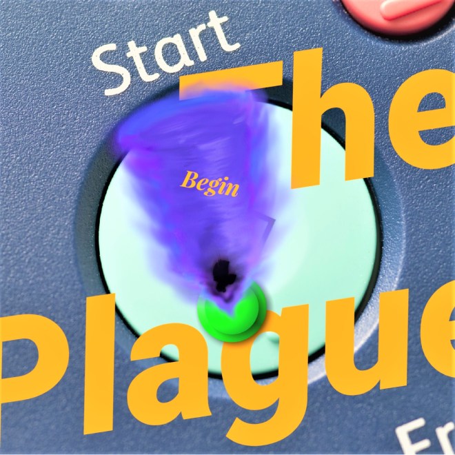
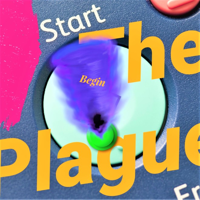
Here are 3 versions of an image I developed for a post (Start). I’ll try to share my process with you (unedited) about how it came together in a time frame of about 15 minutes.
Step 1 – Select a major topic from blog content. (the plague)
Step 2 – Decide if primary message will focus on an image or text. (text)
Step 3 – Decide on a colour palette. (complementary colours blue and orange)
Step 4 – For this image, I decided on text, so the next step was to figure out wording. Wording should be based on the blog’s content, and is usually more effective if it provides the viewer with a direct parallel or bold contrast to the primary message. (the plague)
Step 5 – Pair text with secondary element – image or text. For example, the post’s title is ‘Start’, so I looked for an image of a ‘start button’. (image)
Step 6 – Publish the featured image. Go back to the website to see if it’s effective. In most cases, the image will be cropped, so you may have to edit to ensure the desired elements you want to showcase show up in the frame. (edit to fix)
Step 7 – For this image, I didn’t like the way it was cropped. So, I asked myself – to add or remove? In this case, I decided to add another element in the centre area where visual weight was lacking. (edit for composition)
Step 8 – Again, return to your website and check to see if the image is effective. Still in this case, there was a lack of balance in the top left side corner. I decided to add a pop of colour to provide an additional element of contrast. (edit for graphic design elements)
Step 9 – Check the image on your website. If it works, you will be aesthetically pleased with its presentation or you have found a balance between image – text – colour. (satisfaction)
Step 10 – Double-check to see if there were any cropping issues, spelling or grammar mistakes. Ensure each element of the design is balanced and harmonious. And, you’re finished! (completion)

What’s your graphic design process like? Do you create your own images for your blog? If you could write 10 steps to finalizing an image for a post, what would it entail?
Share this:

Meaningfulness
Editing could quite possibly be the treachery of writing! Overly edited content may tell readers, “This is not false.” On the other side, the raw construction of content is meaningful, but we should argue that the deliberate deconstruction of content to reveal a greater point of view (proper editing) more readily achieves the goals of an SEO/l or a communications strategy – to uphold popularity, relevance, authority and credibility and to distribute a message that is transparent, accurate and responsible.
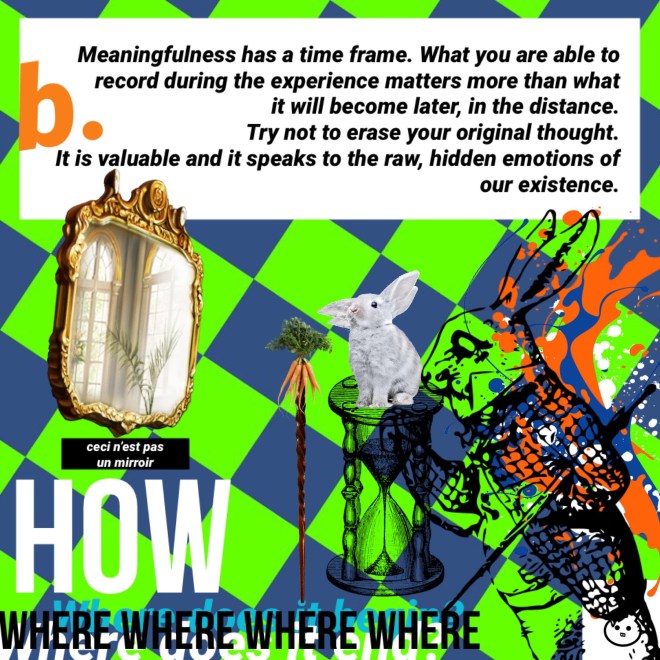
This piece is inspired by a very popular surrealist painting, Ceci n’est pas une pipe by René Magritte. Ironically, my image overloads the viewer with elaborate messages (a commentary on keywords perhaps), whereas Magritte’s painting is a basic review of signified and signifier. Here’s some additional information taken from Wikipedia –
The Treachery of Images (French: La Trahison des images) is a 1929 painting by surrealist painter René Magritte.
The painting shows a pipe. Below it, Magritte painted, “Ceci n’est pas une pipe“, French for “This is not a pipe”.
The famous pipe. How people reproached me for it! And yet, could you stuff my pipe? No, it’s just a representation, is it not? So if I had written on my picture “This is a pipe”, I’d have been lying! (Magritte)
Do you enjoy the process of editing? How do you know when to stop and is this action directly related to the meaningfulness of a message, because content becomes inherently closer to ‘an answer’ or ‘a reality’? Which one for you?

