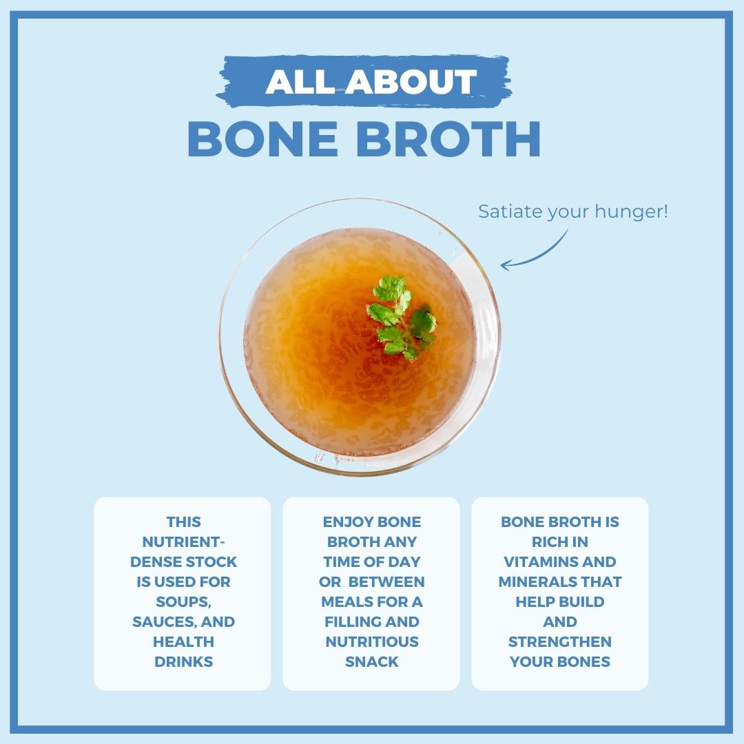
We all wonder about things, everyday things, that lead us to research and ponder.
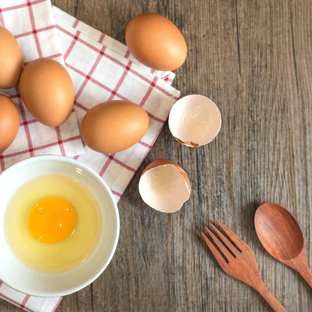
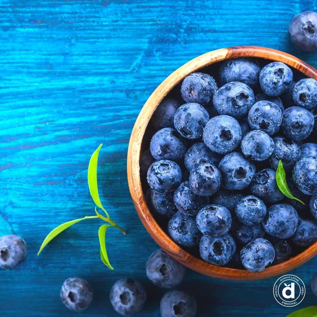
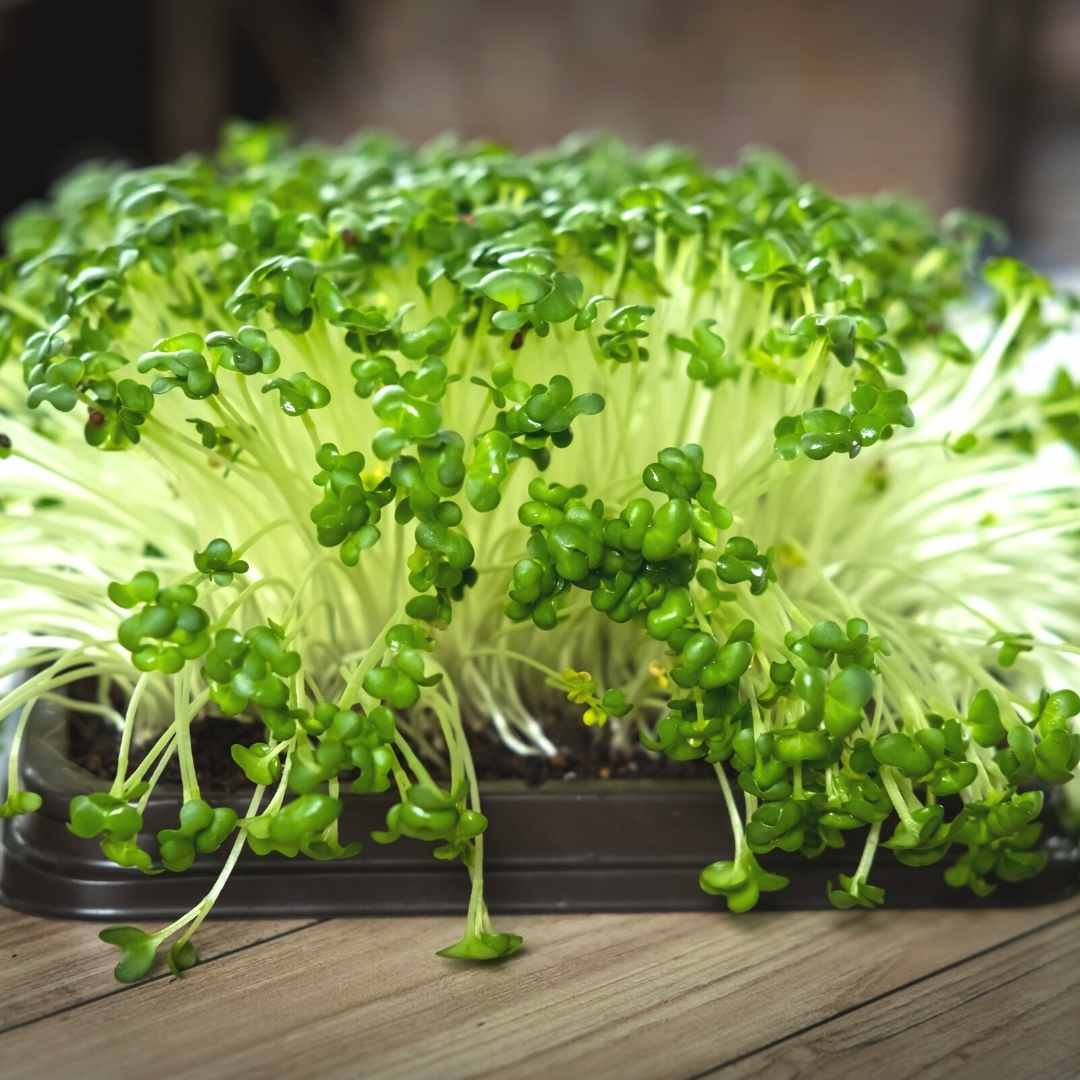
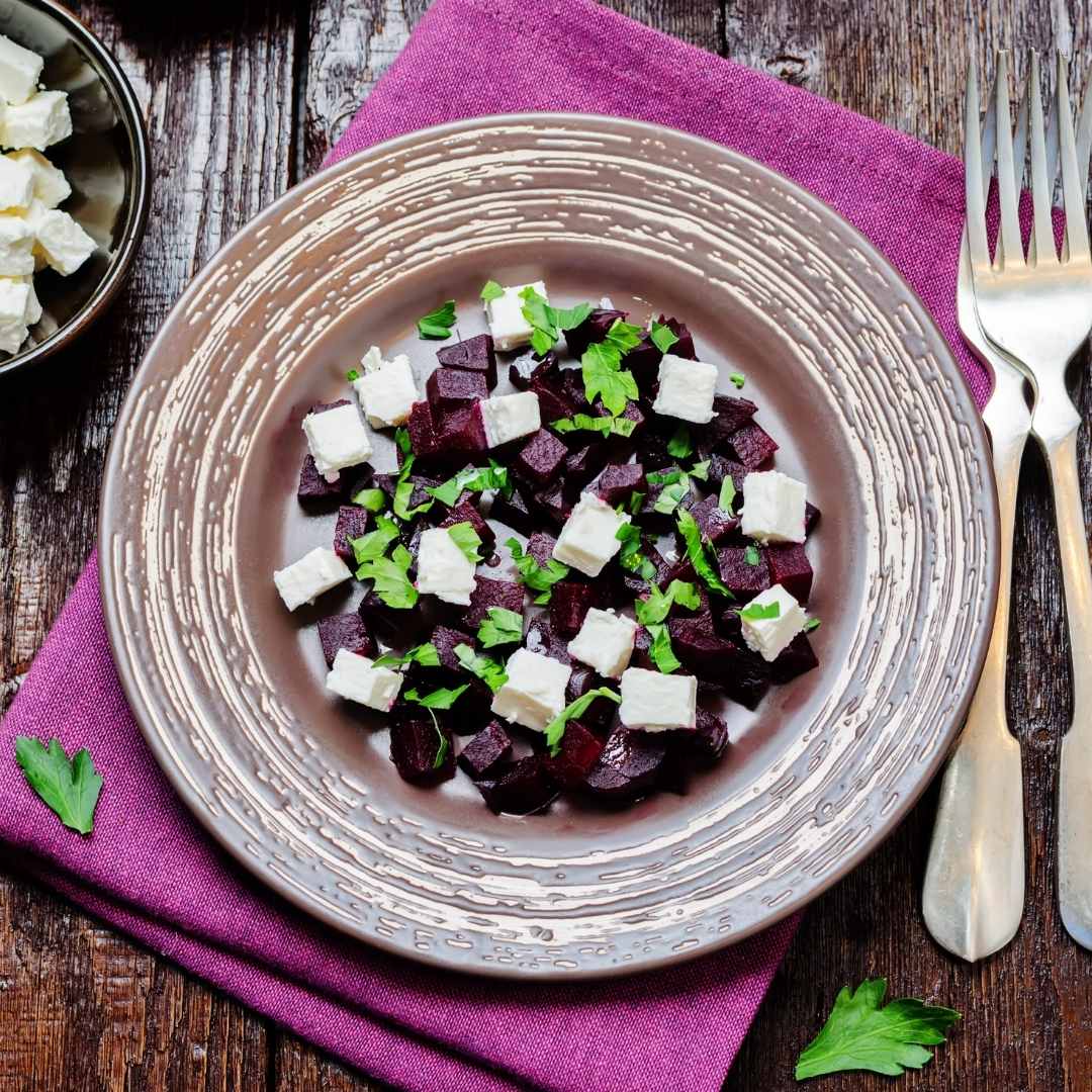
For example, are you starting a new diet? Curious about trying fresh, healthy food? Just nosy about the history of something? Well, these graphics will satiate you.
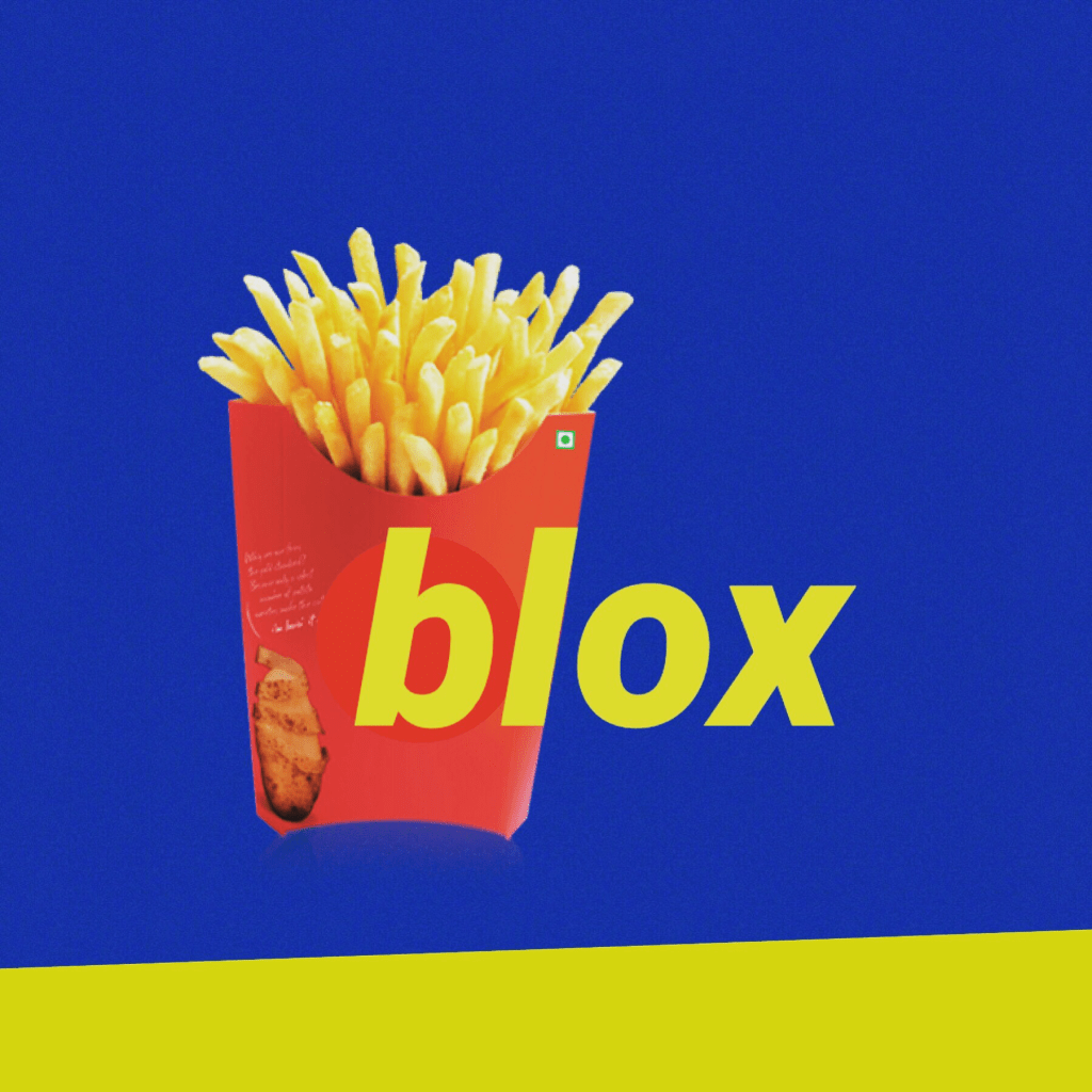
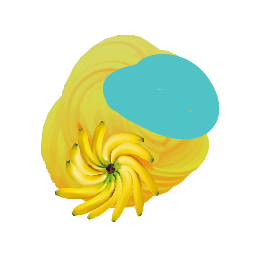
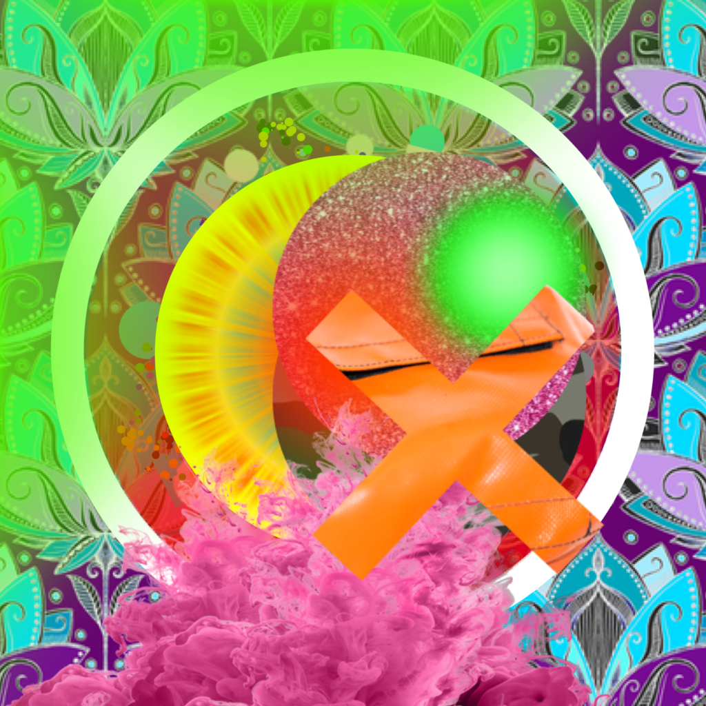
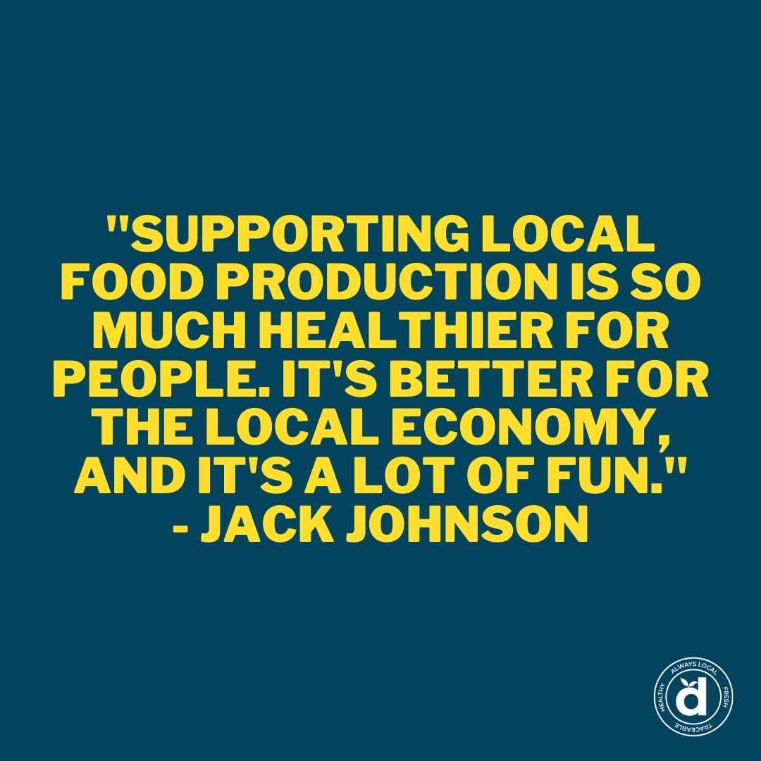
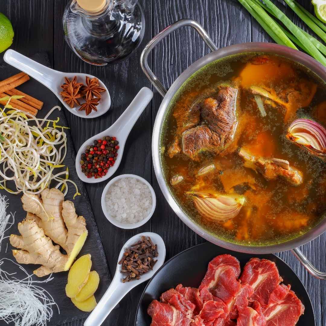
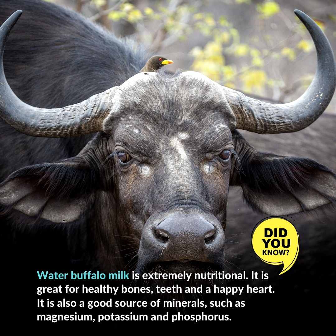
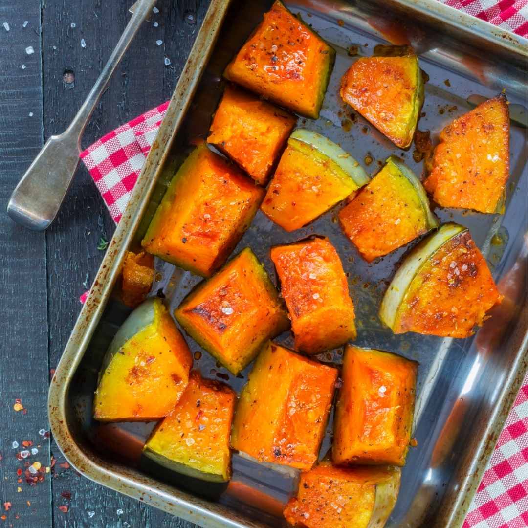
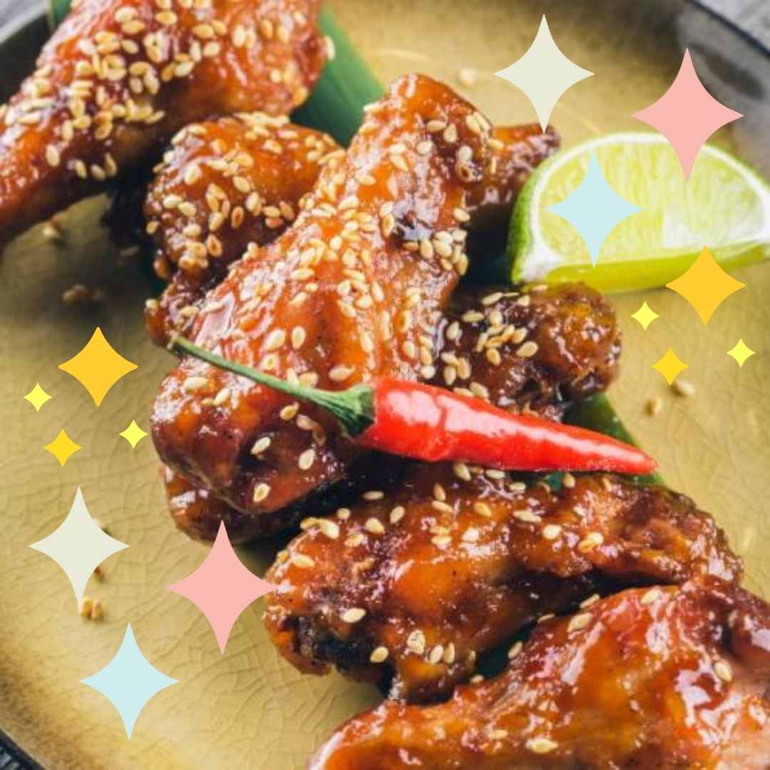
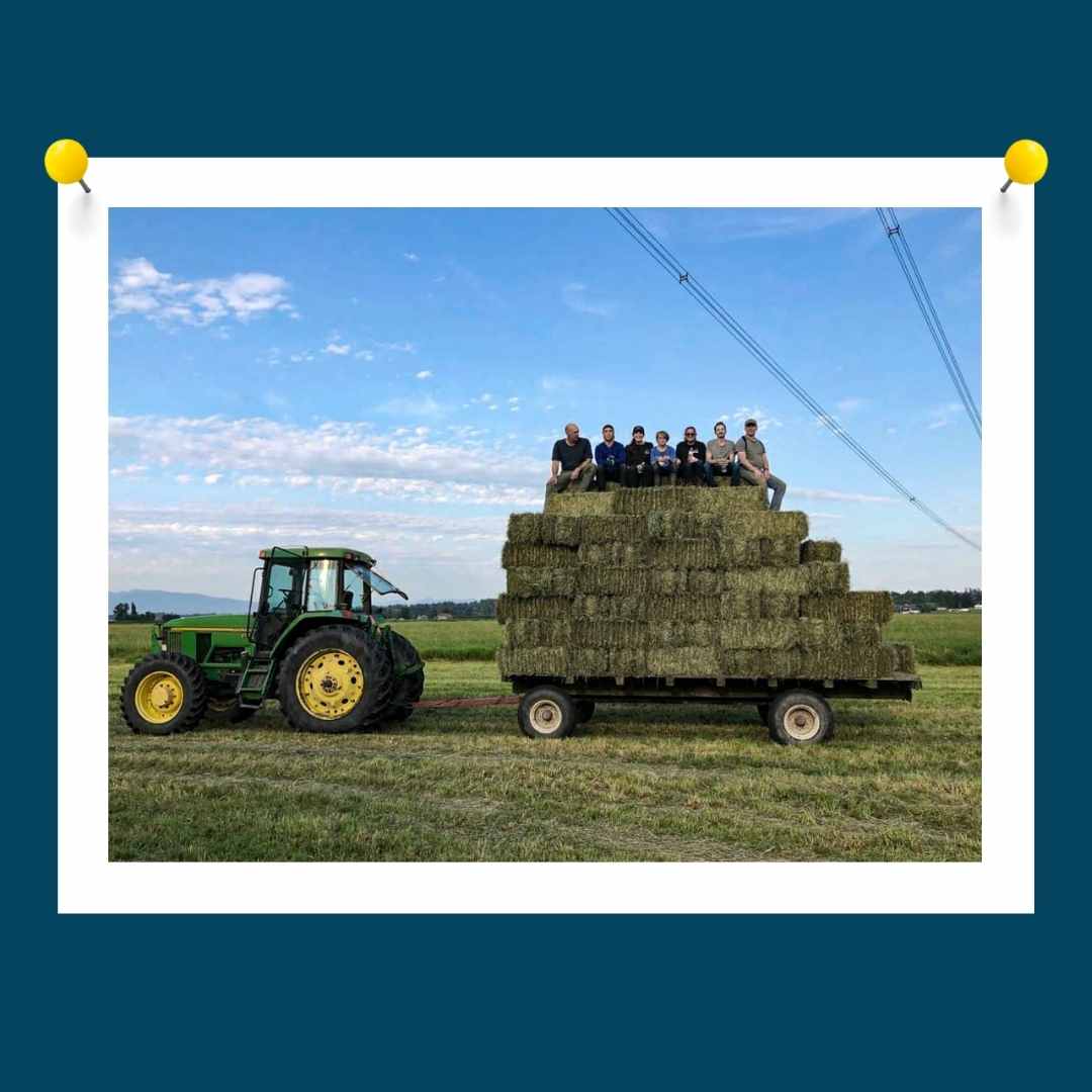
The #AllAbout campaign explores a variety of fresh, local, and healthy products, giving customers the chance to learn something new in a colourful and digestible way. As part of an ongoing strategy to define the tagline #TrulyFarmtoTable, I explicitly position an image at the bottom of a newsletter, like my brother Alan would say when we were kids eating dinner at the dinner table –
“The Ultimate” a.k.a. the last bite.
It satisfies and perfectly wraps up the meal (conversely idea) (metaphorically conversation).
Are you munching on words or proverbial nuggets or just vegan nuggets?
Well, these images will work in the same way! Once again, satisfying and perfectly wrapping up your dinner.
Another analogy – who didn’t chew Bazooka bubble gum only to unwrap the tiny comic folded neatly on the inside? Take it apart. Pop the pink gum. Immediately unravel the humorous reward.
It’s a ritual in a sense, and these graphics were indeed a ritual to create. So, I hope you enjoy them and that they will entice you to…Munsch!
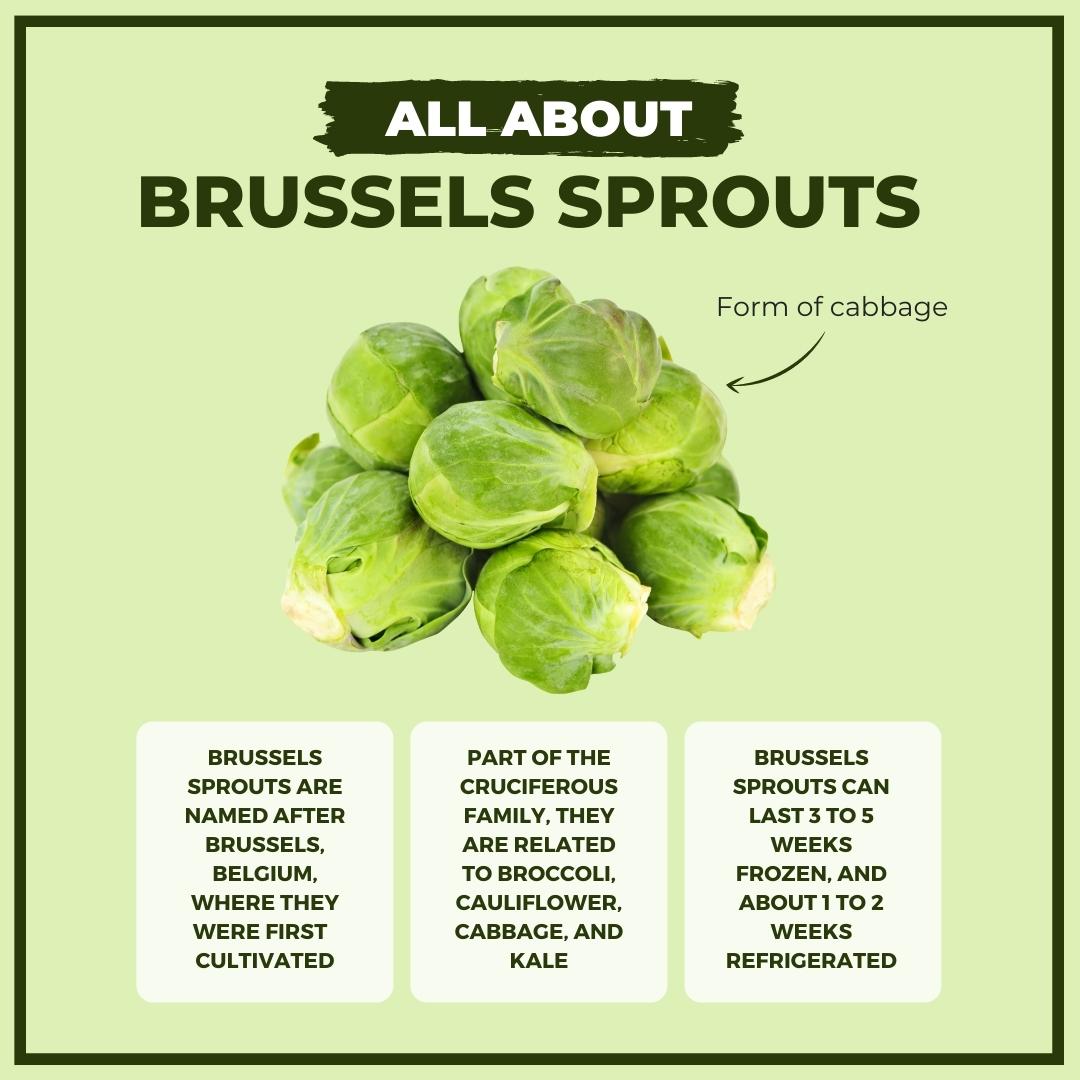
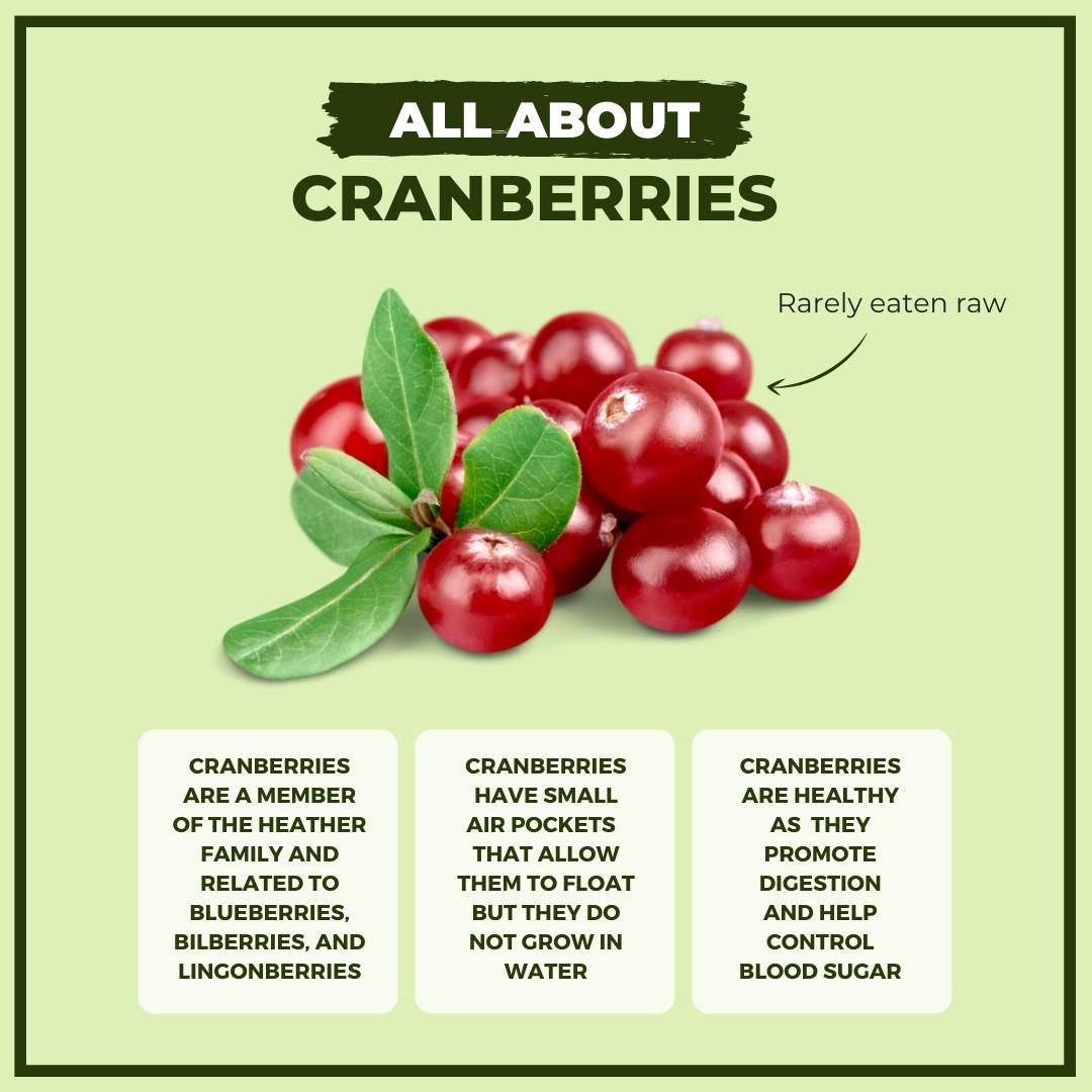
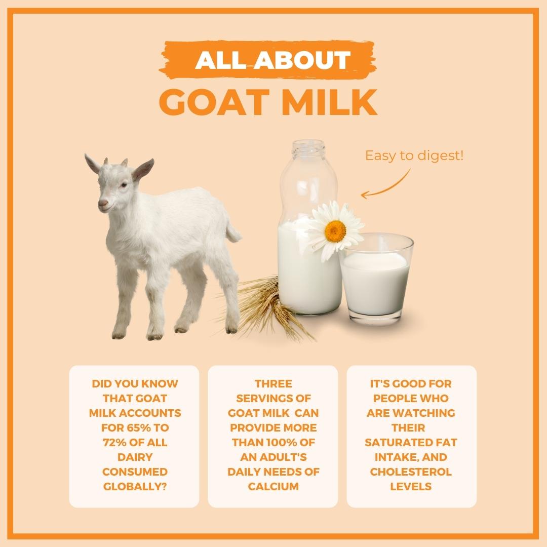
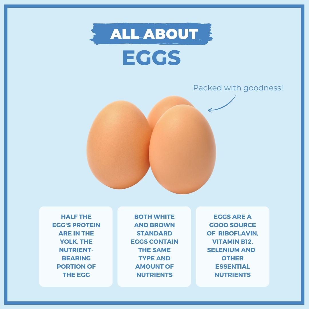
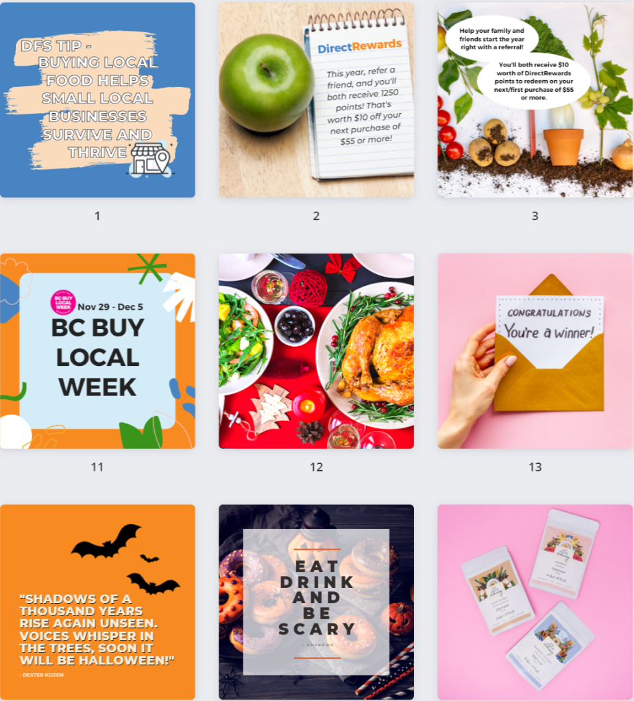
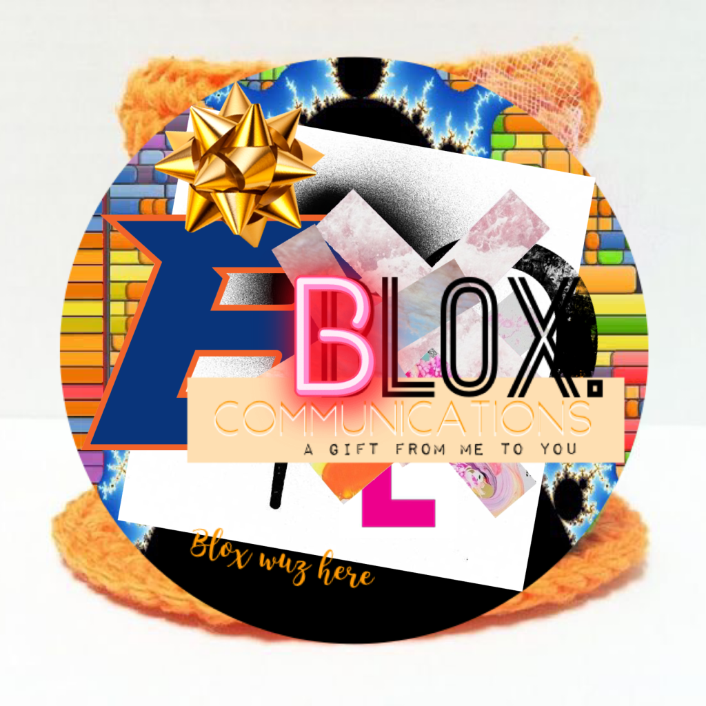
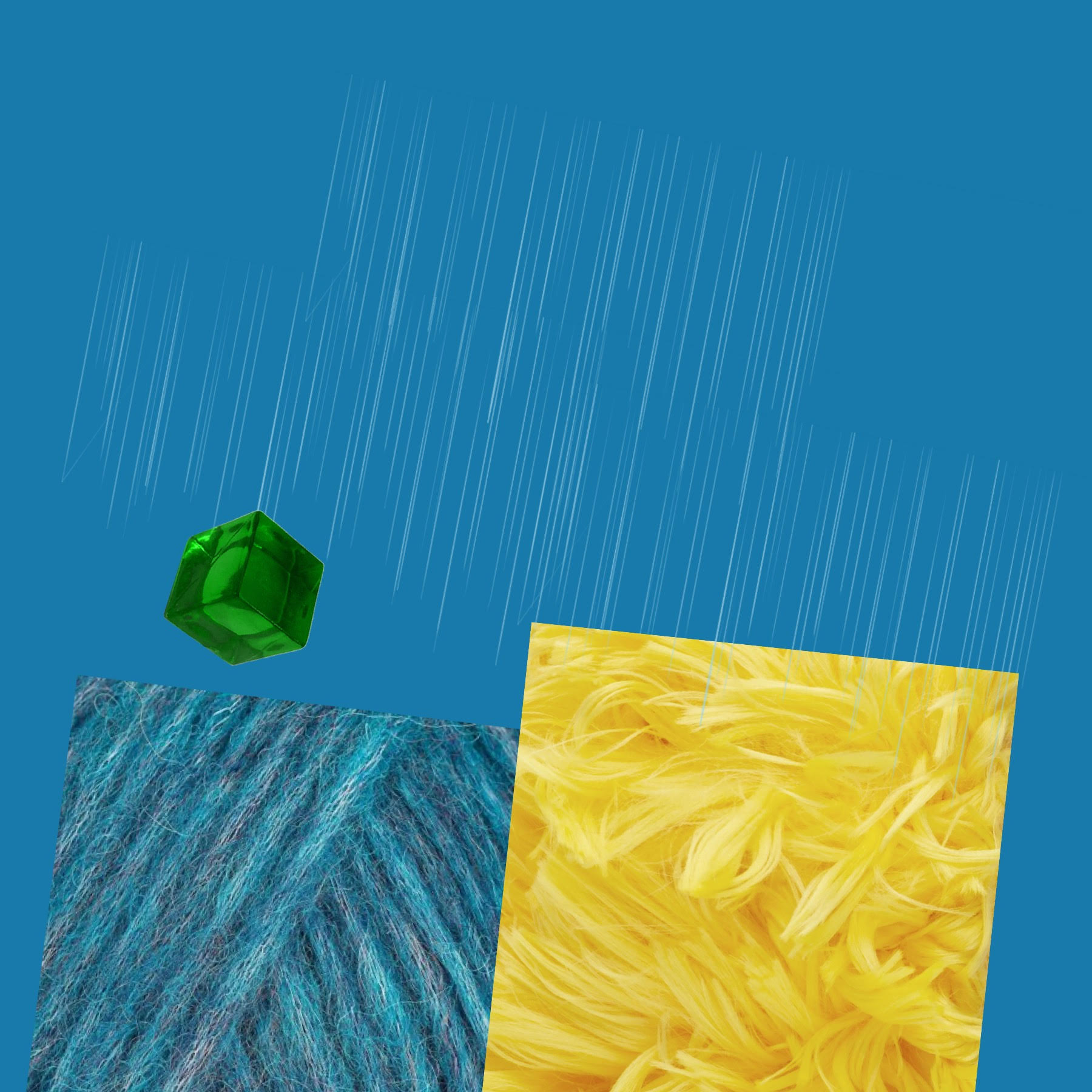
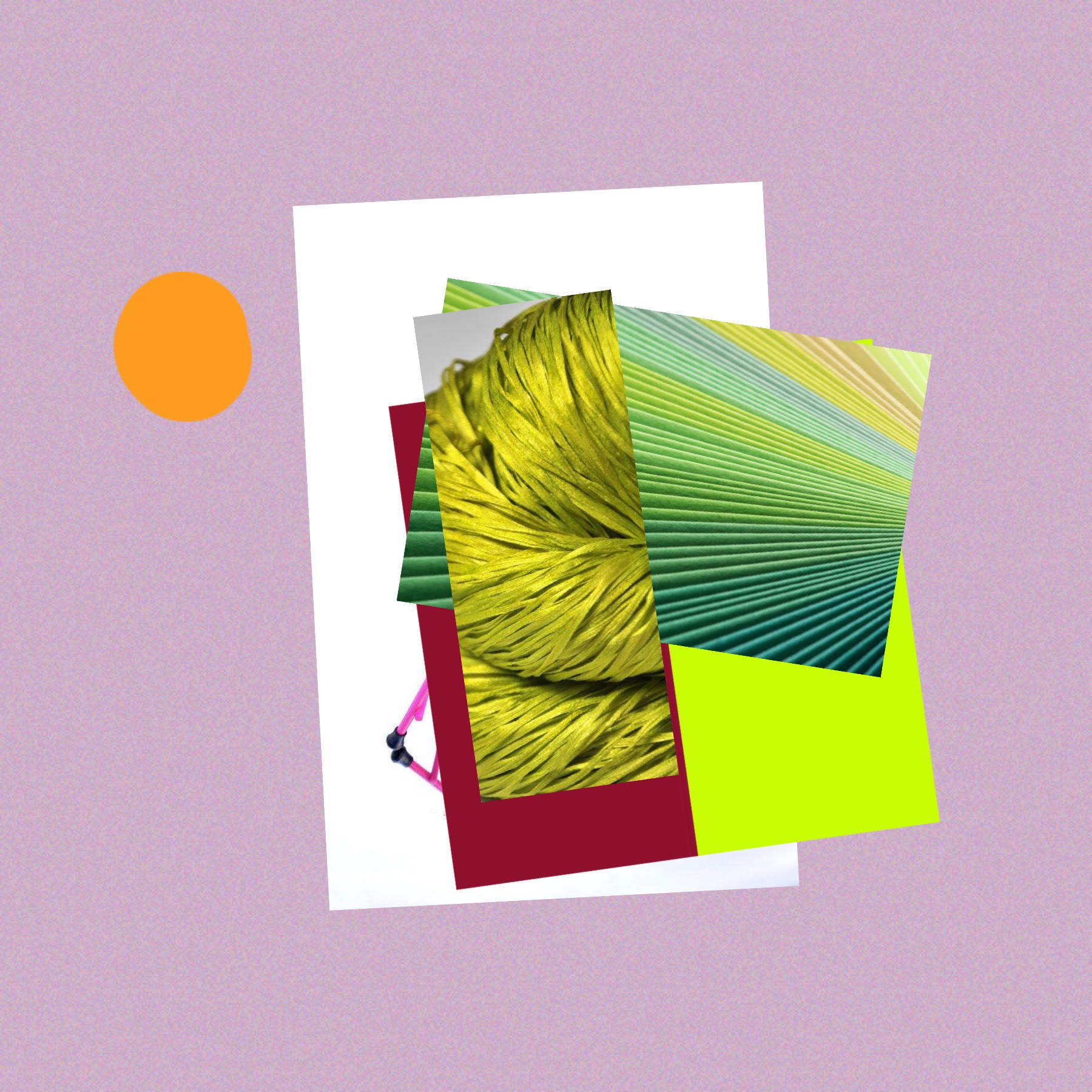
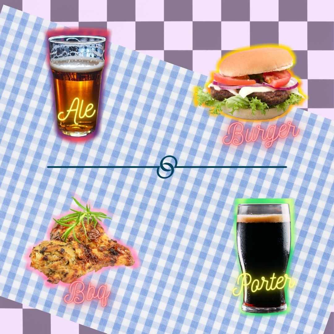
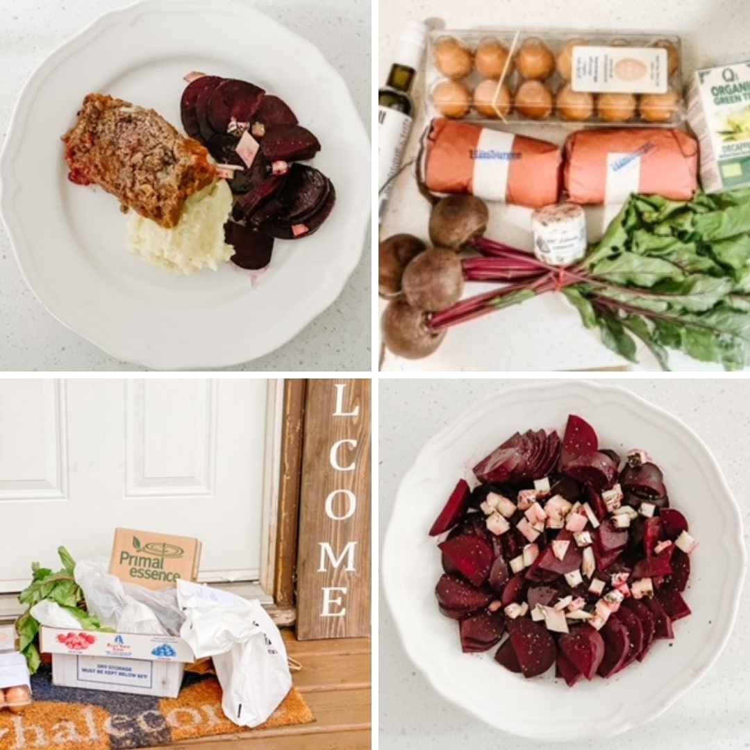
A grid, which features multiple images split into a visually appealing frame, is one way to brand your business on Instagram.
Three benefits (that connect in the end) –
Command attention: make a lasting first impression; if a viewer’s average attention span is about eight seconds, they will have some time to absorb what you have to present to them.
Stand out: imprint your audience’s mind with a quick taste of your identity; give them immediate access to your information and interests while establishing credibility and authority.
Tell a targeted story: communicate who you are to your existing and potential followers while stimulating emotions, and on a practical side, organizing the layout of your images into a narrative.
I created these grids when reviewing the masses of content I have made over the past year for DirectFood. store’s email marketing strategy (a whole other topic on its own). I like how the colours and shapes seem to speak to one another, and the creative copy helps deliver a message in tune with the selected graphics and photographs.
If you like this sort of work, let me know. I’m happy to share more impromptu design posts here for you!
Daisy was always looking for inspiration, the appearance of cursive writing or the look of a padded, bulky knit sweater featuring crimson and indigo animal characters like Filburt. Anything creative, really, would do.
The day she noticed something, she quizzically peered into a bathroom mirror, hoping because she was in the large stall, her sweater would reverse.
Utterly distracted, Daisy made a note never to do it again.
“My progress has become insuperable from all the months of writing exact-sized phrases and headlines with five words or less.” Daisy thought fast while twiddling her phone in her hand.
“Have things changed in A Day? What were things like when I first started anyhow?” she thought. “Well, I was definitely more satisfied. Had a bounce to my step, could care less about the matchy-ness of my outfits. I also felt more powerful, like people were listening to me, learning from me, and so on.”
Stroking her phone, Daisy continued, “However, today, everything is an exercise—an exercise in recalling (all types included).” Distracted, she goes on, “I have great hair, and my skin is young, it seems. On that note, ageing has not necessarily imparted more wisdom or money in my purse.”
She was always digressing.
Back home, Chona grabbed her fire orange Frank & Oak bucket bag and booked it out the door. She was late, again. Always leaving the house ten minutes post-shower. She hopped into her 2008 white Rogue and took off toward the light.
The road was slick, and rain dripped down hard, like her binary code pleated skirt that streamed neon pink zeros and ones from her waist down to her thighs.
She hated driving, though. It was dangerous in Elevententeen, and she knew one day it would kill her. Still, she cranked the radio and listened to old 90s songs like The Cranberries’ Linger. She hummed this tune imagining it more regal played on the baby grand piano at her dad’s house.
When she sat back to play, his gigantic TV wouldn’t let her use the old music books, so she had to carefully balance grade 8 Royal Conservatory in volumes six, seven, eight and ten. The chords? They prevented her from falling.
Daisy’s next big project was sitting in her bag. She put it in there to prevent its glorious shimmer from stirring the Outsiders’ eyes. It could kill, and she didn’t want to be a murderer tonight.
Finally arriving, she stepped out of her car. There were Dreams everywhere! She blinked. Then, blinked again. Her eyes started to roll back into her head, and she could feel the surge streaming now from her crown down to her feet, hiding neatly inside her red rain boots.
In her room.
Someone painted her Brooklyn studio apartment bright orange-red! So, she knew the test had begun.
Should she attack? Chona could barely hold her head up, let alone break out into dance and song. She would just have to sleep it off, her phone continually buzzing that darn song. Then, like all the other times, she passed out. What remained Wide Awake in complete consciousness (forget Artha today) was her supple orange bucket bag. And within it, her project, slipping away…
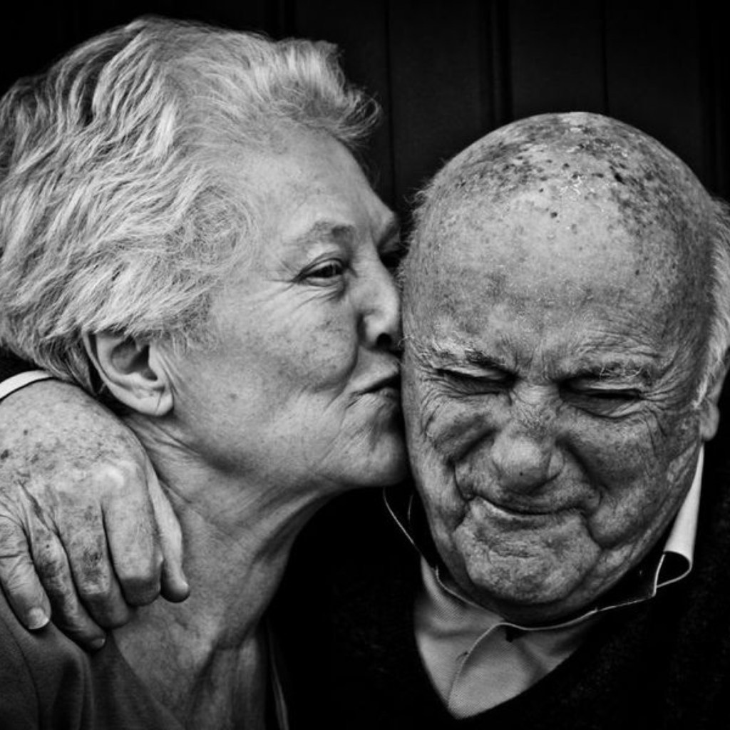
The stack of magazines was impressive. Elle, Vogue, Architectural Digest, Bon Appetit and People. As a 13-year old, I just wanted to fixate and rip, fixate and rip, fixate and rip. Slowly, I was adding to my expanding wall collection, and I was proud. How were the ‘best’ images selected, and what made them ‘iconic’? What mattered to me at the time—creativity, originality, colour, composition—made it onto my closet doors, locker and school binder clear insert. If I could think of these images in my sleep, they became iconic. I will never forget one in particular. The triangular red and white logo juxtaposed against a black and white photograph of a girl pouting while a man anticipates…
What intrigues us about this image? Almost instantly, we find ourselves peering in, linked to the experience. We sense she is in the wrong place; however, we do not feel that she does not belong or would rather be elsewhere. Time and space are interrupted. We ask ourselves, “Will it occur?” But the chain of events does not matter. What matters is that we are suspended in a rare and captivating moment. And because the image is black and white, we are transported to the exact scene where the ‘film’ unravels. Then the bold red of the typeface and the logo bring us back to life, and we are suddenly alive; the advertisement has won us over…without a guess!
If we know that people can impact an ad’s efficacy, should we consider using people on food packaging? Could we use the interaction between a man and a woman on a coffee bag, for example? In my opinion, yes. Imagine this. A tired corporate executive finds herself standing in a Whole Foods Market. There is no one around. Soft music flutters in and out of her ears. She is standing in the coffee aisle, looking at bags and bags and bags. There’s so much unique packaging, she’s not sure what to choose. But then she sees it—a couple set in black and white. The photograph is beautiful; the packaging seems bound by eternal love as the image wraps fully around the product. It portrays something the executive longs for on a deeper level. “I’ll go for this,” she thinks, grabbing it to pay.
Using people in ad imagery is not a new concept, but could potentially be an innovative idea in the food and beverage domain. We know that ads are geared to make us think and feel. And there’s a whole range of themes emotional ads can trigger, from love to empathy to excitement. I don’t think I’ve ever spent valuable time and money on a product that didn’t trigger an emotion somehow. Even if it may go unrecognized—the power and influence of an emotional experience are unforgettable.
Should packaging portray a feeling using images of people? And if so, what are the most effective ways this can be executed?
A great campaign is built on a solid concept. It can stir our emotions and set our souls free to dream. Recently, I had the opportunity to put together a Valentine’s Day video campaign for DirectFood.store. It was a fantastic experience, and I am proud of the output. Here is a little bit more about it.
DirectFood.store is a DTC online grocery store delivery platform that sells fresh, local and organic food from local farmers and vendors to the community. As a brand, DirectFood.store aims to inspire and empower consumers to eat healthily, buy local, and learn more about the farm-to-table concept. Priority is placed on ensuring high-quality products, affordable pricing, and easy ordering, plus free delivery direct to the doorstep.
For this particular campaign, our objectives are:
Increase brand awareness
Connect with our target audience (young, millennial couples and families with kids; age 25-34 / baby boomers drawn to compelling video and who will purchase something based on its value; age 45-64)
Promote interest in our platform and products
Provide entertainment
Create a need for buying local, fresh & organic food from local farmers and vendors with free delivery direct to the doorstep
The campaign features BC blogger and influencer Chelsea Helm. We find her wondering how to impress her Valentine. While pondering an answer, she suddenly thinks of DirectFood.store. She decides to put together a thoughtful and delicious dinner for her partner. The campaign follows Chelsea through her decision-making process. She orders the ingredients, and they arrive at her doorstep. We then capture her preparing a steak and salad, setting the table and signing a Valentine’s day card. Will her Valentine make it in time? Will they be surprised? Ultimately, she shares with the audience that through DirectFood.store, you can make something special for that special someone in your life.
I wanted the advertising tone to be fun, happy, thoughtful, romantic, youthful, and vibrant. Our primary message is that consumers identify with our brand, and our products fit their lifestyle and choices. I think we hit the mark, and best of all, the campaign was completed on brand, on time and on budget. Now to see how it performs as a Facebook ad!
I hope you enjoyed the video. If you have any questions or comments, feel free to reach out!