A Design Thinking Process

I’m no design wizard, but I have an eye for harmony and style!

These images were created as draft ads for a publication. They are not final but simply an example of my design strategy at work.

What strategy is that, you ask?

Well, for a multitude of reasons, there is always a small group of work that stands the test of time. I hold on to these works, for I know they will come in handy later.

And so, I found some old designs used to create our persona project Facebook ads and decided (ever-so-decidedly) that they were appropriate to appropriate (see what I did there) for this particular task.

So alas, using my trusted canvas called Canva, I copied the design in the new dimensions and spent about 2 hours iterating upon iteration, if that could be a thing!

So, what are your thoughts? Which one speaks to you the most? Which one do you think the team went with? Let me know!

Agtech Career Series

I am so passionate about educational marketing. It inspires me to look beyond the standard expectations of my role. For this project, I tried to situate myself in the mind of a teenager reading a presentation about a job in farming. It’s so much more than that though. It’s igniting their energy with thoughtful and calculated design. It’s creating flawless headlines and engaging copy that will leave them fascinated and motivated. More urgently, it’s about arming that younger generation with the knowledge to pursue a rewarding career in an ever-growing and transitioning industry.

Our primary call-to-action invokes us to – farm smart start today. We’ll provide you with the education and the technology to succeed. To change your operation for the better. To help the planet survive. So let’s band together and fill each other with hope to prepare ourselves to fight with our minds and hearts to beat global problems like a growing population, food waste, and climate change.

I hope to participate in more projects like this in the future and maybe even join the classroom for some face-to-face interaction and hands-on teaching!

Read more about the project I launched here. Alongside a blog series, these are the assets I designed for the students:

And here are the blog graphics that were used to complement the content. I mimicked a rainbow effect because the colours of a rainbow positively impact our brains, affecting emotions, mental clarity, and energy levels. We all know long nights of studying could take advantage of a rainbow or two!

But Local First Facebook Ad

The ‘support local’ movement is a force driving change worldwide. It moves people to want to purchase fresh, healthy products from farmers. It creates a connection between shoppers, where we can ignite conversations to examine how we’re doing our part and why it’s so important. Products are showing up more readily and in places where you least expect to see them. Overall, there is a feeling of togetherness, kindness, and open-mindedness that helps promote awareness and captures the interest of new, existing, and prospective customers.

I wanted to create a fun digital ad that spoke to the nature of the ‘support local’ concept, one that explores options (expressed using a carousel format), eliminates predisposition (articulated in the ad copy), and ultimately grants us the ability to choose (the call-to-action ‘but local first’) – take action (decide what you want to eat for breakfast) or take action through inspiration (are your eggs local? Well, you can get them laid the same day of delivery! How awesome is that!). The inspiration trickles through in a matter of seconds affecting all those involved (conveyed through various images, colours, animation, and the image of a family). As individuals watching the ad, we feel more attuned to thinking about what’s on our plates, how it got there, where it comes from, and why our consumption habits can negatively or positively impact the planet. The focus remains on the following values –

Support local

Empower people

Help the planet

Grow the community

What are your thoughts on this ad? If I could make one change, I would use a graphic of a globe in place of the farming graphic (at the end of the video). Does it speak to you and make you feel empowered to support local? Let me know your thoughts; open to discussing with you!

Instagram Grid Layouts

grid, which features multiple images split into a visually appealing frame, is one way to brand your business on Instagram. 

Three benefits (that connect in the end) – 

  • Command attention: make a lasting first impression; if a viewer’s average attention span is about eight seconds, they will have some time to absorb what you have to present to them.
  • Stand out: imprint your audience’s mind with a quick taste of your identity; give them immediate access to your information and interests while establishing credibility and authority.
  • Tell a targeted story: communicate who you are to your existing and potential followers while stimulating emotions, and on a practical side, organizing the layout of your images into a narrative.

I created these grids when reviewing the masses of content I have made over the past year for DirectFood. store’s email marketing strategy (a whole other topic on its own). I like how the colours and shapes seem to speak to one another, and the creative copy helps deliver a message in tune with the selected graphics and photographs.

If you like this sort of work, let me know. I’m happy to share more impromptu design posts here for you!

How Ad Imagery Could Translate Into Product Packaging

The stack of magazines was impressive. Elle, Vogue, Architectural Digest, Bon Appetit and People. As a 13-year old, I just wanted to fixate and rip, fixate and rip, fixate and rip. Slowly, I was adding to my expanding wall collection, and I was proud. How were the ‘best’ images selected, and what made them ‘iconic’? What mattered to me at the time—creativity, originality, colour, composition—made it onto my closet doors, locker and school binder clear insert. If I could think of these images in my sleep, they became iconic. I will never forget one in particular. The triangular red and white logo juxtaposed against a black and white photograph of a girl pouting while a man anticipates… 

What intrigues us about this image? Almost instantly, we find ourselves peering in, linked to the experience. We sense she is in the wrong place; however, we do not feel that she does not belong or would rather be elsewhere. Time and space are interrupted. We ask ourselves, “Will it occur?” But the chain of events does not matter. What matters is that we are suspended in a rare and captivating moment. And because the image is black and white, we are transported to the exact scene where the ‘film’ unravels. Then the bold red of the typeface and the logo bring us back to life, and we are suddenly alive; the advertisement has won us over…without a guess!

If we know that people can impact an ad’s efficacy, should we consider using people on food packaging? Could we use the interaction between a man and a woman on a coffee bag, for example? In my opinion, yes. Imagine this. A tired corporate executive finds herself standing in a Whole Foods Market. There is no one around. Soft music flutters in and out of her ears. She is standing in the coffee aisle, looking at bags and bags and bags. There’s so much unique packaging, she’s not sure what to choose. But then she sees it—a couple set in black and white. The photograph is beautiful; the packaging seems bound by eternal love as the image wraps fully around the product. It portrays something the executive longs for on a deeper level. “I’ll go for this,” she thinks, grabbing it to pay.

Using people in ad imagery is not a new concept, but could potentially be an innovative idea in the food and beverage domain. We know that ads are geared to make us think and feel. And there’s a whole range of themes emotional ads can trigger, from love to empathy to excitement. I don’t think I’ve ever spent valuable time and money on a product that didn’t trigger an emotion somehow. Even if it may go unrecognized—the power and influence of an emotional experience are unforgettable.

Should packaging portray a feeling using images of people? And if so, what are the most effective ways this can be executed?

How Art on Food Packaging Affects Decision-Making

Oldhand Coffee

Koichi Kiyono

Process

Luna Coffee

DFS Valentine’s Day Campaign

How to Impress My Valentine

A great campaign is built on a solid concept. It can stir our emotions and set our souls free to dream. Recently, I had the opportunity to put together a Valentine’s Day video campaign for DirectFood.store. It was a fantastic experience, and I am proud of the output. Here is a little bit more about it.

DirectFood.store is a DTC online grocery store delivery platform that sells fresh, local and organic food from local farmers and vendors to the community. As a brand, DirectFood.store aims to inspire and empower consumers to eat healthily, buy local, and learn more about the farm-to-table concept. Priority is placed on ensuring high-quality products, affordable pricing, and easy ordering, plus free delivery direct to the doorstep. 

For this particular campaign, our objectives are:

  • Increase brand awareness 
  • Connect with our target audience (young, millennial couples and families with kids; age 25-34 / baby boomers drawn to compelling video and who will purchase something based on its value; age 45-64)
  • Promote interest in our platform and products
  • Provide entertainment
  • Create a need for buying local, fresh & organic food from local farmers and vendors with free delivery direct to the doorstep

The campaign features BC blogger and influencer Chelsea Helm. We find her wondering how to impress her Valentine. While pondering an answer, she suddenly thinks of DirectFood.store. She decides to put together a thoughtful and delicious dinner for her partner. The campaign follows Chelsea through her decision-making process. She orders the ingredients, and they arrive at her doorstep. We then capture her preparing a steak and salad, setting the table and signing a Valentine’s day card. Will her Valentine make it in time? Will they be surprised? Ultimately, she shares with the audience that through DirectFood.store, you can make something special for that special someone in your life.

I wanted the advertising tone to be fun, happy, thoughtful, romantic, youthful, and vibrant. Our primary message is that consumers identify with our brand, and our products fit their lifestyle and choices. I think we hit the mark, and best of all, the campaign was completed on brand, on time and on budget. Now to see how it performs as a Facebook ad!

I hope you enjoyed the video. If you have any questions or comments, feel free to reach out!

5 Ways to Differentiate Your Brand

In life, different is good. 

It’s about who we are and how we showcase ourselves to the world. 

In branding, it’s much the same. 

Although being different can be a challenge. 

Why?

We don’t want to clash with the norm. We want to be unique and memorable.

I came across an excellent article about brand differentiation and put together this quick presentation.

Let me know what you think!

Food for Thought

I wanted to share some recent social media work I developed for DirectFood.store. Check it out and let me know what you think!

A Poem About Differentiation

A differentiator is what sets you apart from the competition.

It’s playing sports vs playing ball.

It’s smiling when life throws you those base curves,

because by the end of the day, everyone will remember.

In marketing, a differentiator makes people revel.

At times in silence, but that silence is awe.

You have differentiated your product when,

people know your name by your vision,

your philosophy, your mission statement.

Your audience begins to recognize your slogan,

they begin to identify with your colours.

You are en route to differentiating when,

you feel nervous and yet grounded.

At the end of the day,

you feel like you’re taking a risk

like you’re in trouble for something because

it pushes boundaries, it causes discussions,

it breaks the rules but never forget,

you are leading the group.

A true differentiator cannot be physically realized, because it has infinite gain at infinite frequency – Wikepedia

Digital reach is UNLIMITED. How does art make a difference? COOL is an UNLIMITED concept. Take that back to the couch when you break. Like someone in sales talking about sales, talking about art takes vision. It takes direction and you must be a leader through and through. I am obviously trying to push myself. Always, always tryin’ ta be that purple cow. Let’s remind the crowd again –

Purple cow:

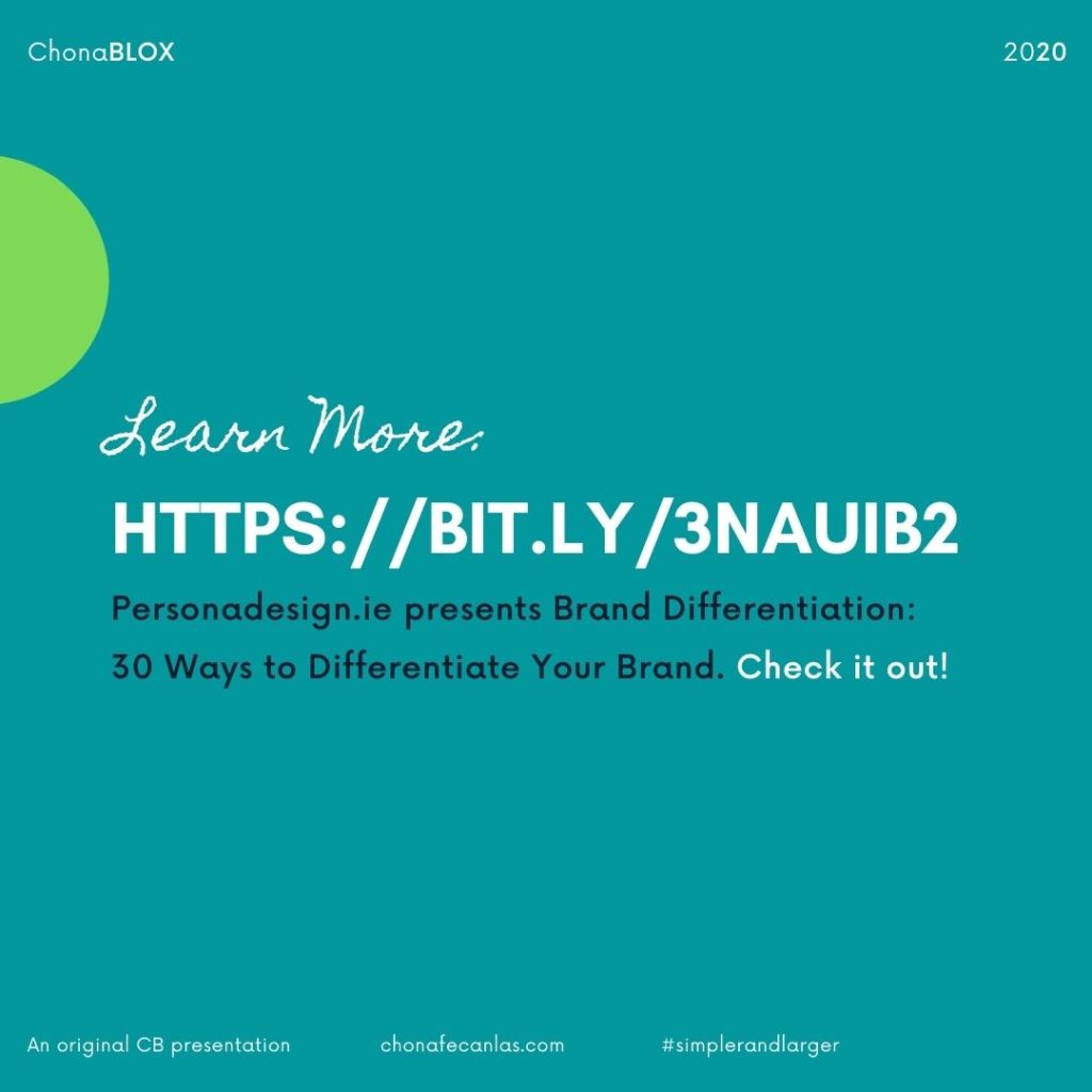
The concept of the Purple Cow was introduced by Seth Godin in his groundbreaking book by the same title.  Recently I read it again because it is full of ideas and case studies on how to make your business remarkable. When you drive by a heard of cattle they all look like cows and it doesn’t seem out of the ordinary.  But if you drive by a heard and standing in the field is a Purple Cow you have to tell someone because it is so different.  When something forces you to remark on it, by definition it is remarkable.  This is what your new business strategy should be focusing on, finding ways to make your customers talk about your products to their friends.

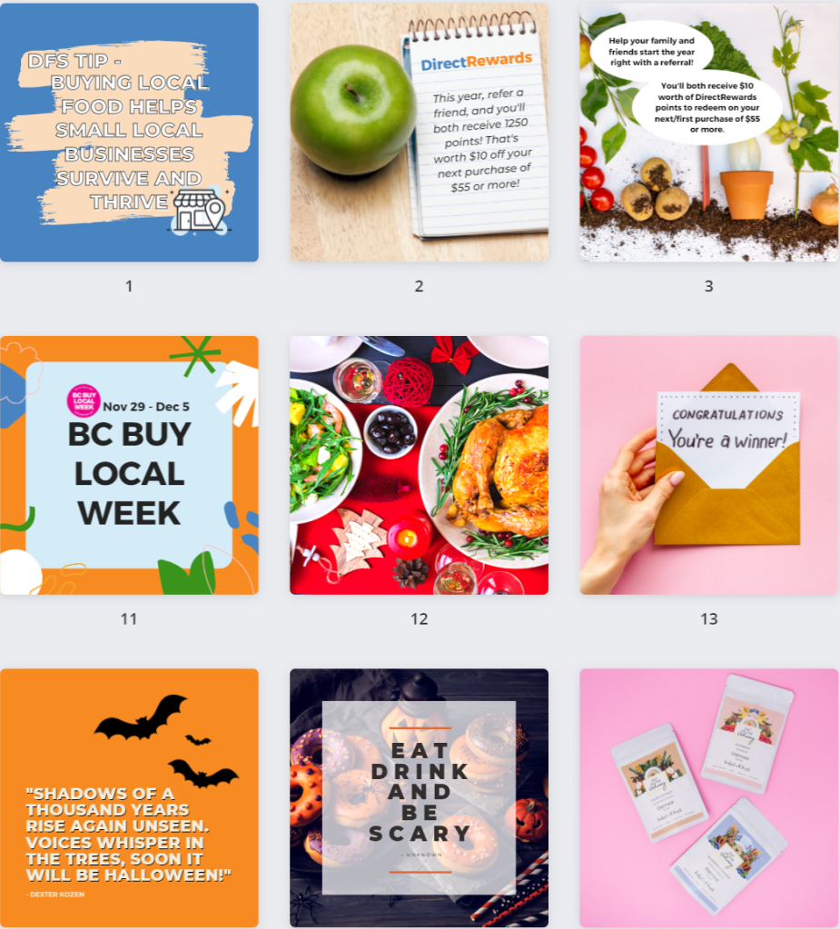
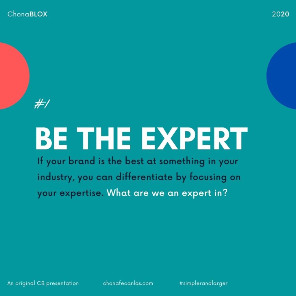
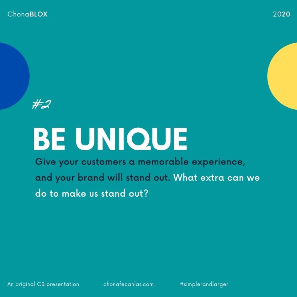
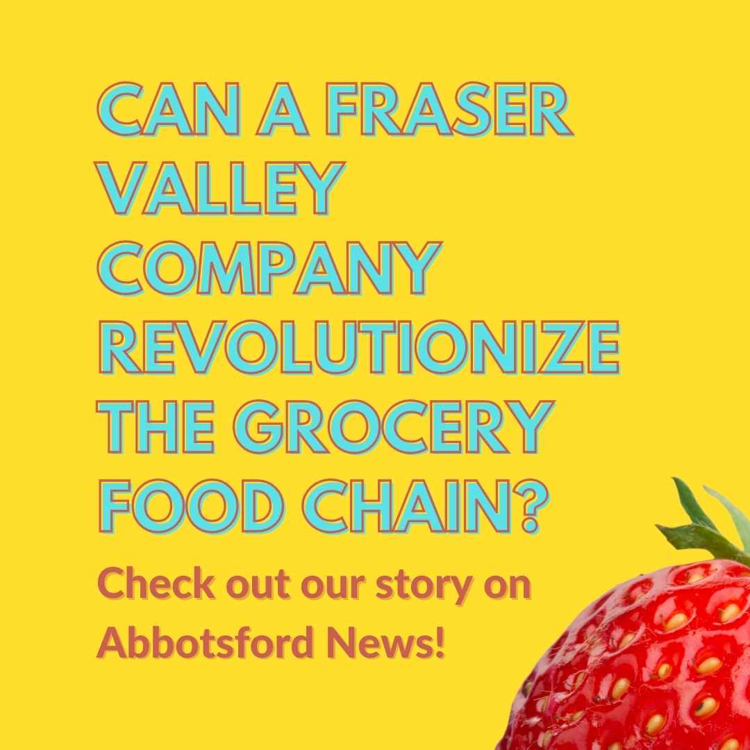
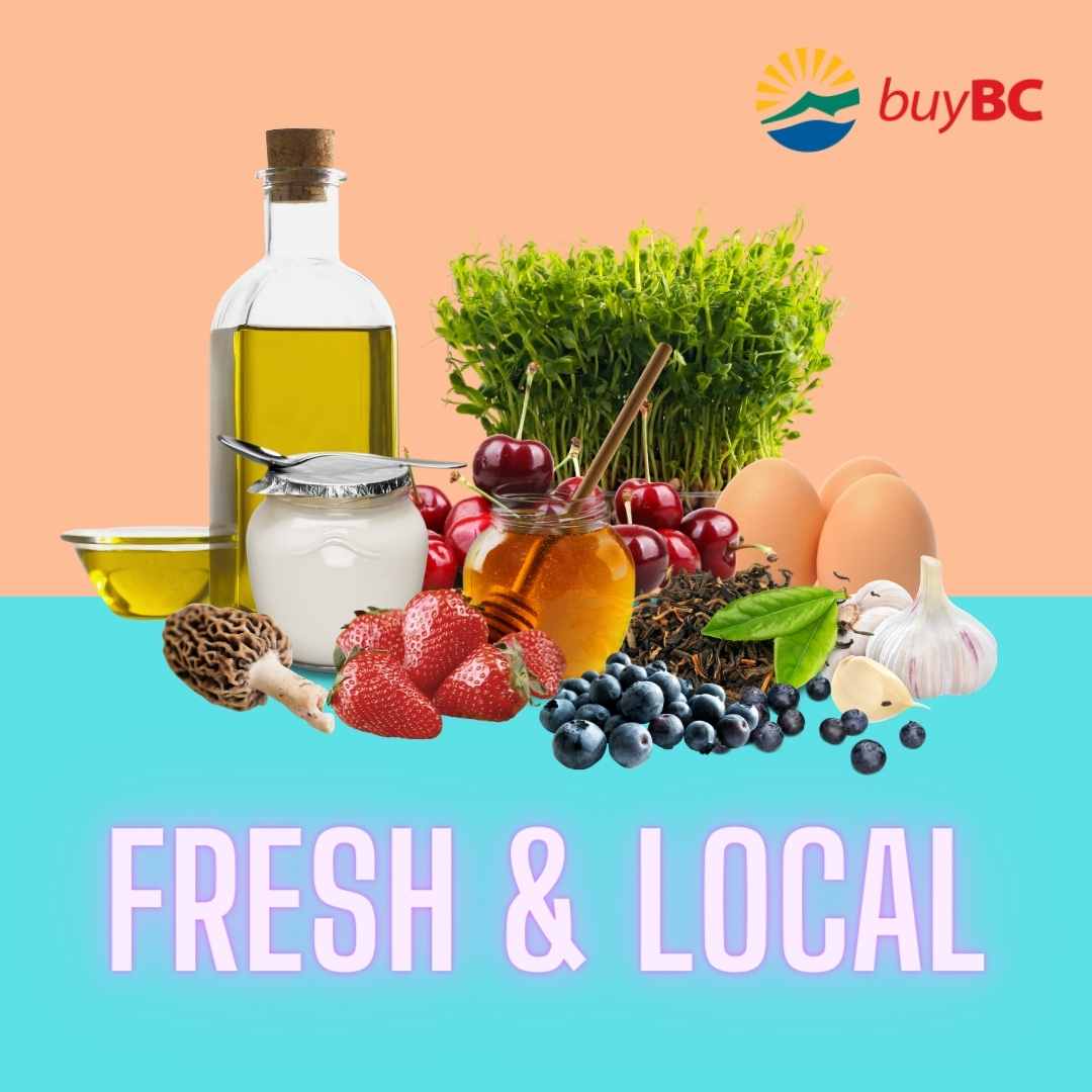
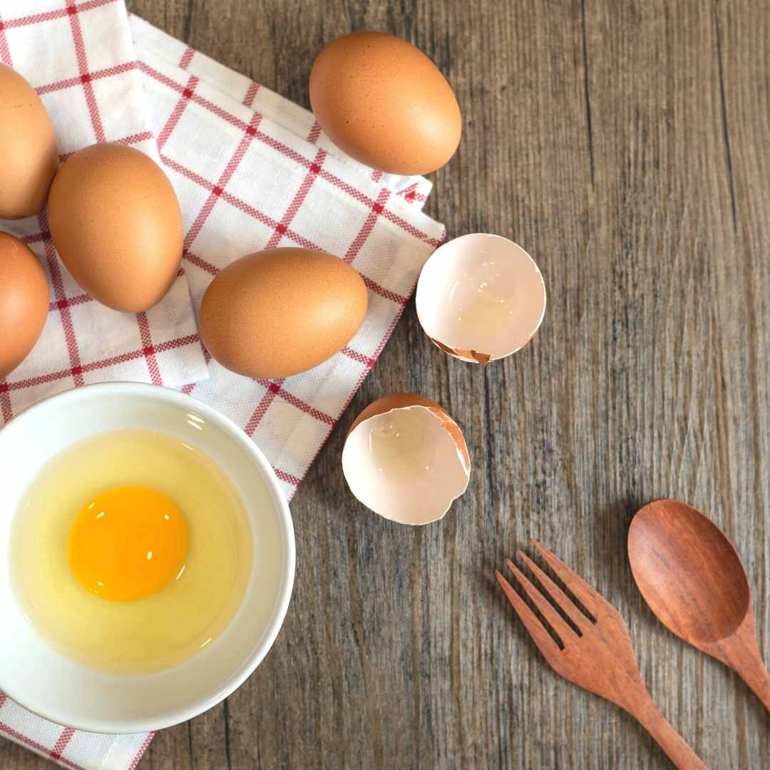
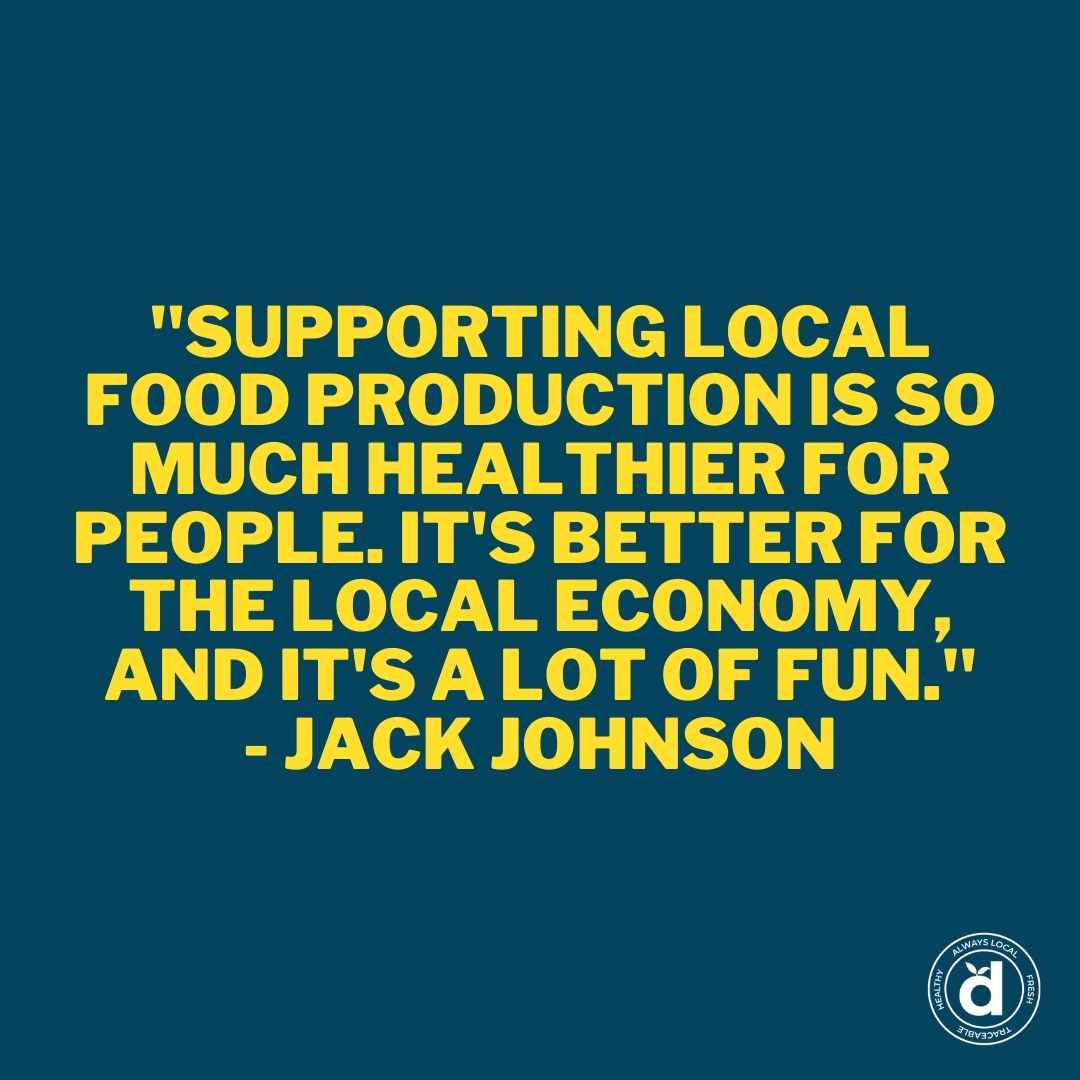
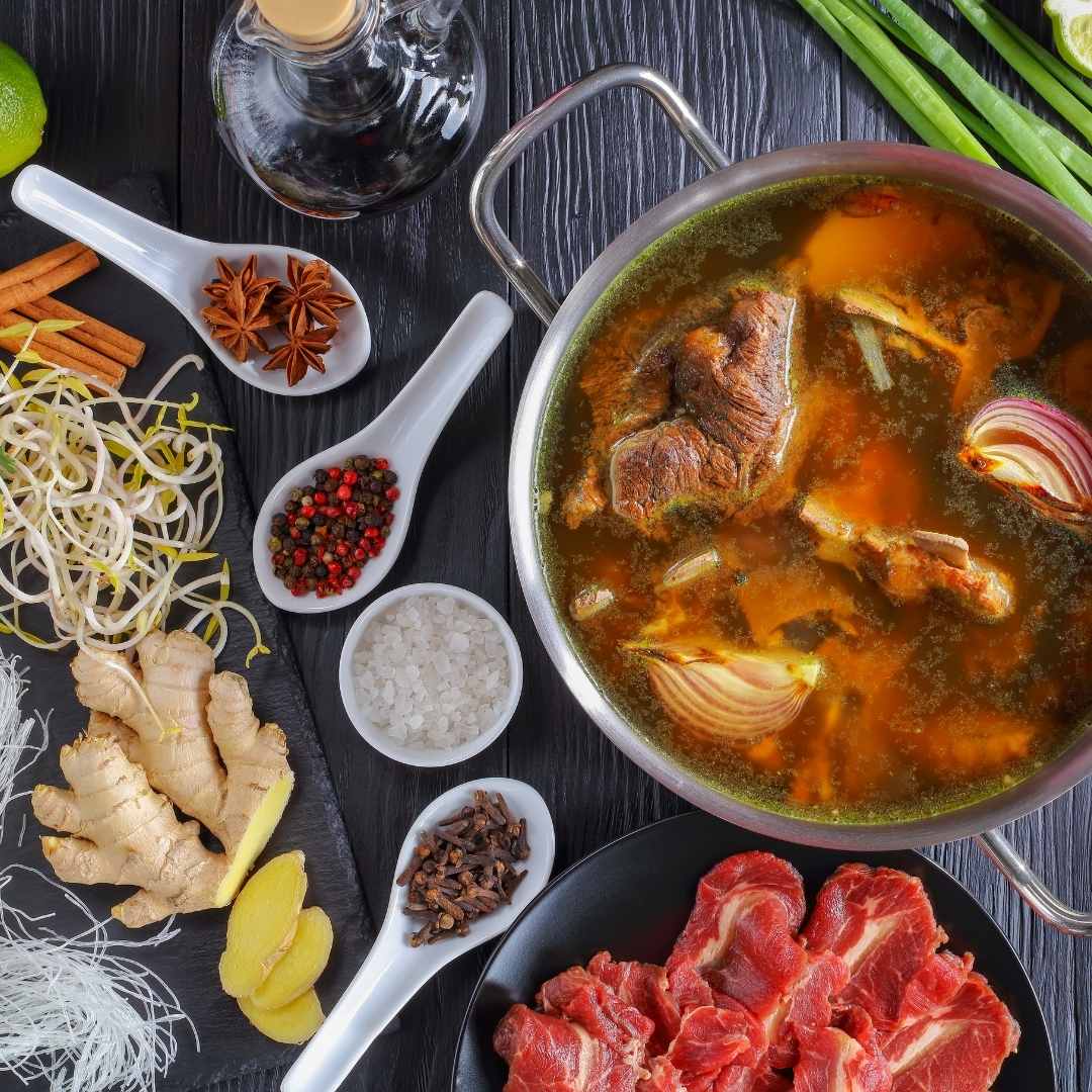
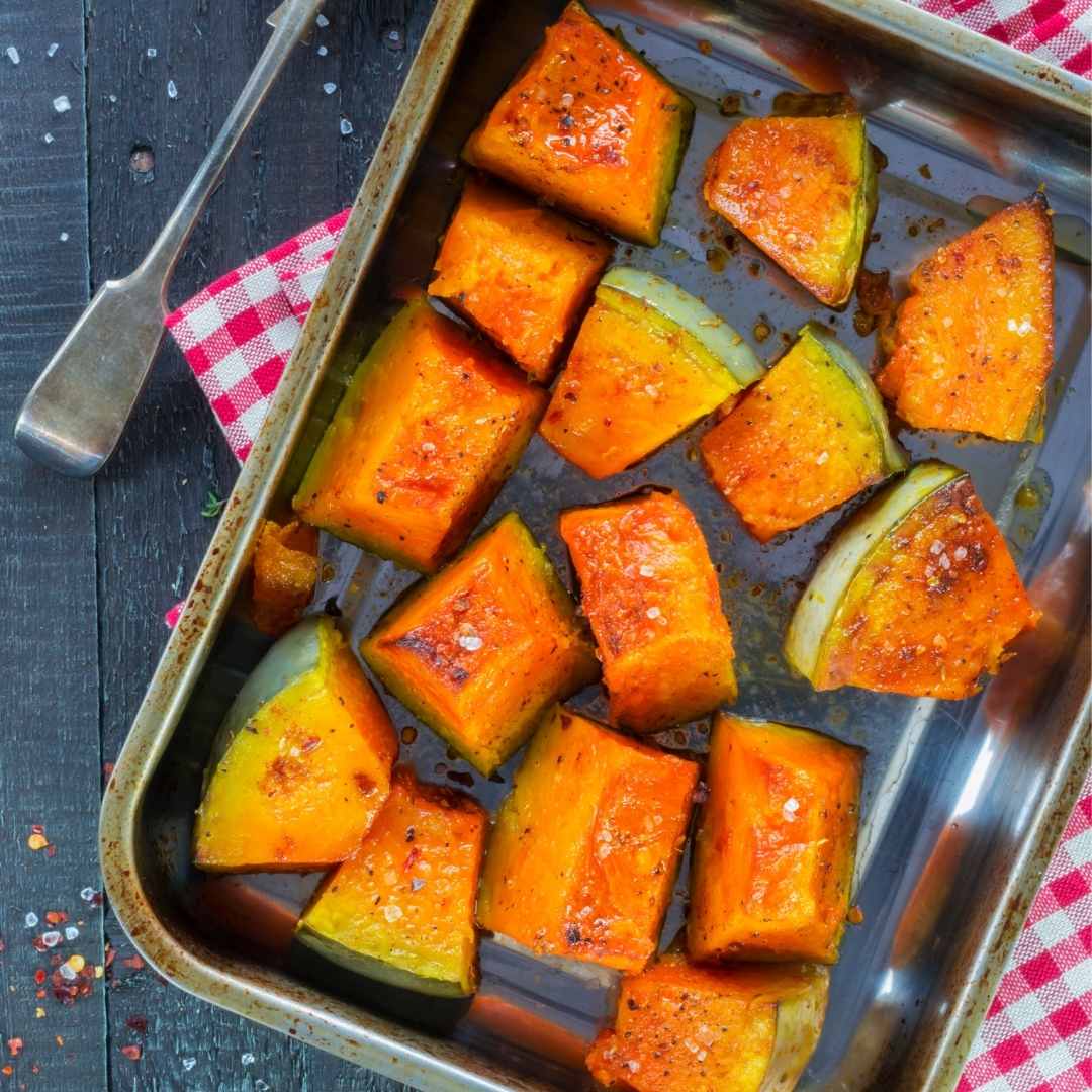
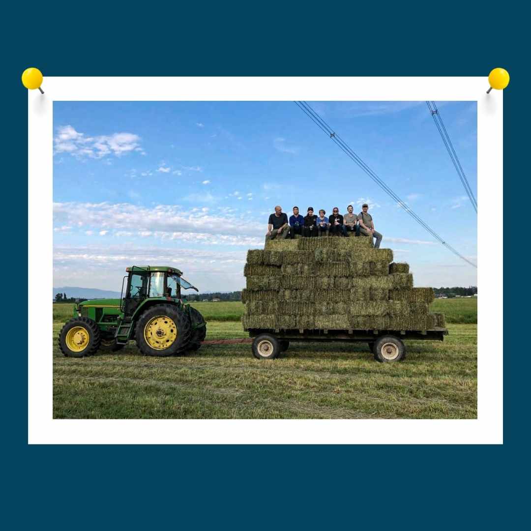
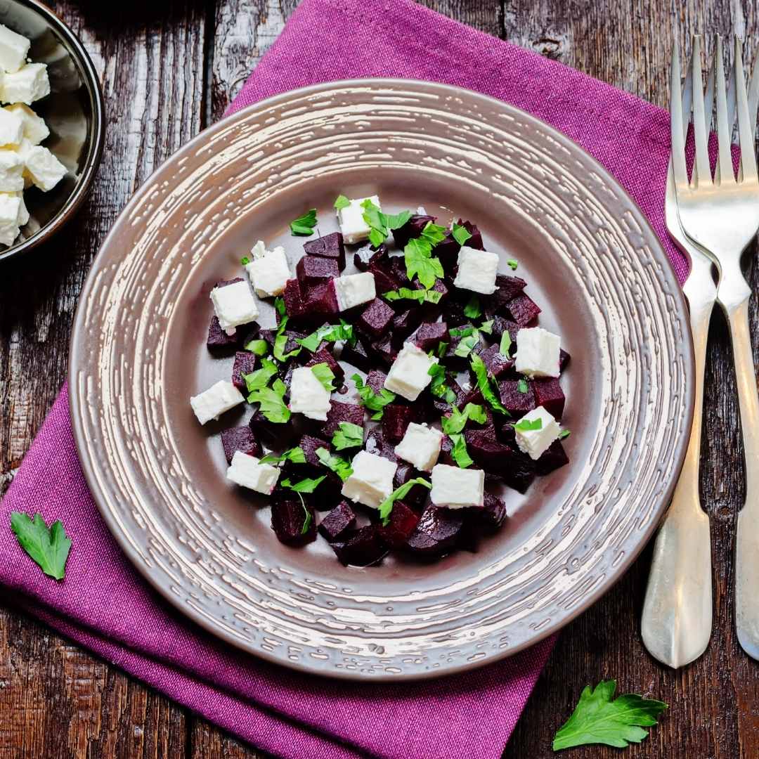
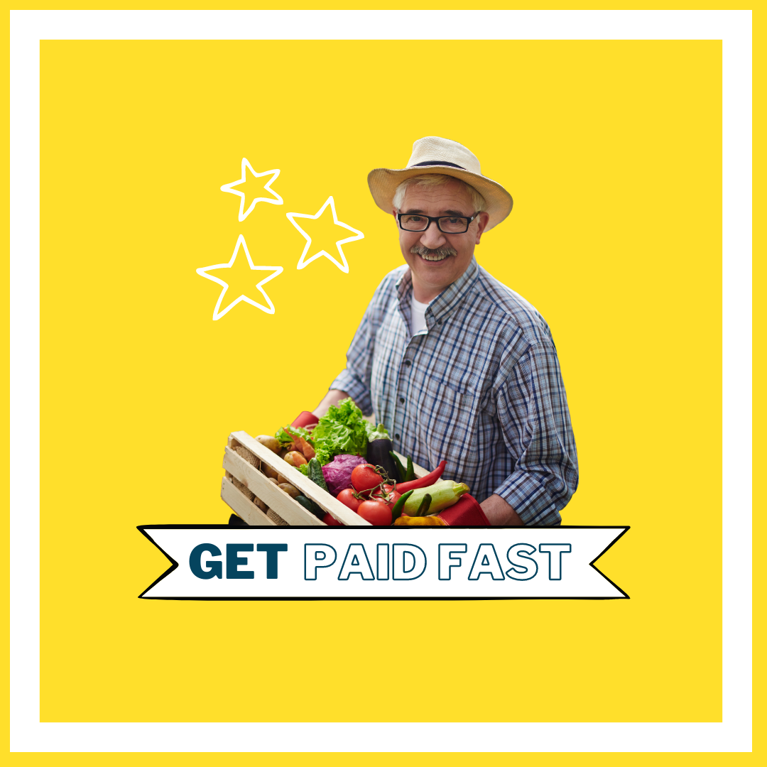
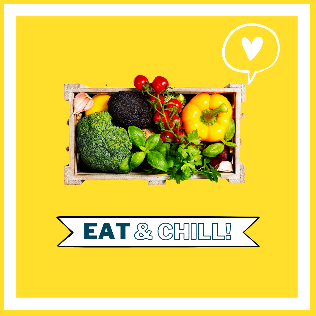
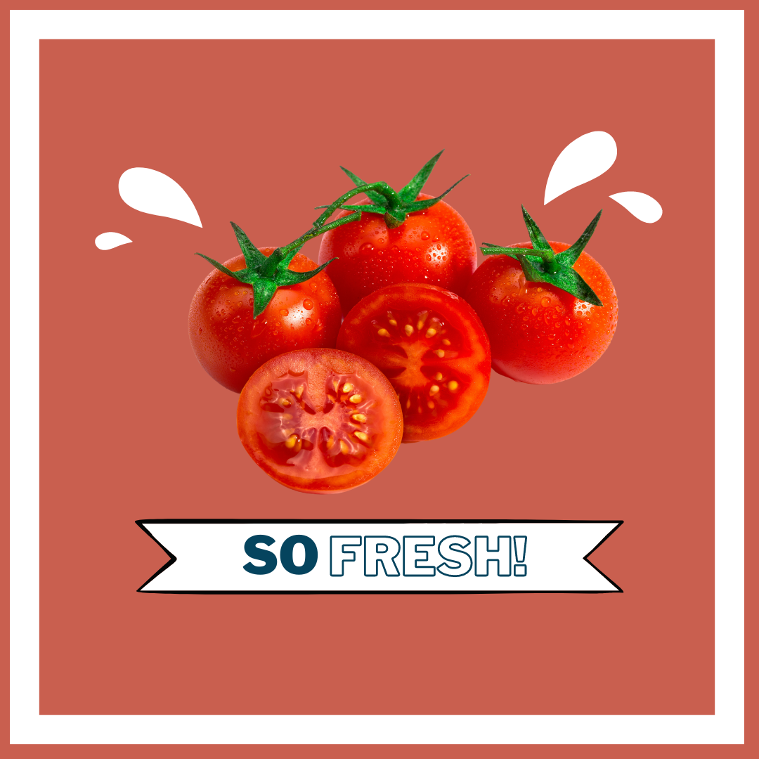
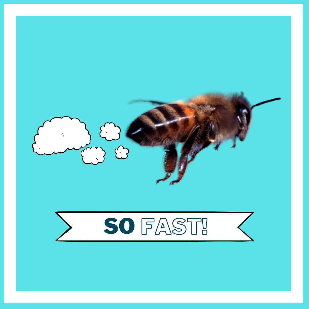
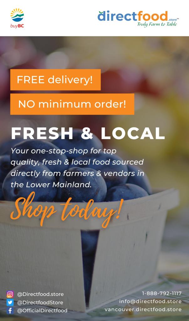
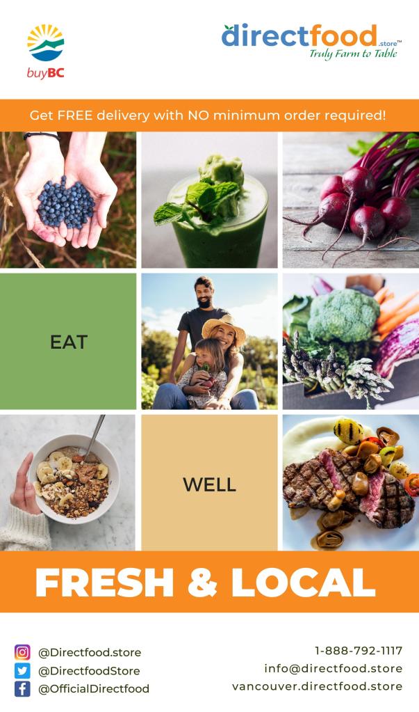
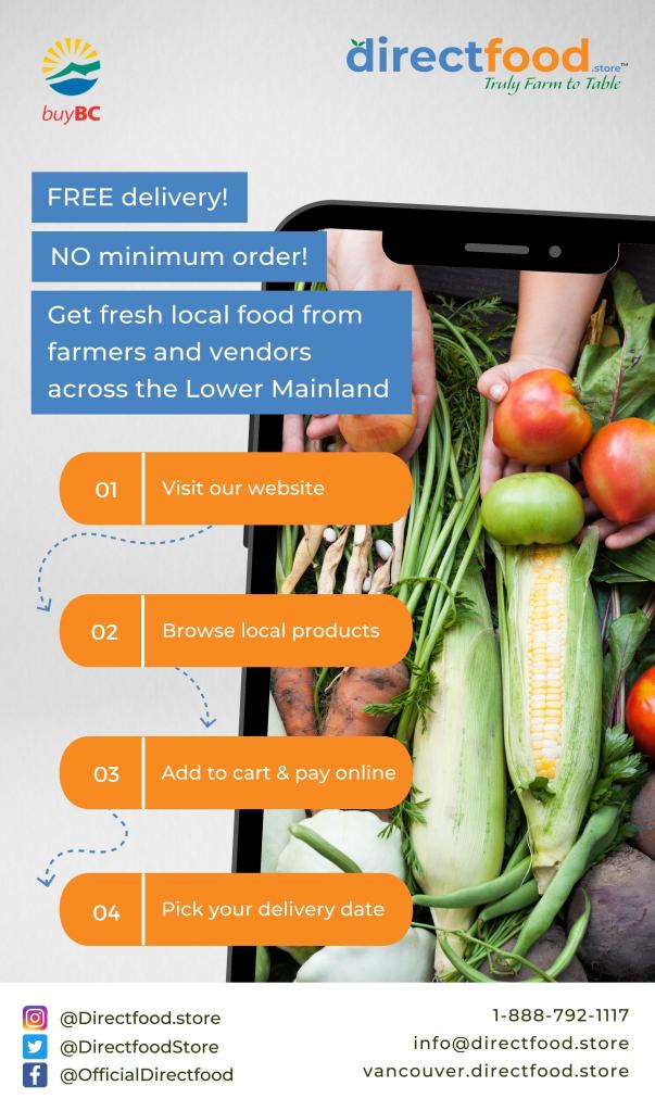
I write about differentiation in light of the launch of DirectFood.store, an online platform that enables local farmers and vendors to sell their products to consumers, restaurants, and care homes. The food is fresh. SO FRESH. The food is local. SO LOCAL. And you get it right away, to your doorstep, the next day. DIRECT TO YOUR DOOR.

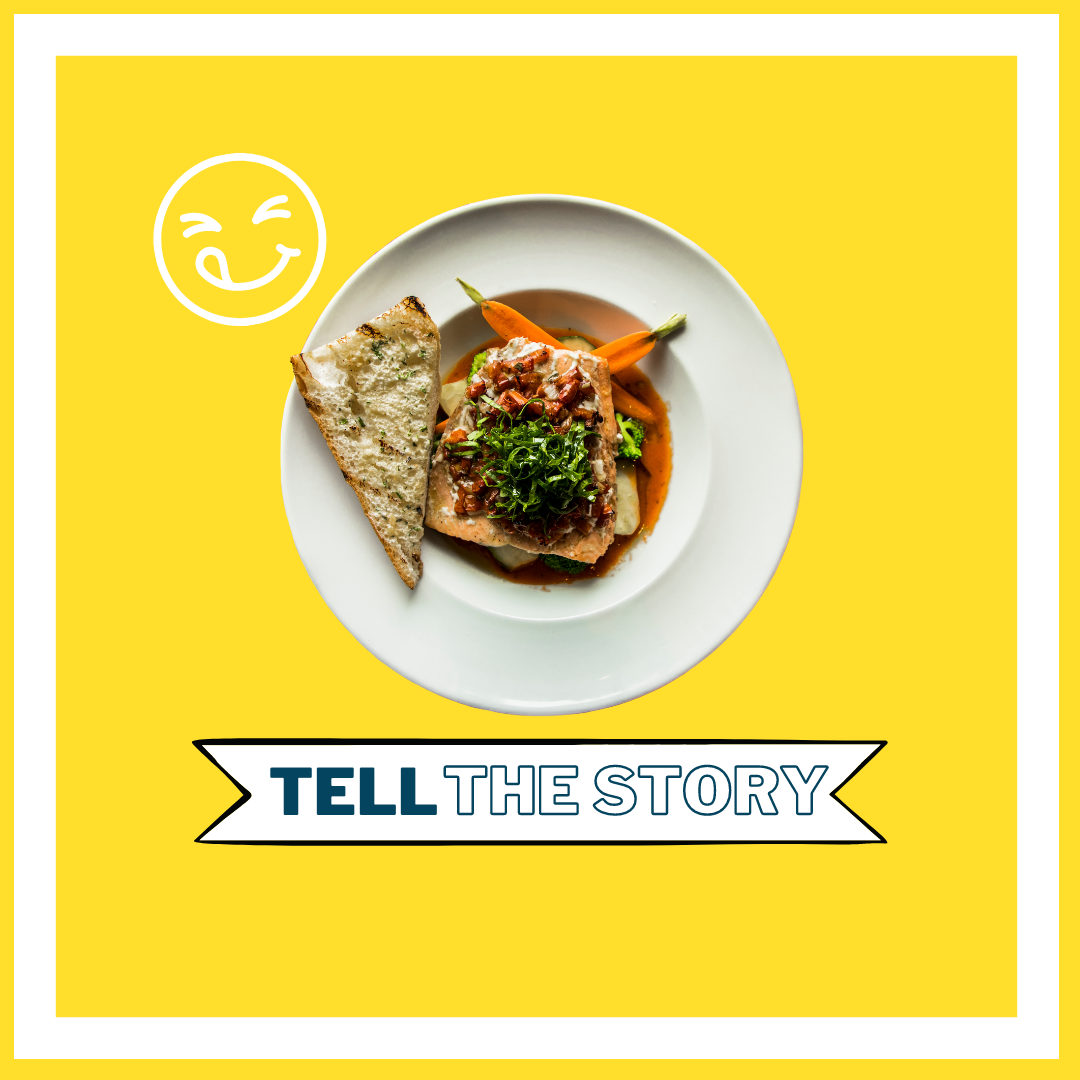
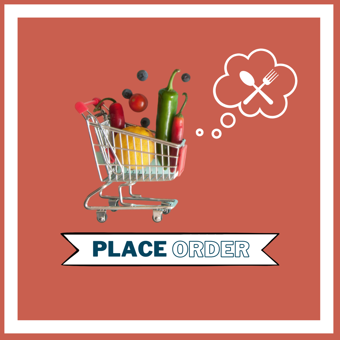
I helped to develop the brand identity which you can witness on our recently revamped website. And I run our social media campaign, which is meant to be fresh, in the definition of COOL, like Will Smith Fresh Prince of Bel-Air COOL, that shirt is sick COOL, those kicks are dope COOL.

COOL is just one aspect of the brand, obviously my favourite. But DirectFood.store is also about:

  • Supporting local businesses
  • Engaging the community
  • Spreading the good word about fresh, healthy, organic & local food
  • Promoting a good cause for the good of all people

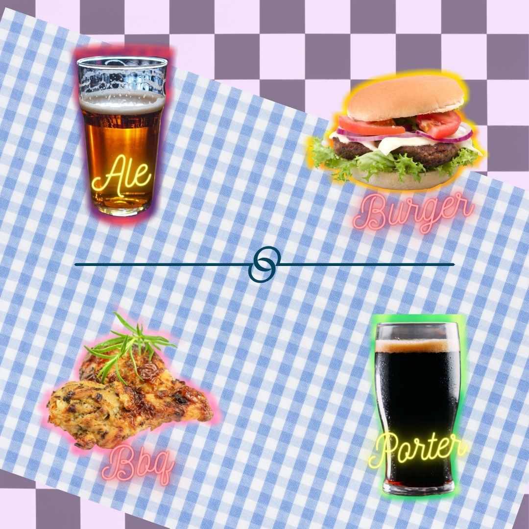
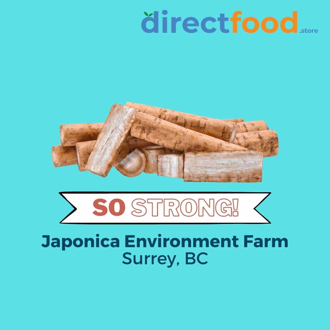
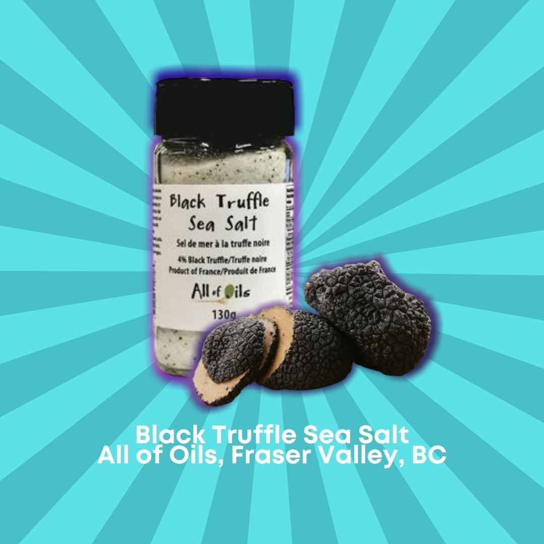
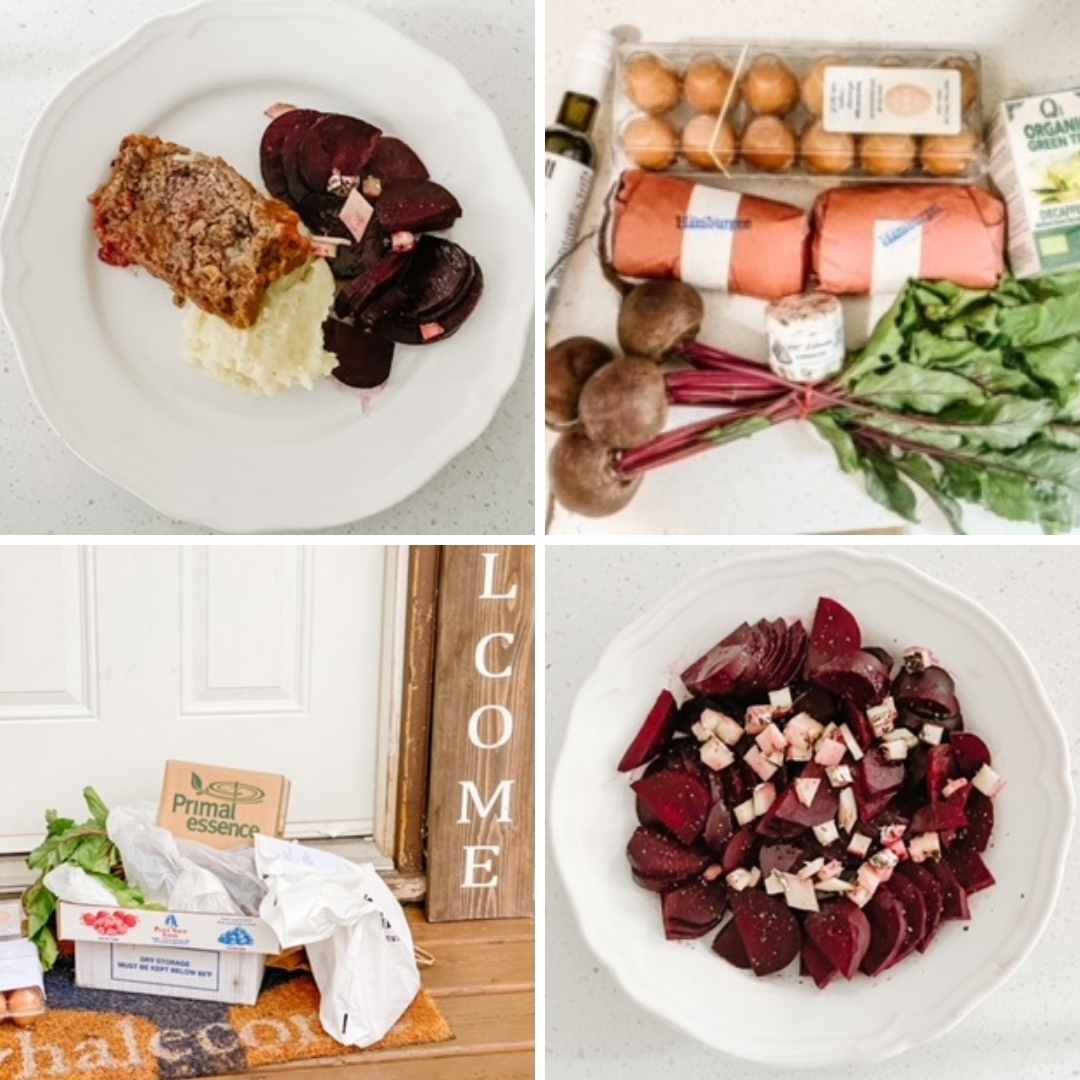
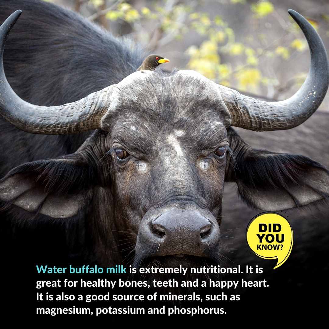
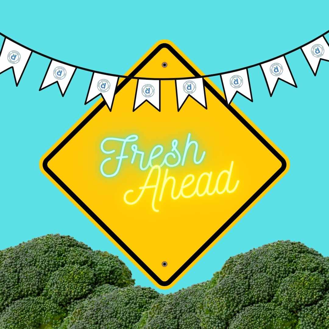
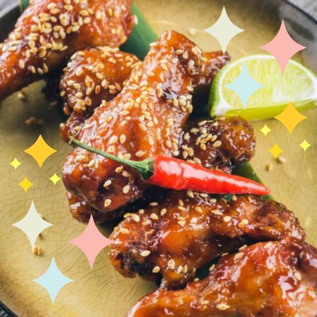
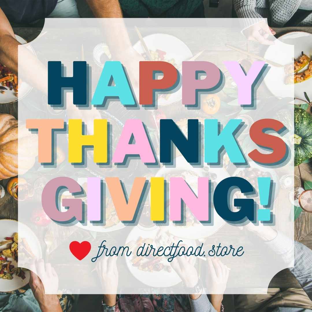
Just wanted to share some graphics I created that are live on the website. And you need to follow us on Instagram, to check out the REAL DEAL grid. 2 posts per day. Slammin’ balls against the ground. ALL BALL SPORTS. It’s bold. It’s cheeky. It’s collage. It promotes our core values + image. It’s inspired by a retro van, who needs a name…any ideas?

I AM STILL AN ART DIRECTOR. PERIOD.

WHY DOES RANTING END BEFORE YOU’RE FINISHED?

Never let anyone sway you otherwise. If you’re capable, you’re capable. You don’t go back in time. You move forward. And forward-thinking people, know the game. But they’ve got their own game going on, and other people play that. That’s it. Goodnight.

PS – Props to Gurwinder!

PPS – A little lightness. I am lovin’ my work, my day, my grind at i-Open Technologies!

Delivering Real & Sustainable Technology Solutions for a Better Planet. Hi Ray!

DFS Website Graphics - Restaurants Page (3)DFS Website Graphics - Restaurants Page (2)DFS Website Graphics - Restaurants Page (1)DFS Website Graphics - Restaurants PageDFS Website Graphics - Sell Direct Page (3)DFS Website Graphics - Sell Direct Page (2)DFS Website Graphics - Sell Direct PageDFS Website Graphics - Sell Direct PageDFS Website Graphics - Homepage (3)DFS Website Graphics - Homepage (2)DFS Website Graphics - Homepage (1)DFS Website Graphics - Homepage