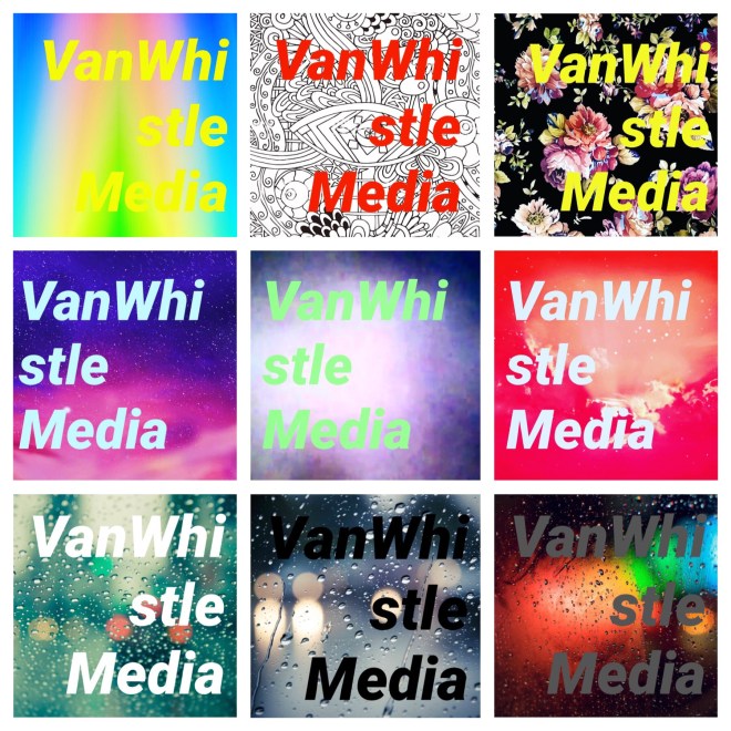
This started as a quick way to advertise the VWM name on social media. Using MART (Mobile Art or graphic design made via mobile application), designing sometimes became about speed. What quality of work could I output in the least amount of time? This is also when Roboto Black Oblique became our branded font. It worked so well with being bold, and to the point. For me, the most powerful logos are just a word. Not only a word, but A WORD. The most obvious example being, Apple.


